- Home
- /
- Programming
- /
- Graphics
- /
- Re: Now to create scatter plot like this?
- RSS Feed
- Mark Topic as New
- Mark Topic as Read
- Float this Topic for Current User
- Bookmark
- Subscribe
- Mute
- Printer Friendly Page
- Mark as New
- Bookmark
- Subscribe
- Mute
- RSS Feed
- Permalink
- Report Inappropriate Content
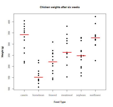
HI, dose anyone has insight to create the following figure?
Accepted Solutions
- Mark as New
- Bookmark
- Subscribe
- Mute
- RSS Feed
- Permalink
- Report Inappropriate Content
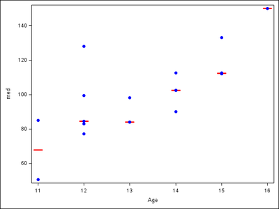
OK, one more try, following @Jay54's suggestion (tested with 9.4) :
proc sql;
create table class as
select *, median(weight) as med
from sashelp.class
group by age;
quit;

proc sgplot data=class noautolegend;
highlow x=age high=med low=med / type=bar lineattrs=(thickness=2 color=red) barwidth=0.6;
scatter y=weight x=age / markerattrs=(symbol=circlefilled color=blue);
xaxis type=discrete;
run;
- Mark as New
- Bookmark
- Subscribe
- Mute
- RSS Feed
- Permalink
- Report Inappropriate Content
We could try the sgplot procedure as below, I am assuming that the graph is overlapping of scatter plot on box plot with mean. If it is the case the below procedure should help.
proc sgplot data=have;
scatter x=feed_type y=weight / markerattrs = (size = 2 symbol = circlefilled); /*this will be the scatter plot*/
vbox weight / category=feed_type; /*this will create the box plot with mean*/
quit;
run;
Jag
- Mark as New
- Bookmark
- Subscribe
- Mute
- RSS Feed
- Permalink
- Report Inappropriate Content
Hi Jagadishkatam,
It seems that the overlapping scatter plot and box plot is not worked.
Please see the SAS log below.
Thanks for your reply.
By the way, I'm using SAS 9.3.
- Mark as New
- Bookmark
- Subscribe
- Mute
- RSS Feed
- Permalink
- Report Inappropriate Content
I guess in 9.3 you could cheat this way:
proc sql;
create table class as
select *, median(weight) as med
from sashelp.class
group by age;
quit;

proc sgplot data=class noautolegend;
scatter x=age y=med / yerrorlower=med yerrorupper=med
    markerattrs=(size=0) errorbarattrs=(thickness=2 color=red);
scatter y=weight x=age / markerattrs=(symbol=circlefilled color=blue);
run;- Mark as New
- Bookmark
- Subscribe
- Mute
- RSS Feed
- Permalink
- Report Inappropriate Content
Thanks for your solution.
Another question, how to lengthen the length of 'mean'?
- Mark as New
- Bookmark
- Subscribe
- Mute
- RSS Feed
- Permalink
- Report Inappropriate Content
I don't know. Seems to be proportional to line thickness.
- Mark as New
- Bookmark
- Subscribe
- Mute
- RSS Feed
- Permalink
- Report Inappropriate Content
According to your reply, SAS 9.3 cannot overlay vbox and scatter plot, right?
- Mark as New
- Bookmark
- Subscribe
- Mute
- RSS Feed
- Permalink
- Report Inappropriate Content
Looks like variation on a box plot.
http://blogs.sas.com/content/graphicallyspeaking/2012/05/07/unbox-your-box-plots/
- Mark as New
- Bookmark
- Subscribe
- Mute
- RSS Feed
- Permalink
- Report Inappropriate Content
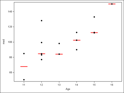
Here is an approaching example:
proc sql;
create table class as
select *, median(weight) as med
from sashelp.class
group by age;
quit;

proc sgplot data=class noautolegend;
vbox med / category=age nomean nomedian nocaps
    lineattrs=(color=red thickness=2);
scatter y=weight x=age / markerattrs=(symbol=circlefilled);
xaxis type=discrete;
run;- Mark as New
- Bookmark
- Subscribe
- Mute
- RSS Feed
- Permalink
- Report Inappropriate Content
If you know the value for drawing the mean or median (the red line), and are using SAS 9.3, I suggest overlaying a Scatter and a HighLow (Type=Bar). Make the high and low the same value to get a single line. You can set the BarWidth to control the width of the line.
- Mark as New
- Bookmark
- Subscribe
- Mute
- RSS Feed
- Permalink
- Report Inappropriate Content
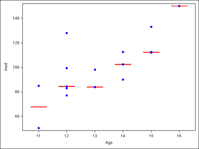
OK, one more try, following @Jay54's suggestion (tested with 9.4) :
proc sql;
create table class as
select *, median(weight) as med
from sashelp.class
group by age;
quit;

proc sgplot data=class noautolegend;
highlow x=age high=med low=med / type=bar lineattrs=(thickness=2 color=red) barwidth=0.6;
scatter y=weight x=age / markerattrs=(symbol=circlefilled color=blue);
xaxis type=discrete;
run;

- Mark as New
- Bookmark
- Subscribe
- Mute
- RSS Feed
- Permalink
- Report Inappropriate Content
Besides, the function "median" seems not okay in SAS 9.3. There will be a warning message "The MEDIAN function has been called with only one argument.".
However, 'mean' function can be worked in proc sql statement and that what I need!
Thanks again!
JC
Catch up on SAS Innovate 2026
Nearly 200 sessions are now available on demand with the SAS Innovate Digital Pass.
Explore Now →Learn how use the CAT functions in SAS to join values from multiple variables into a single value.
Find more tutorials on the SAS Users YouTube channel.
SAS Training: Just a Click Away
Ready to level-up your skills? Choose your own adventure.


