- Home
- /
- Programming
- /
- Graphics
- /
- Need to change labels in proc gchart vbar
- RSS Feed
- Mark Topic as New
- Mark Topic as Read
- Float this Topic for Current User
- Bookmark
- Subscribe
- Mute
- Printer Friendly Page
- Mark as New
- Bookmark
- Subscribe
- Mute
- RSS Feed
- Permalink
- Report Inappropriate Content
Please help to edit the code to get desired output.
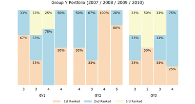
In the final graph i want x axis to be labelled as count and not year and is shown below.
data my_data;

input Group_Y_ID Year count rank_1st rank_2nd rank_3rd;

label rank_1st='1st Ranked' rank_2nd='2nd Ranked' rank_3rd='3rd Ranked';

datalines;

1 2007 3 66.66667 33.33333 0

1 2008 3 33.33333 33.3333 33.33333

1 2009 4 0 75 25

1 2010 4 50 50 0

2 2007 4 50 50 0

2 2008 3 33.33333 66.66667 0

2 2009 4 100 0 0

2 2010 5 80 20 0

3 2007 3 33.33333 33.33333 33.33333

3 2008 2 50 0 50

3 2009 3 33.33333 33.33333 33.33333

3 2010 4 25 75 0

;

run;

proc transpose data=my_data  out=tran_data;

by Group_Y_ID year;

run;

data tran_data; set tran_data;

format col1 percentn6.0;

col1=col1/100;

run;

goptions xpixels=500 ypixels=450;

goptions gunit=pct htitle=3 ftitle="albany amt/bold" htext=2.5 ftext="albany amt";

legend1 label=none;

pattern1 v=s c=cxfad9b8;

pattern2 v=s c=cxadd7e5;

pattern3 v=s c=cxf7f8d0;

axis1 label=none value=none style=0 major=none minor=none;

axis2 label=none value=(angle=90) style=0;

axis3 label=none;

title1 ls=1.5 "Group Portfolio (2007 / 2008 / 2009 / 2010)";

proc gchart data=tran_data;

vbar year / discrete

group=Group_Y_ID

type=sum sumvar=col1 inside=sum

subgroup=_label_ legend=legend1

raxis=axis1 maxis=axis2 gaxis=axis3 noframe

width=8 space=0 coutline=white;

run;
Accepted Solutions
- Mark as New
- Bookmark
- Subscribe
- Mute
- RSS Feed
- Permalink
- Report Inappropriate Content
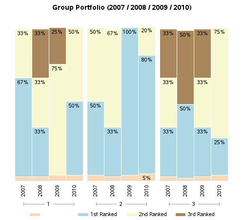
Ok - I think the original poster is talking about the values at the base of each bar, rather than what we think of as the "axis label". Note that his image at the top of the post is what he *wants* (not what his code is currently producing). Below is the graph his code is currently producing:
One problem Is that when you transpose the data, you need to also include the count as one of the 'by' variables (without doing that, the count is getting treated as a data value, and gets included at the base of the stacked bars, and the 'blank' legend item to the left).
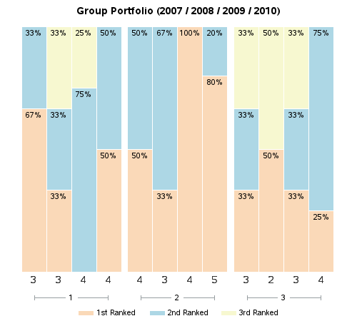
The most direct way I know of to get the graph you want is to make the year values at the bottom of each bar 'invisible' (by making them white text on white background) by using value=(color=white) on the axis2 statement, and then annotate the values you want at the base of the bars. Note that using annotate is a little tricky for beginners, and annotating on a grouped bar chart can be tricky for even a seasoned SAS/Graph pro.
That being said, here is a quick proof-of-concept that I think gets what you want (note that I haven't put a great deal of time into double-checking this, so please check behind me and make sure that the values in the graph are what you're expecting - I did have to make a few assumptions, and I did it quickly so I might have made an error). The parts I added are in bold text to make them easy to see...
data my_data;
input Group_Y_ID Year count rank_1st rank_2nd rank_3rd;
label rank_1st='1st Ranked' rank_2nd='2nd Ranked' rank_3rd='3rd Ranked';
datalines;
1 2007 3 66.66667 33.33333 0
1 2008 3 33.33333 33.3333 33.33333
1 2009 4 0 75 25
1 2010 4 50 50 0
2 2007 4 50 50 0
2 2008 3 33.33333 66.66667 0
2 2009 4 100 0 0
2 2010 5 80 20 0
3 2007 3 33.33333 33.33333 33.33333
3 2008 2 50 0 50
3 2009 3 33.33333 33.33333 33.33333
3 2010 4 25 75 0
;
run;
proc transpose data=my_data out=tran_data;
by Group_Y_ID year count;
run;
data tran_data; set tran_data;
format col1 percentn6.0;
col1=col1/100;
run;
proc sql noprint;
create table my_anno as
select unique group_y_id, year, count, _label_
from tran_data;
quit; run;
data my_anno; set my_anno;
xsys='2'; ysys='2'; hsys='3'; when='a';
group=Group_Y_ID;
midpoint=year;
y=0;
function='label'; position='e'; size=3; color='gray33';
length text $20;
text=trim(left(count));
run;
goptions xpixels=500 ypixels=450;
goptions gunit=pct htitle=3 ftitle="albany amt/bold" htext=2.5 ftext="albany amt";
legend1 label=none;
pattern1 v=s c=cxfad9b8;
pattern2 v=s c=cxadd7e5;
pattern3 v=s c=cxf7f8d0;
axis1 label=none value=none style=0 major=none minor=none;
axis2 label=none value=(angle=90) style=0 value=(color=white);
axis3 label=none;
title1 ls=1.5 "Group Portfolio (2007 / 2008 / 2009 / 2010)";
proc gchart data=tran_data anno=my_anno;
vbar year / discrete
group=Group_Y_ID
type=sum sumvar=col1 inside=sum
subgroup=_label_ legend=legend1
raxis=axis1 maxis=axis2 gaxis=axis3 noframe
width=8 space=0 coutline=white;
run;
And here is the graph my code produces:
- Mark as New
- Bookmark
- Subscribe
- Mute
- RSS Feed
- Permalink
- Report Inappropriate Content
Calling @GraphGuy
- Mark as New
- Bookmark
- Subscribe
- Mute
- RSS Feed
- Permalink
- Report Inappropriate Content
Try putting the text you want for an axis label in the LABEL option of axis definition used for the axis if you must use GCHART. And don't forget the QUIT to end the Gchart procedure.
axis1 label=none value=none style=0 major=none minor=none;
axis2 label=('Count') value=(angle=90) style=0;
axis3 label=none;
title1 ls=1.5 "Group Portfolio (2007 / 2008 / 2009 / 2010)";
proc gchart data=tran_data;
   vbar year / discrete
   group=Group_Y_ID
   type=sum sumvar=col1 inside=sum
   subgroup=_label_ legend=legend1
   raxis=axis1 maxis=axis2 gaxis=axis3 noframe
   width=8 space=0 coutline=white;
run;
quit;
- Mark as New
- Bookmark
- Subscribe
- Mute
- RSS Feed
- Permalink
- Report Inappropriate Content
- Mark as New
- Bookmark
- Subscribe
- Mute
- RSS Feed
- Permalink
- Report Inappropriate Content
Ok - I think the original poster is talking about the values at the base of each bar, rather than what we think of as the "axis label". Note that his image at the top of the post is what he *wants* (not what his code is currently producing). Below is the graph his code is currently producing:
One problem Is that when you transpose the data, you need to also include the count as one of the 'by' variables (without doing that, the count is getting treated as a data value, and gets included at the base of the stacked bars, and the 'blank' legend item to the left).
The most direct way I know of to get the graph you want is to make the year values at the bottom of each bar 'invisible' (by making them white text on white background) by using value=(color=white) on the axis2 statement, and then annotate the values you want at the base of the bars. Note that using annotate is a little tricky for beginners, and annotating on a grouped bar chart can be tricky for even a seasoned SAS/Graph pro.
That being said, here is a quick proof-of-concept that I think gets what you want (note that I haven't put a great deal of time into double-checking this, so please check behind me and make sure that the values in the graph are what you're expecting - I did have to make a few assumptions, and I did it quickly so I might have made an error). The parts I added are in bold text to make them easy to see...
data my_data;
input Group_Y_ID Year count rank_1st rank_2nd rank_3rd;
label rank_1st='1st Ranked' rank_2nd='2nd Ranked' rank_3rd='3rd Ranked';
datalines;
1 2007 3 66.66667 33.33333 0
1 2008 3 33.33333 33.3333 33.33333
1 2009 4 0 75 25
1 2010 4 50 50 0
2 2007 4 50 50 0
2 2008 3 33.33333 66.66667 0
2 2009 4 100 0 0
2 2010 5 80 20 0
3 2007 3 33.33333 33.33333 33.33333
3 2008 2 50 0 50
3 2009 3 33.33333 33.33333 33.33333
3 2010 4 25 75 0
;
run;
proc transpose data=my_data out=tran_data;
by Group_Y_ID year count;
run;
data tran_data; set tran_data;
format col1 percentn6.0;
col1=col1/100;
run;
proc sql noprint;
create table my_anno as
select unique group_y_id, year, count, _label_
from tran_data;
quit; run;
data my_anno; set my_anno;
xsys='2'; ysys='2'; hsys='3'; when='a';
group=Group_Y_ID;
midpoint=year;
y=0;
function='label'; position='e'; size=3; color='gray33';
length text $20;
text=trim(left(count));
run;
goptions xpixels=500 ypixels=450;
goptions gunit=pct htitle=3 ftitle="albany amt/bold" htext=2.5 ftext="albany amt";
legend1 label=none;
pattern1 v=s c=cxfad9b8;
pattern2 v=s c=cxadd7e5;
pattern3 v=s c=cxf7f8d0;
axis1 label=none value=none style=0 major=none minor=none;
axis2 label=none value=(angle=90) style=0 value=(color=white);
axis3 label=none;
title1 ls=1.5 "Group Portfolio (2007 / 2008 / 2009 / 2010)";
proc gchart data=tran_data anno=my_anno;
vbar year / discrete
group=Group_Y_ID
type=sum sumvar=col1 inside=sum
subgroup=_label_ legend=legend1
raxis=axis1 maxis=axis2 gaxis=axis3 noframe
width=8 space=0 coutline=white;
run;
And here is the graph my code produces:
Learn how use the CAT functions in SAS to join values from multiple variables into a single value.
Find more tutorials on the SAS Users YouTube channel.
SAS Training: Just a Click Away
Ready to level-up your skills? Choose your own adventure.


