- Home
- /
- Programming
- /
- Graphics
- /
- Re: NEED HELP! swimmer plots - change swim lane colors PROC TEMPLATE
- RSS Feed
- Mark Topic as New
- Mark Topic as Read
- Float this Topic for Current User
- Bookmark
- Subscribe
- Mute
- Printer Friendly Page
- Mark as New
- Bookmark
- Subscribe
- Mute
- RSS Feed
- Permalink
- Report Inappropriate Content
does anyone know if there's a way to change the swimmer lane colors in PROC TEMPLATE swimmer plots??
also if you can add a second title in a legend? thanks
Accepted Solutions
- Mark as New
- Bookmark
- Subscribe
- Mute
- RSS Feed
- Permalink
- Report Inappropriate Content
Thanks everyone for their help!
I solved the problem (in bold):
Proc TEMPLATE;
define STATGRAPH GTL_GRAPH;
BEGINGRAPH /BORDER=False datacontrastcolor=(purple red blue green);
LAYOUT OVERLAY /
YAXISOPTS= (DISPLAY=(LABEL) OFFSETMIN=0.1 OFFSETMAX=0.2 LABEL="Patients"
LABELATTRS=(FAMILY="Arial" WEIGHT=bold SIZE=11pt)
LINEAROPTS=(VIEWMIN=1 viewmax=%eval(&viewmax - 3) TICKVALUESEQUENCE=(start=1 end=&viewmax INCREMENT=1)))
XAXISOPTS=(OFFSETMIN=0.05 OFFSETMAX=0.05 LABEL="Drug Treatment (weeks)"
LABELATTRS=(FAMILY="Arial" weight=bold size=11pt) TICKVALUEATTRS=(COLOR=BLACK)
LINEAROPTS=(VIEWMIN=0 VIEWMAX=&maxweek TICKVALUESEQUENCE=(START=0 END=&maxweek INCREMENT=&weekint)));
* ENTRY HALIGN=center TEXTATTRS=(FAMILY="Arial" COLOR=black SIZE=11pt WEIGHT=bold) "Dose Cohort: Drug 20mg/d (N=10)"/valign=top ;
- Mark as New
- Bookmark
- Subscribe
- Mute
- RSS Feed
- Permalink
- Report Inappropriate Content
I'm just guessing:
You may find relevant information in:
http://www.pharmasug.org/proceedings/2014/DG/PharmaSUG-2014-DG07.pdf
a line taken from this link:
scatter X=crstart1 Y=subjn /markerattrs=(symbol=trianglefilled size=9 color=red);
- Mark as New
- Bookmark
- Subscribe
- Mute
- RSS Feed
- Permalink
- Report Inappropriate Content
Your posts of the same question under different headings is a bit confusing. Also, it would be easier to help if you add more information, such as an image of what you want. Having said that, you can find some information in this blog article. If you want to change the colors of the "Disease Stage" bars, then you can use a STYLEATTRS statement to set your colors, or use a Discrete Attributes Map (DATTRMAP).
You can find more information on these options in the same blog by searching for those terms, or searching on Google or in SAS documentation.
- Mark as New
- Bookmark
- Subscribe
- Mute
- RSS Feed
- Permalink
- Report Inappropriate Content
Hi Sanjay,
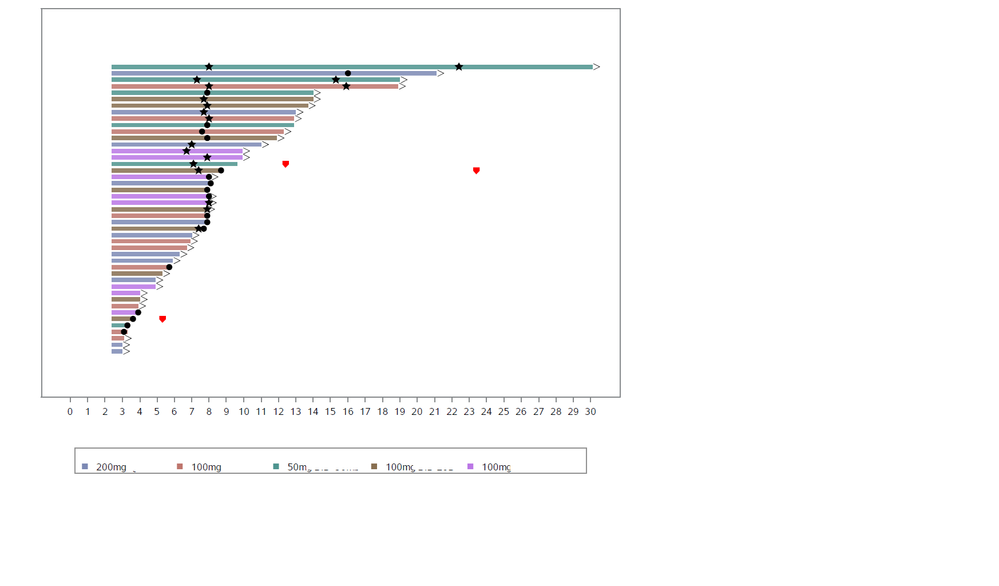
I'm using Proc Template. Below is the code. Under "vectorplot" statement, I want to assign specific colors to "group=DSTAGE" (bold font). "DSTAGE" are different cohorts to the study. Attached is an image of my current plot. The colors are hard to distinguish from each other.
how do I apply the proc sgplot code onto this? thank you.
Proc TEMPLATE;
define STATGRAPH GTL_GRAPH;
BEGINGRAPH /BORDER=False;
LAYOUT OVERLAY /
YAXISOPTS= (DISPLAY=(LABEL) OFFSETMIN=0.1 OFFSETMAX=0.2 LABEL="Patients"
LABELATTRS=(FAMILY="Arial" WEIGHT=bold SIZE=11pt)
LINEAROPTS=(VIEWMIN=1 viewmax=%eval(&viewmax - 3) TICKVALUESEQUENCE=(start=1 end=&viewmax INCREMENT=1)))
XAXISOPTS=(OFFSETMIN=0.05 OFFSETMAX=0.05 LABEL="Drug Treatment (weeks)"
LABELATTRS=(FAMILY="Arial" weight=bold size=11pt) TICKVALUEATTRS=(COLOR=BLACK)
LINEAROPTS=(VIEWMIN=0 VIEWMAX=&maxweek TICKVALUESEQUENCE=(START=0 END=&maxweek INCREMENT=&weekint)));
* ENTRY HALIGN=center TEXTATTRS=(FAMILY="Arial" COLOR=black SIZE=11pt WEIGHT=bold) "Dose Cohort: Drug 20mg/d (N=10)"/valign=top ;
* draw swimmer lane bars;
VECTORPLOT X=XTIME Y=YVAR XORIGIN=0 YORIGIN=yvar/GROUP=DSTAGE
DATATRANSPARENCY=0.4 ARROWHEADS=FALSE LINEATTRS=(PATTERN=1 THICKNESS=6));
SCATTERPLOT X=eval(XTIME+999) Y=YVAR/GROUP=DSTAGE Name="TYP" DATATRANSPARENCY=0.3 MARKERATTRS=(SYMBOL=squarefilled SIZE=9) ;
* draw SUBJECT on the bar;
SCATTERPLOT X=eval(XTIME-XTIME) Y=eval(YVAR+0.6)/GROUP=DSTAGE DATALABEL=SUBJECT DATALABELATTRS=(COLOR=black SIZE=5pt) MARKERATTRS=(size=0) ;

- Mark as New
- Bookmark
- Subscribe
- Mute
- RSS Feed
- Permalink
- Report Inappropriate Content
You will find full documentation on VECTORPLOT in:
see next options in the linked page:
COLORMODEL=color-ramp-style-element | (color-list)
COLORRESPONSE=numeric-column | range-attr-var | expression
I have used google search for: "sas proc template vectorplot color" and choosed the link above.
- Mark as New
- Bookmark
- Subscribe
- Mute
- RSS Feed
- Permalink
- Report Inappropriate Content
Next link is to documentation on SAS color names and color definitions:
http://www.lexjansen.com/pharmasug/2009/tt/TT04.pdf
see page 12 in the PDF.
- Mark as New
- Bookmark
- Subscribe
- Mute
- RSS Feed
- Permalink
- Report Inappropriate Content
- Mark as New
- Bookmark
- Subscribe
- Mute
- RSS Feed
- Permalink
- Report Inappropriate Content
Thanks everyone for their help!
I solved the problem (in bold):
Proc TEMPLATE;
define STATGRAPH GTL_GRAPH;
BEGINGRAPH /BORDER=False datacontrastcolor=(purple red blue green);
LAYOUT OVERLAY /
YAXISOPTS= (DISPLAY=(LABEL) OFFSETMIN=0.1 OFFSETMAX=0.2 LABEL="Patients"
LABELATTRS=(FAMILY="Arial" WEIGHT=bold SIZE=11pt)
LINEAROPTS=(VIEWMIN=1 viewmax=%eval(&viewmax - 3) TICKVALUESEQUENCE=(start=1 end=&viewmax INCREMENT=1)))
XAXISOPTS=(OFFSETMIN=0.05 OFFSETMAX=0.05 LABEL="Drug Treatment (weeks)"
LABELATTRS=(FAMILY="Arial" weight=bold size=11pt) TICKVALUEATTRS=(COLOR=BLACK)
LINEAROPTS=(VIEWMIN=0 VIEWMAX=&maxweek TICKVALUESEQUENCE=(START=0 END=&maxweek INCREMENT=&weekint)));
* ENTRY HALIGN=center TEXTATTRS=(FAMILY="Arial" COLOR=black SIZE=11pt WEIGHT=bold) "Dose Cohort: Drug 20mg/d (N=10)"/valign=top ;
- Mark as New
- Bookmark
- Subscribe
- Mute
- RSS Feed
- Permalink
- Report Inappropriate Content
The 4 colors you have defined will be used for the classifications instead of the 12 colors defined in the Style. However, it should be noted the colors will be used in the order the Class values arrive in the data. If the order of the class values in the data change from day to day, you will get different class values assigned to different colors.
The safest way to consistently assign colors to class values is by using the Discrete Attributes Map, where they are assigned by VALUE, like "Mild", or "Severe" and not by position in the data.
- Mark as New
- Bookmark
- Subscribe
- Mute
- RSS Feed
- Permalink
- Report Inappropriate Content
Sorry, I have almost no experience with SAS GRAPH of any kind.
I have a lot of experience working with SAS and searching for relevant SAS documentation,
and that is what I have done, with hope that you may understand the documentation better than me
and come to the right conclusion.
Regards

The 2025 SAS Hackathon has begun!
It's finally time to hack! Remember to visit the SAS Hacker's Hub regularly for news and updates.
Learn how use the CAT functions in SAS to join values from multiple variables into a single value.
Find more tutorials on the SAS Users YouTube channel.
SAS Training: Just a Click Away
Ready to level-up your skills? Choose your own adventure.


