- Home
- /
- Programming
- /
- Graphics
- /
- Re: Multiple line graphs in single graph
- RSS Feed
- Mark Topic as New
- Mark Topic as Read
- Float this Topic for Current User
- Bookmark
- Subscribe
- Mute
- Printer Friendly Page
- Mark as New
- Bookmark
- Subscribe
- Mute
- RSS Feed
- Permalink
- Report Inappropriate Content
Hi all,
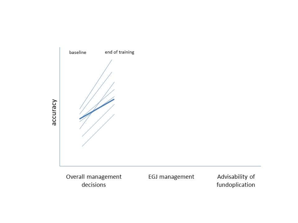
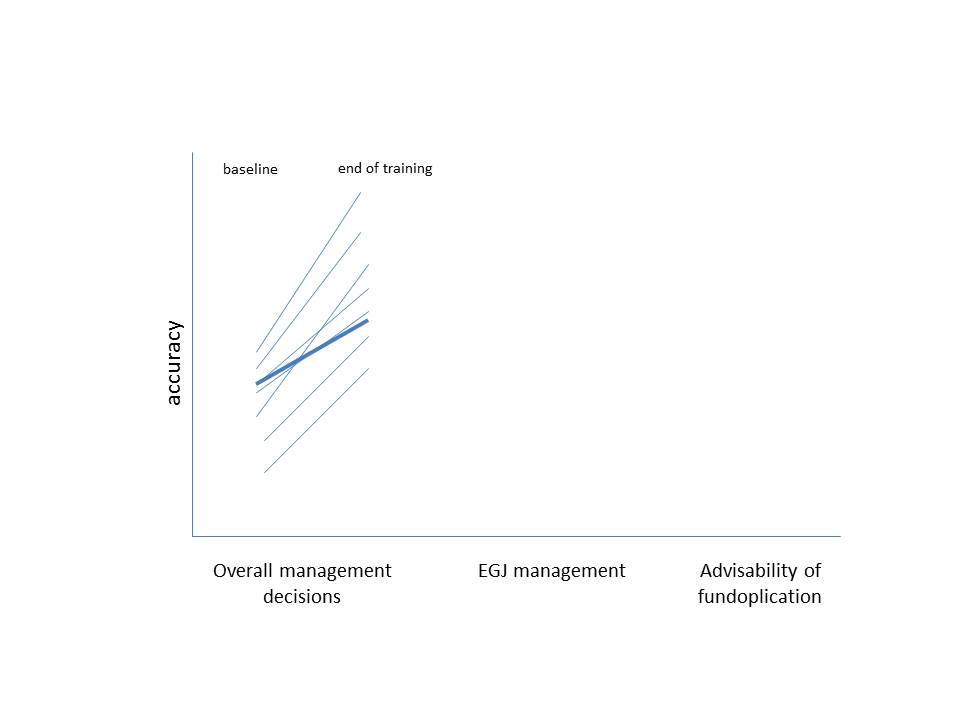
Thanks so much for helping me through some of the procedures. I have my data in excel and I am looking to plot baseline and end of training line graph for 7 characteristics of interest. I have 18 subjects so I need individual line graphs for each of the 18 subjects and the average (overall) baseline and end of training line graph. Of the 7 characteristics, I want to plot at least 3-4 in one graph and rest in other.
Subject_ID - has individual IDs and Overall
HRM- has my characteristics of interest
Baseline- baseline value
End- End of training value
So I need 18 lines in different shade and overall (average) line in a darker or a thick shade.
I have attached an example PPT of what I am looking for.
So basically the goal of the graph is to show there is an upward trend/ improvement after the training.
Any help with SAS code or references would be of great help.
Thank you all,
Sat
Accepted Solutions
- Mark as New
- Bookmark
- Subscribe
- Mute
- RSS Feed
- Permalink
- Report Inappropriate Content
You should post it at ODS Graphic forum.
data have;
infile cards expandtabs truncover;
input Subject_ID :$40. HRM :$40. Baseline	End;
vname='Baseline';value=Baseline;output;
vname='End';value=End;output;
drop baseline end;
cards;
2531176	Achalasia_obstructio 	60	100
2941226	Achalasia_obstructio 	60	100
2946145	Achalasia_obstructio 	40	80
4070061	Achalasia_obstructio 	60	100
4071502	Achalasia_obstructio 	40	80
4072576	Achalasia_obstructio 	60	100
4073464	Achalasia_obstructio 	50	80
4075018	Achalasia_obstructio 	80	90
4076717	Achalasia_obstructio 	40	100
4077019	Achalasia_obstructio 	60	140
4077142	Achalasia_obstructio 	60	100
4077188	Achalasia_obstructio 	80	100
4077945	Achalasia_obstructio 	80	100
4077972	Achalasia_obstructio 	80	100
4078140	Achalasia_obstructio 	100	180
4078395	Achalasia_obstructio 	100	100
4079303	Achalasia_obstructio 	40	100
4076742	Achalasia_obstructio 	80	100
Overall	Achalasia_obstructio 	65.9	90.6
2531176	EGJmanagement 	60	100
2941226	EGJmanagement 	60	100
2946145	EGJmanagement 	40	80
4070061	EGJmanagement 	60	100
4071502	EGJmanagement 	40	80
4072576	EGJmanagement 	60	100
4073464	EGJmanagement 	80	86
4075018	EGJmanagement 	80	100
4076717	EGJmanagement 	40	100
4077019	EGJmanagement 	60	90
4077142	EGJmanagement 	60	100
4077188	EGJmanagement 	80	100
4077945	EGJmanagement 	80	100
4077972	EGJmanagement 	80	100
4078140	EGJmanagement 	100	180
4078395	EGJmanagement 	100	100
4079303	EGJmanagement 	40	100
4076742	EGJmanagement 	80	100
Overall	EGJmanagement 	65.9	90.6
;
run;

data want;
 merge have(where=(subject_id ne 'Overall'))
  have(rename=(subject_id=id vname=b value=d) where=(id eq 'Overall'));
 by hrm;
 output;
 call missing(of _all_);
run;
proc sgpanel data=want;
 panelby hrm/ layout=columnlattice colheaderpos=bottom noborder novarname;
 series x=vname y=value/group=subject_id  lineattrs=graphdata1;
 series x=b y=d/lineattrs=graphdata2(thickness=4px) name='x' legendlabel='Overall';
 keylegend 'x' / position=top ;
 colaxis label=' ';
run;
- Mark as New
- Bookmark
- Subscribe
- Mute
- RSS Feed
- Permalink
- Report Inappropriate Content
Sorry, I won't download XLSX files, post test data in the form of a datastep.
For your graph, this should be very simple:
proc sgplot data=<your dataset>;
  series y=<var> x=<var>;
  series y=<var> x=<var>;
...
run;
Note there are a vast amount of options you can apply to graphs, and many statements. Here is a site which gives you lots of advice:
- Mark as New
- Bookmark
- Subscribe
- Mute
- RSS Feed
- Permalink
- Report Inappropriate Content
Thanks for the reply. Here is the data:
| Subject_ID | HRM | Baseline | End |
| 2531176 | Achalasia_obstructio | 60 | 100 |
| 2941226 | Achalasia_obstructio | 60 | 100 |
| 2946145 | Achalasia_obstructio | 40 | 80 |
| 4070061 | Achalasia_obstructio | 60 | 100 |
| 4071502 | Achalasia_obstructio | 40 | 80 |
| 4072576 | Achalasia_obstructio | 60 | 100 |
| 4073464 | Achalasia_obstructio | 80 | 80 |
| 4075018 | Achalasia_obstructio | 80 | 80 |
| 4076717 | Achalasia_obstructio | 40 | 100 |
| 4077019 | Achalasia_obstructio | 60 | 40 |
| 4077142 | Achalasia_obstructio | 60 | 100 |
| 4077188 | Achalasia_obstructio | 80 | 100 |
| 4077945 | Achalasia_obstructio | 80 | 100 |
| 4077972 | Achalasia_obstructio | 80 | 100 |
| 4078140 | Achalasia_obstructio | 100 | 80 |
| 4078395 | Achalasia_obstructio | 100 | 100 |
| 4079303 | Achalasia_obstructio | 40 | 100 |
| 4076742 | Achalasia_obstructio | 80 | 100 |
| Overall | Achalasia_obstructio | 65.9 | 90.6 |
Just like Achalasia_obstructio there are three other variables that I am interested in under HRM Variable which I want to plot next to Achalasia_Obstruction. Please see my JPEG fig I attached in my original email.
- Mark as New
- Bookmark
- Subscribe
- Mute
- RSS Feed
- Permalink
- Report Inappropriate Content
I don't see any JPEG or JPG attachment, only XLSX.
- Mark as New
- Bookmark
- Subscribe
- Mute
- RSS Feed
- Permalink
- Report Inappropriate Content
Here I am attaching the JPEG again as an image.

- Mark as New
- Bookmark
- Subscribe
- Mute
- RSS Feed
- Permalink
- Report Inappropriate Content
You should post it at ODS Graphic forum.
data have;
infile cards expandtabs truncover;
input Subject_ID :$40. HRM :$40. Baseline	End;
vname='Baseline';value=Baseline;output;
vname='End';value=End;output;
drop baseline end;
cards;
2531176	Achalasia_obstructio 	60	100
2941226	Achalasia_obstructio 	60	100
2946145	Achalasia_obstructio 	40	80
4070061	Achalasia_obstructio 	60	100
4071502	Achalasia_obstructio 	40	80
4072576	Achalasia_obstructio 	60	100
4073464	Achalasia_obstructio 	50	80
4075018	Achalasia_obstructio 	80	90
4076717	Achalasia_obstructio 	40	100
4077019	Achalasia_obstructio 	60	140
4077142	Achalasia_obstructio 	60	100
4077188	Achalasia_obstructio 	80	100
4077945	Achalasia_obstructio 	80	100
4077972	Achalasia_obstructio 	80	100
4078140	Achalasia_obstructio 	100	180
4078395	Achalasia_obstructio 	100	100
4079303	Achalasia_obstructio 	40	100
4076742	Achalasia_obstructio 	80	100
Overall	Achalasia_obstructio 	65.9	90.6
2531176	EGJmanagement 	60	100
2941226	EGJmanagement 	60	100
2946145	EGJmanagement 	40	80
4070061	EGJmanagement 	60	100
4071502	EGJmanagement 	40	80
4072576	EGJmanagement 	60	100
4073464	EGJmanagement 	80	86
4075018	EGJmanagement 	80	100
4076717	EGJmanagement 	40	100
4077019	EGJmanagement 	60	90
4077142	EGJmanagement 	60	100
4077188	EGJmanagement 	80	100
4077945	EGJmanagement 	80	100
4077972	EGJmanagement 	80	100
4078140	EGJmanagement 	100	180
4078395	EGJmanagement 	100	100
4079303	EGJmanagement 	40	100
4076742	EGJmanagement 	80	100
Overall	EGJmanagement 	65.9	90.6
;
run;

data want;
 merge have(where=(subject_id ne 'Overall'))
  have(rename=(subject_id=id vname=b value=d) where=(id eq 'Overall'));
 by hrm;
 output;
 call missing(of _all_);
run;
proc sgpanel data=want;
 panelby hrm/ layout=columnlattice colheaderpos=bottom noborder novarname;
 series x=vname y=value/group=subject_id  lineattrs=graphdata1;
 series x=b y=d/lineattrs=graphdata2(thickness=4px) name='x' legendlabel='Overall';
 keylegend 'x' / position=top ;
 colaxis label=' ';
run;
- Mark as New
- Bookmark
- Subscribe
- Mute
- RSS Feed
- Permalink
- Report Inappropriate Content
Thank you so much. Couple of follow-up questions.
1. Can I do three characteristics in one panel?
2. How do I lable (in sas statement) for Achalasia_Obstructio as "Achalasis/ Outflow Obstruction" and EJGManagment as "Management: EGJ"
- Mark as New
- Bookmark
- Subscribe
- Mute
- RSS Feed
- Permalink
- Report Inappropriate Content
One last question...How do I change or control y-axis? I need 0-200 by 20, rather than 0-100 by 10.
Thank you,
Sat
- Mark as New
- Bookmark
- Subscribe
- Mute
- RSS Feed
- Permalink
- Report Inappropriate Content
The panelby statement has options to specify the number of rows or columns.
If the values in your data set are not what you want displayed then often the easiest way is to use a custom format such as
proc format;
value $MyValues
"Achalasia_Obstructio" = "Achalasis/ Outflow Obstruction"
"EJGManagment" = "Management: EGJ";
run;
And then use a FORMAT statement in the procedure to associate the format with the variable.
The ROWAXIS statement controls appearance of the Y axis in SGPANEL.
Rowaxis values=( 0 to 200 by 20);
should do the trick.
add label="Some y description" to the Rowaxis if you want a different axis label.
- Mark as New
- Bookmark
- Subscribe
- Mute
- RSS Feed
- Permalink
- Report Inappropriate Content
"1. Can I do three characteristics in one panel?"
I don't understand what you mean.Give us an example .
panelby hrm/ layout=columnlattice colheaderpos=bottom noborder novarname onepanel ;
Others questions have been answered by @ballardw . You really should post it at ODS Graphic forum.
Catch up on SAS Innovate 2026
Nearly 200 sessions are now available on demand with the SAS Innovate Digital Pass.
Explore Now →Learn how use the CAT functions in SAS to join values from multiple variables into a single value.
Find more tutorials on the SAS Users YouTube channel.
SAS Training: Just a Click Away
Ready to level-up your skills? Choose your own adventure.


