- Home
- /
- Programming
- /
- Graphics
- /
- Multiple figures on one page and a common name?
- RSS Feed
- Mark Topic as New
- Mark Topic as Read
- Float this Topic for Current User
- Bookmark
- Subscribe
- Mute
- Printer Friendly Page
- Mark as New
- Bookmark
- Subscribe
- Mute
- RSS Feed
- Permalink
- Report Inappropriate Content
Hi, there:
I wonder if I can plot multiple figures on one page with a common title and common legends. The ideal figure I want to generate is to compare outcome from different models. They are doing essentially the same thing but the result could be different. I learned that greplay can put different figures together, but each figure has individual title and legends. That makes the graph too busy, in addtion, the title and legends overlap with each other in the final outcome, which makes the graph pretty ugly.
Is there a sample code or sample template that I can follow?
Thanks.
- Mark as New
- Bookmark
- Subscribe
- Mute
- RSS Feed
- Permalink
- Report Inappropriate Content
There are a *LOT* of possibilities; but I've put together a little example that has two chart, with independent axes, a common legend, titles for each cell, and an overall title. Let me know ifyou have any questions about it.
Hope this helps!
Dan
proc template;
define statgraph barcharts;
  begingraph;
    EntryTitle "A Big Overall Title";
    EntryTitle "and a subtitle";
    layout lattice / columns=2;
      cell;
        cellheader;
          Entry "Average Height";
        endcellheader;
        layout overlay;
          barchart x=age y=height / stat=mean group=sex name="bar1";
        endlayout;
      endcell;
      cell;
        cellheader;
          Entry "Average Weight";
        endcellheader;
        layout overlay;
          barchart x=age y=weight / stat=mean group=sex name="bar2";
        endlayout;
      endcell;
      sidebar / align=bottom spacefill=false;
        discretelegend "bar1" / title="Gender";
      endsidebar;
    endlayout;
  endgraph;
end;

proc sgrender data=sashelp.class template=barcharts; run;
- Mark as New
- Bookmark
- Subscribe
- Mute
- RSS Feed
- Permalink
- Report Inappropriate Content
Since you mention Proc Greplay, I'll elaborate on that a little...
You can suppress the titles on the individual graphs by giving them blank title statements:
title;
And you can use Proc Gslide to create a blank page with the main/overall title, and overlay it with the rest using proc greplay. You can either use title statements on the gslide, or you can annotate the text for more control.
Here is an example:
http://robslink.com/SAS/democd15/scen3b.htm
And here is a whole page of similar samples (along with the SAS code):
- Mark as New
- Bookmark
- Subscribe
- Mute
- RSS Feed
- Permalink
- Report Inappropriate Content
With regards to GPLOT you may find this example useful.
- Mark as New
- Bookmark
- Subscribe
- Mute
- RSS Feed
- Permalink
- Report Inappropriate Content
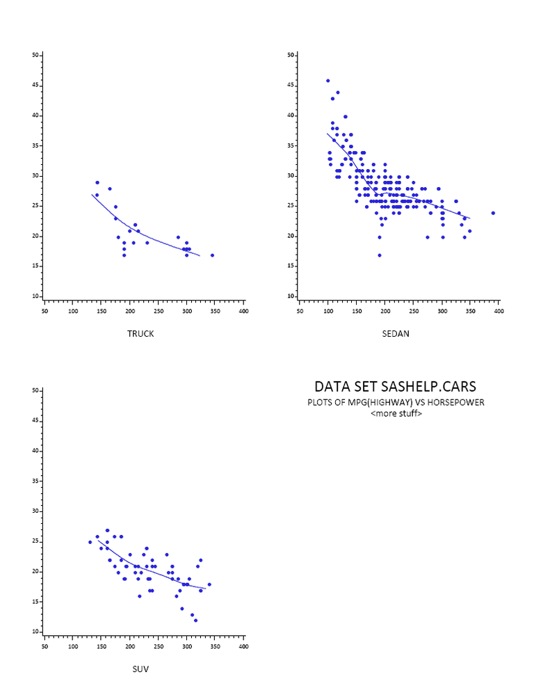
hi ... another idea that works with PDF output
you can arrange output on a page with GOPTIONS and HSIZE, VSIZE, HORIGIN, and VORIGIN plus the STARTPAGE=NEVER option in ODS
once you have the PDF output, if you can do a screen capture, you can make a bit-mapped version (e.g. PNG)
proc sort data=sashelp.cars out=cars;
by horsepower;
run;
ods pdf file='z:\plots.pdf' startpage=never notoc;
ods listing close;
ods results off;
goptions reset=all ftext='calibri' htext=2 gunit=pct ;
* no axis labels;
axis1 label=none order=10 to 50 by 5 minor=(n=4);
axis2 label=none order=50 to 400 by 50 minor=(n=5);
* a nice looking DOT plus a spline;
symbol1 f='wingdings' v='l' h=2 i=smp90 w=2;
* some white space around plots;
title1 ls=2;
title2 a=90 ls=2;
title3 a=-90 ls=2;
goptions hsize=4in vsize=5in;
proc gplot data=cars;
goptions horigin=0in vorigin=0in;
where type eq 'SUV';
footnote1 ls=2 h=3 'SUV';
plot mpg_highway*horsepower / noframe vaxis=axis1 haxis=axis2;
run;
goptions vorigin=5.5in;
where type eq 'Truck';
footnote1 ls=2 h=3 'TRUCK';
plot mpg_highway*horsepower / noframe vaxis=axis1 haxis=axis2;
run;
goptions horigin=4.25in;
where type eq 'Sedan';
footnote1 ls=2 h=3 'SEDAN';
plot mpg_highway*horsepower / noframe vaxis=axis1 haxis=axis2;
run;
quit;
goptions vorigin=0in;
footnote1 ls=2;
proc gslide;
note h=5
j=c 'DATA SET SASHELP.CARS'
j=c h=3
j=c 'PLOTS OF MPG(HIGHWAY) VS HORSEPOWER'
j=c '<more stuff>'
;
run;
quit;
ods pdf close;
ods listing;
ods results;

Learn how use the CAT functions in SAS to join values from multiple variables into a single value.
Find more tutorials on the SAS Users YouTube channel.
SAS Training: Just a Click Away
Ready to level-up your skills? Choose your own adventure.


