- Home
- /
- Programming
- /
- Graphics
- /
- Re: Multiple Bar charts side by side
- RSS Feed
- Mark Topic as New
- Mark Topic as Read
- Float this Topic for Current User
- Bookmark
- Subscribe
- Mute
- Printer Friendly Page
- Mark as New
- Bookmark
- Subscribe
- Mute
- RSS Feed
- Permalink
- Report Inappropriate Content
Hi,
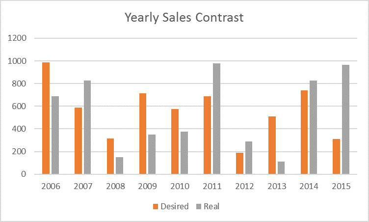
I want to plot a graph to compare the real sales and planned sales over the years, the original dataset is
| Year | Desired | Real |
| 2006 | 987 | 689 |
| 2007 | 588 | 827 |
| 2008 | 313 | 150 |
| 2009 | 716 | 349 |
| 2010 | 575 | 376 |
| 2011 | 686 | 979 |
| 2012 | 189 | 288 |
| 2013 | 509 | 112 |
| 2014 | 741 | 828 |
| 2015 | 309 | 967 |
I wonder if there is any possible ways in SAS to get the same effects as in the following graph.

Accepted Solutions
- Mark as New
- Bookmark
- Subscribe
- Mute
- RSS Feed
- Permalink
- Report Inappropriate Content
Here you go:
data sales;
input Year Desired Real;
cards;
2006 987 689
2007 588 827
2008 313 150
2009 716 349
2010 575 376
2011 686 979
2012 189 288
2013 509 112
2014 741 828
2015 309 967
;
run;

proc sgplot data=sales;
vbarparm category=Year response=Desired / discreteoffset=-0.17 barwidth=0.3;
vbarparm category=Year response=Real / discreteoffset=0.17 barwidth=0.3;
run;
- Mark as New
- Bookmark
- Subscribe
- Mute
- RSS Feed
- Permalink
- Report Inappropriate Content
You can use PROC SGPANEL after you play with your data a little bit - that will give you graphs like you want
- Mark as New
- Bookmark
- Subscribe
- Mute
- RSS Feed
- Permalink
- Report Inappropriate Content
of course. Transpose the data from "wide form" to "long form" and use PROC SGPLOT like this:
data Have;
input Year Desired Real ;
datalines;
2006 987 689
2007 588 827
2008 313 150
2009 716 349
2010 575 376
2011 686 979
2012 189 288
2013 509 112
2014 741 828
2015 309 967
;

data Want;
set Have;
Group = "Desired"; Value = Desired; output;
Group = "Real   "; Value = Real; output;
drop Desired Real;
run;

proc sgplot data=Want;
vbar Year / response=Value group=Group groupdisplay=cluster;
run;- Mark as New
- Bookmark
- Subscribe
- Mute
- RSS Feed
- Permalink
- Report Inappropriate Content
Hi, Rick
Thanks for your reply, it really works. I really appreciate it , but I don't know how to accept both two replies as solutions.
- Mark as New
- Bookmark
- Subscribe
- Mute
- RSS Feed
- Permalink
- Report Inappropriate Content
You can only accept one solution, so give "Likes" to other helpful coments and post a comment (which you have already done!) that indicates that another answer also works. Many times in SAS there are three or four ways to solve the same problem.
I'm glad your problem is resolved.
- Mark as New
- Bookmark
- Subscribe
- Mute
- RSS Feed
- Permalink
- Report Inappropriate Content
Under SAS 9.2, there is no groupdisplay option in the VBAR statement, so is there another way to get the desired graph under SAS 9.2? Thanks a lot.
- Mark as New
- Bookmark
- Subscribe
- Mute
- RSS Feed
- Permalink
- Report Inappropriate Content
Here you go:
data sales;
input Year Desired Real;
cards;
2006 987 689
2007 588 827
2008 313 150
2009 716 349
2010 575 376
2011 686 979
2012 189 288
2013 509 112
2014 741 828
2015 309 967
;
run;

proc sgplot data=sales;
vbarparm category=Year response=Desired / discreteoffset=-0.17 barwidth=0.3;
vbarparm category=Year response=Real / discreteoffset=0.17 barwidth=0.3;
run;
Catch up on SAS Innovate 2026
Nearly 200 sessions are now available on demand with the SAS Innovate Digital Pass.
Explore Now →Learn how use the CAT functions in SAS to join values from multiple variables into a single value.
Find more tutorials on the SAS Users YouTube channel.
SAS Training: Just a Click Away
Ready to level-up your skills? Choose your own adventure.


