- Home
- /
- Programming
- /
- Graphics
- /
- Re: Mergedlegend statement not merging legends
- RSS Feed
- Mark Topic as New
- Mark Topic as Read
- Float this Topic for Current User
- Bookmark
- Subscribe
- Mute
- Printer Friendly Page
- Mark as New
- Bookmark
- Subscribe
- Mute
- RSS Feed
- Permalink
- Report Inappropriate Content
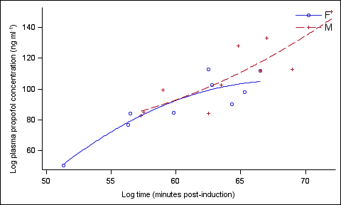
I am trying to merge two legends using the mergedlegend statement in GTL, but I keep getting the first set of plots merged (regression line and individual data points), but the second set is still split into two individual legend entries. Does anyone have any idea why this is happening? I have been over and over the code.
I can't give you the data set, but you can pick any set of x's and y's to input.
Thanks!
Gregg
Code:
proc template; define style styles.mydefaultstyle;
parent = styles.journal3;
*style GraphAxisLines / linethickness = 2px;
style GraphWalls / LineThickness = 1px FrameBorder = off;
*style GraphError / LineThickness = 2px;
*style GraphDataDefault / LineThickness = 2px MarkerSize =14px;
style graphdata1 / Markersymbol = "trianglefilled" LineStyle = 1
Color = black ContrastColor = black;
style graphdata2 / Markersymbol = "circle" LineStyle = 2
Color = black ContrastColor = black;
end;
run;
Proc Template; Define statgraph plasmaconc2;
begingraph;
entrytitle "";
layout lattice / columns=1 rows=1;
layout OVERLAY /
XAxisOpts = (display = (line ticks tickvalues))
YAxisOpts = (display = (line ticks tickvalues))
walldisplay=(fill);
scatterplot x=logminute y=logresponse/ group=trt name = 'scatter';
regressionplot x=logminute y=logresponse/ group=trt degree=2 lineattrs = (thickness=1) name='regression';
mergedlegend 'regression' 'scatter'/
across=1 location=inside autoalign=(topright)
border = false
valueattrs = (size=12pt);
endlayout;
sidebar / align=left;
entry "Log plasma propofol concentration (ng ml"{sup "-1"}")" / rotate = 90;
endsidebar;
sidebar / align=bottom;
entry "Log time (minutes post-induction)";
endsidebar;
endlayout;
endgraph;
end; run;
quit;
ods graphics / reset antialiasmax=1300;
ods listing style = mydefaultstyle
gpath = "Z:\Desktop\testgraphics"; goptions device=png300;
proc sgrender data = concd template = plasmaconc2; run;
- Mark as New
- Bookmark
- Subscribe
- Mute
- RSS Feed
- Permalink
- Report Inappropriate Content
I think it works for me in SAS 9.3, what version of SAS are you on?

- Mark as New
- Bookmark
- Subscribe
- Mute
- RSS Feed
- Permalink
- Report Inappropriate Content
Or better still you could include a data step to generate a set of any x's and y's. Don't make the forum have to work so hard to help you.
- Mark as New
- Bookmark
- Subscribe
- Mute
- RSS Feed
- Permalink
- Report Inappropriate Content
As 'data_null' says, it is easier to help if you include a full working program. Your code, modified using class data set works:
Proc Template; Define statgraph plasmaconc2;
begingraph;
entrytitle "";
layout lattice / columns=1 rows=1;
layout OVERLAY /
XAxisOpts = (display = (line ticks tickvalues))
YAxisOpts = (display = (line ticks tickvalues))
walldisplay=(fill);
scatterplot x=height y=weight/ group=sex name = 'scatter';
regressionplot x=height y=weight/ group=sex degree=2 lineattrs = (thickness=1) name='regression';
mergedlegend 'regression' 'scatter'/
across=1 location=inside autoalign=(topright)
border = false
valueattrs = (size=12pt);
endlayout;
sidebar / align=left;
entry "Log plasma propofol concentration (ng ml"{sup "-1"}")" / rotate = 90;
endsidebar;
sidebar / align=bottom;
entry "Log time (minutes post-induction)";
endsidebar;
endlayout;
endgraph;
end; run;
quit;
proc sort data=sashelp.class out=class;
by sex;
run;
ods listing;
proc sgrender data = class template = plasmaconc2; run;

- Mark as New
- Bookmark
- Subscribe
- Mute
- RSS Feed
- Permalink
- Report Inappropriate Content
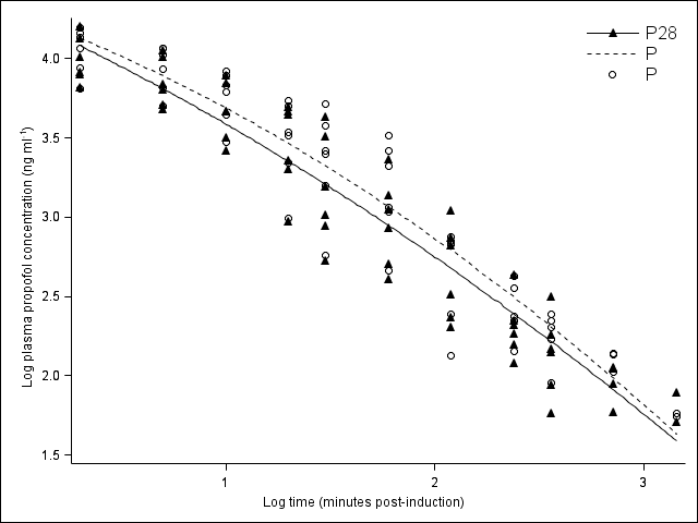
I appreciate the help - and I agree that including the data set would be helpful, but as it is already in publication, I cannot disclose it, even out of context. When I tried to create my own data, the code works fine. But, when I use the actual dataset, I get this (note the legend):

and the original data looks no different other than the numbers.... Is there anything in the code that might give me his sort of result?
- Mark as New
- Bookmark
- Subscribe
- Mute
- RSS Feed
- Permalink
- Report Inappropriate Content
The original dataset looks like this (but longer), if that helps - I am assuming that there is something in the data, not the code?
Obs | cat | trt | wt | minute | response | logminute | logresponse |
1 | 1 | P28 | 7.7 | 2 | 15899.88 | 0.30103 | 4.20139 |
2 | 1 | P28 | 7.7 | 5 | 11304.92 | 0.69897 | 4.05327 |
3 | 1 | P28 | 7.7 | 10 | 6959.90 | 1.00000 | 3.84260 |
4 | 1 | P28 | 7.7 | 20 | 4612.61 | 1.30103 | 3.66395 |
5 | 1 | P28 | 7.7 | 30 | 4291.60 | 1.47712 | 3.63262 |
6 | 1 | P28 | 7.7 | 60 | 1359.31 | 1.77815 | 3.13332 |
7 | 1 | P28 | 7.7 | 120 | 233.30 | 2.07918 | 2.36791 |
8 | 1 | P28 | 7.7 | 240 | 183.00 | 2.38021 | 2.26245 |
9 | 1 | P28 | 7.7 | 360 | 146.00 | 2.55630 | 2.16435 |
10 | 1 | P28 | 7.7 | 720 | 58.60 | 2.85733 | 1.76789 |
11 | 1 | P28 | 7.7 | 1440 | . | 3.15836 | . |
12 | 2 | P28 | 4.2 | 2 | 7893.48 | 0.30103 | 3.89727 |
13 | 2 | P28 | 4.2 | 5 | 5095.32 | 0.69897 | 3.70717 |
14 | 2 | P28 | 4.2 | 10 | 3149.43 | 1.00000 | 3.49823 |
15 | 2 | P28 | 4.2 | 20 | 4905.62 | 1.30103 | 3.69069 |
- Mark as New
- Bookmark
- Subscribe
- Mute
- RSS Feed
- Permalink
- Report Inappropriate Content
It likelymeans that the values for TRT are not matching. "P28" is matching, so those are merged. But there are other values in the TRT column that are not matching. They may look like "P", but are somehow different.
- Mark as New
- Bookmark
- Subscribe
- Mute
- RSS Feed
- Permalink
- Report Inappropriate Content
Thanks for all the help. I will go back and check the data set to see what went wrong. The code appears correct for what I want done.
I will include a data set in further posts as requested - thanks for the etiquette tip, I am new around here!
- Mark as New
- Bookmark
- Subscribe
- Mute
- RSS Feed
- Permalink
- Report Inappropriate Content
Sanjay
I have the following
seriesplot x=eval(atptn-13*&offx) y=mean1 / lineattrs=graphdata1(color=blue pattern=shortdash thickness=2) name='a1' legendlabel="Drug A";
scatterplot x=eval(atptn-13*&offx) y=mean1/ YErrorUpper=High1 YErrorLower=Low1
markerattrs=graphdata1(color=blue symbol=trianglefilled size=9) errorbarattrs=graphdata1(color=blue pattern=solid)
name='a2' legendlabel="Drug A";
seriesplot x=eval(atptn-11*&offx) y=mean2 / lineattrs=graphdata2(color=red pattern=mediumdash thickness=2) name='b1' legendlabel="Drug B";
scatterplot x=eval(atptn-11*&offx) y=mean2 / YErrorUpper=High2 YErrorLower=Low2
markerattrs=graphdata2(color=red symbol=starfilled size=9) errorbarattrs=graphdata2(color=red pattern=solid)
name='b2' legendlabel="Drug B";
How do I use Mergedlegend
Currentl Im using the following way
mergedlegend 'a1' 'a2' 'b1' 'b2 / across=1 location=inside halign=right valign=top;
But its not working !!
Catch up on SAS Innovate 2026
Nearly 200 sessions are now available on demand with the SAS Innovate Digital Pass.
Explore Now →Learn how use the CAT functions in SAS to join values from multiple variables into a single value.
Find more tutorials on the SAS Users YouTube channel.
SAS Training: Just a Click Away
Ready to level-up your skills? Choose your own adventure.


