- Home
- /
- Programming
- /
- Graphics
- /
- Markers in vline plot does not line up with the xaxis ticks.
- RSS Feed
- Mark Topic as New
- Mark Topic as Read
- Float this Topic for Current User
- Bookmark
- Subscribe
- Mute
- Printer Friendly Page
- Mark as New
- Bookmark
- Subscribe
- Mute
- RSS Feed
- Permalink
- Report Inappropriate Content
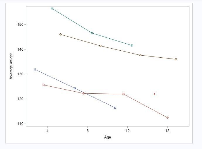
I am using the following codes to get a vline plots for comparing the average weight of four groups at age 4 8,12, and 18. The average age markers should line up at age 4, 8, 12 and 18 but it does not. How can i correct this? Here is the plot that I get and the codes that I use.
Proc sgplot data =data noautolegend;
	vline Age/ response =weight group =group groupdisplay =cluster stat= mean markers;
	xaxis type =Discrete;
	yaxis label ="Average weight";
	xaxis label ="Age";
	run;
Accepted Solutions
- Mark as New
- Bookmark
- Subscribe
- Mute
- RSS Feed
- Permalink
- Report Inappropriate Content
Remove GROUPDISPLAY=CLUSTER. That option makes the groups offset from the tick value, which is desired in certain cases.
- Mark as New
- Bookmark
- Subscribe
- Mute
- RSS Feed
- Permalink
- Report Inappropriate Content
Remove GROUPDISPLAY=CLUSTER. That option makes the groups offset from the tick value, which is desired in certain cases.
- Mark as New
- Bookmark
- Subscribe
- Mute
- RSS Feed
- Permalink
- Report Inappropriate Content
Try changing the Groupdisplay=Cluster to Groupdisplay=Overlay.
If you are familiar with the VBAR plots and groupdisplay=cluster then bars are offset horizontally along side. VLINE will match the VBAR behavior so you can create Bar-Line plots and the Xaxis variables align by the groups for the bars.
Catch up on SAS Innovate 2026
Dive into keynotes, announcements and breakthroughs on demand.
Explore Now →Learn how use the CAT functions in SAS to join values from multiple variables into a single value.
Find more tutorials on the SAS Users YouTube channel.
SAS Training: Just a Click Away
Ready to level-up your skills? Choose your own adventure.


