- Home
- /
- Programming
- /
- Graphics
- /
- Re: Legend as annotation?
- RSS Feed
- Mark Topic as New
- Mark Topic as Read
- Float this Topic for Current User
- Bookmark
- Subscribe
- Mute
- Printer Friendly Page
- Mark as New
- Bookmark
- Subscribe
- Mute
- RSS Feed
- Permalink
- Report Inappropriate Content
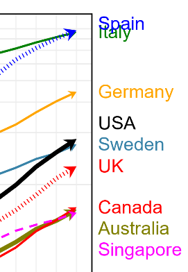
Any suggestions on how to create this type of plot? (Not too fussed about the text colours, but being able to attach legends at the right of crowded graphs would be great).
Accepted Solutions
- Mark as New
- Bookmark
- Subscribe
- Mute
- RSS Feed
- Permalink
- Report Inappropriate Content
First thing to do would be to show how you are creating the base of the graph to start.
There are procs that create graphs that have fewer options than others.
Many of the SGPLOT or SGPANEL plots have the CURVELABEL= option to attach text with CURVELABELATTRS= to control color and font of the label and CURVELABELLOC= with options of INSIDE or OUTSIDE to place the label inside or outside of the plot axis and CURVELABELPOS= for which x value (start, end, min, max) to place the label near
- Mark as New
- Bookmark
- Subscribe
- Mute
- RSS Feed
- Permalink
- Report Inappropriate Content
Thanks. I hadn't come across the curvelabel option before. It does what I want, though the positioning algorithm isn't quite perfect.
- Mark as New
- Bookmark
- Subscribe
- Mute
- RSS Feed
- Permalink
- Report Inappropriate Content
It is almost never a waste of time to post the code that you are using to create output. Then we don't have to guess about options used.
I suspect that if you do something to increase the values shown on the Y axis you may get a little more space so that the collision you show for Spain and Italy no longer occurs. There are a number of things that SAS uses to create the actual graph display area and I suspect that the Curvelabel positioning is determined after the graph space is determined. So if there is more vertical axis space set aside then the label has a bit more room.
- Mark as New
- Bookmark
- Subscribe
- Mute
- RSS Feed
- Permalink
- Report Inappropriate Content
Hello,
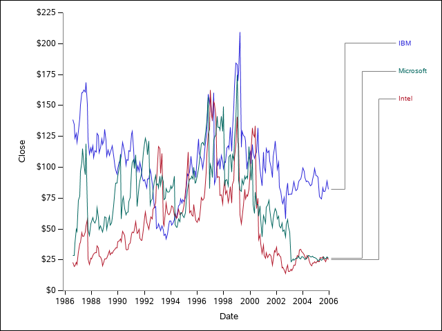
I know this is marked as being solved already but it looked like a fun challenge to try to make. Here's my take on it.
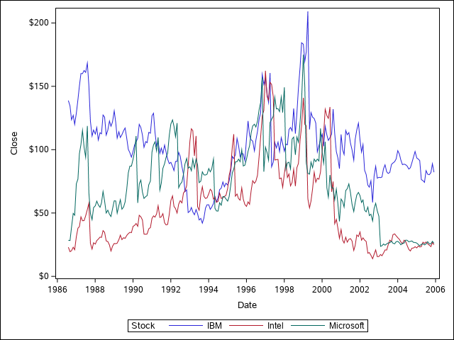
I used STOCKS from the SASHELP library to make this graph:
proc sgplot data=sashelp.stocks;
    series x=date y=close / group=stock lineattrs=(pattern=solid);
run;
I then used the following code to use annotation to make the connecting lines and labels as you were looking for. It's not perfect and not really universal at the moment, but might give a start if you're looking for something. It basically sets up the labels (stocks in this case) in ranked order from the maximum date and prints them in an axis table. The graph then sets aside space for the connecting lines at the end of the series plot (using offsetmax in the x-axis) and uses DRAWLINE to connect the end of each curve to their label. The axis table is drawn on the y2 axis in another panel so that percentages can be used in the draw lines to line things up. Hopefully this isn't too confusing:
proc sort data=sashelp.stocks out=rank;
    by descending close stock;
    where date=mdy(12,1,2005);
run;

data plot_prep;
    set rank end=last;
    by descending close stock;
    if first.stock then rank+1;
    if last.stock then call symputx(catx('_','y',rank),close);
    if last then call symputx('ngroups',rank);
run;
%put &=y_1  &=y_2 &=y_3 &=ngroups;

proc sort data=plot_prep;
    by stock;
data plot;
    merge sashelp.stocks plot_prep;
    by stock;
    if ^first.stock then call missing(rank);
run;

%macro connect_lines;
    %do i = 1 %to 3;
        /*First horizontal line*/
        drawline x1=81 x2=%sysevalf(80+20*&i/(1+&ngroups)) y1=&&y_&i  y2=&&y_&i / lineattrs=(pattern=solid thickness=1pt color=grey) x1space=layoutpercent x2space=layoutpercent
            y1space=datavalue y2space=datavalue;
        /*Vertical line*/
        drawline x1=%sysevalf(80+20*&i/(1+&ngroups)) x2=%sysevalf(80+20*&i/(1+&ngroups)) y1=&&y_&i  y2=%sysevalf(99-100*&i/10) /
            lineattrs=(pattern=solid thickness=1pt color=grey) x1space=layoutpercent x2space=layoutpercent
            y1space=datavalue y2space=datapercent;
        /*Second horizontal line*/
        drawline x1=%sysevalf(80+20*&i/(1+&ngroups)) x2=100 y1=%sysevalf(99-100*&i/10) y2=%sysevalf(99-100*&i/10) /
            lineattrs=(pattern=solid thickness=1pt color=grey) x1space=layoutpercent x2space=layoutpercent
            y1space=datapercent y2space=datapercent;
    %end;
%mend;
options mprint;
ods path WORK.TEMPLAT(UPDATE) SASHELP.TMPLMST (READ);
proc template;
    define statgraph series_label;
    begingraph;

    layout lattice / rows=1 columns=2 columnweights=(0.9 0.10) rowdatarange=union columngutter=0;
        rowaxes;
            rowaxis / type=linear display=(ticks tickvalues label) linearopts=(tickvaluesequence=(start=0 end=225 increment=25) viewmin=0 viewmax=225) offsetmin=0 offsetmax=0;
        endrowaxes;
        layout overlay/walldisplay=none  yaxisopts=(type=linear linearopts=(tickvaluesequence=(start=0 end=225 increment=25) viewmin=0 viewmax=225) offsetmin=0 offsetmax=0)
            y2axisopts=(type=linear display=none linearopts=(viewmin=0 viewmax=10) reverse=true offsetmin=0 offsetmax=0)
            xaxisopts=(display=(ticks tickvalues label) offsetmax=0.2);
            seriesplot x=date y=close / group=stock lineattrs=(pattern=solid);
            drawline x1=0 x2=100 y1=0 y2=0 / x1space=wallpercent x2space=datapercent y2space=datavalue y1space=datavalue lineattrs=(color=grey pattern=solid thickness=1pt);
            drawline x1=0 x2=0 y1=0 y2=100 / drawspace=wallpercent lineattrs=(color=grey pattern=solid thickness=1pt);
            %connect_lines;
        endlayout;

        layout overlay/ walldisplay=none xaxisopts=(display=none) y2axisopts=(type=linear display=none linearopts=(viewmin=0 viewmax=10) reverse=true offsetmin=0 offsetmax=0);
            axistable value=stock y=rank / colorgroup=stock yaxis=y2 display=(values);
            scatterplot x=date y=close / markerattrs=(size=0pt);
        endlayout;
    endlayout;
    endgraph;
    end;
run;

proc sgrender data=plot template=series_label;
run;
I redrew the y axis with drawline also because when using ROWDATARANGE=union there's an annoying feature where it draws the y axis line in every panel, which I don't want in this case. I redrew the x-axis because otherwise there would be a longer blank line after the 2006 due to using offsets.
Catch up on SAS Innovate 2026
Dive into keynotes, announcements and breakthroughs on demand.
Explore Now →Learn how use the CAT functions in SAS to join values from multiple variables into a single value.
Find more tutorials on the SAS Users YouTube channel.
SAS Training: Just a Click Away
Ready to level-up your skills? Choose your own adventure.


