- Home
- /
- Programming
- /
- Graphics
- /
- Re: Label Maximum Value Only on Scatterplot
- RSS Feed
- Mark Topic as New
- Mark Topic as Read
- Float this Topic for Current User
- Bookmark
- Subscribe
- Mute
- Printer Friendly Page
- Mark as New
- Bookmark
- Subscribe
- Mute
- RSS Feed
- Permalink
- Report Inappropriate Content
Hi! I've been trying to figure out how to label only a maximum value on a scatterplot by a value from another column in that observation.
eg. with the following:
1 Yellow 3
2 Red 5
3 Blue 16
4 Purple 2
5 Orange 5
I would use column 1 as the x variable, column 3 as the y variable and in the case of "3 Blue 16" I would like the point to be displayed as "Blue" on the plot and the rest of the data points as the default style.
I've tried a few methods (links below) which _do_ find the maximum value, but I haven't been able to make use of that information with a plot.
https://communities.sas.com/t5/Base-SAS-Programming/Maximum-value-of-a-column-variable/td-p/28751
I've tried storing a local variable with the maximum, and only labelling that through
if column3 = maximum_value then scatterplot x=column1 y=column2 / datalabel=column2;
else  scatterplot x=column1 y=column2;
But haven't been able to make that work, and thinking about it might not be the best method: the axis are probably not going to align by default if nothing else.
My other approach was to create a column4, and setting it to = column2 if column3's value is the maximum of the column, or blank if that observation's column3 value is not the maximum but I don't seem to be having any success. I don't think I know the syntax well enough.
Does anyone know a way I can dynamically calculate the maximum of column3, store that and use the information to label the relevant plot point with the value for column2 ?
Thanks in advance!
- Mark as New
- Bookmark
- Subscribe
- Mute
- RSS Feed
- Permalink
- Report Inappropriate Content
It would help to show the entire code you are using to generate your graph. The snippet you show implies that you are using GTL and incorporating methods for such a task might require changes to either the template or the sgrender code.
Probably the most flexible to display a single value would be to add an SGANNO= annotate data set but that requires having the appropriate ANNOTATE statements in the template.
- Mark as New
- Bookmark
- Subscribe
- Mute
- RSS Feed
- Permalink
- Report Inappropriate Content
Thanks for the reply! I found an approach that worked, I think my use of if / then syntax needs some practice because the same approach was not working until I added do / end.
I'm not familiar with sganno, i'm trying to find an example of case where it is used to apply an annotation only to the maximum value. I don't suppose you would know of an example, or a source I can read?
An approach I have that seems to work, given the variable names from my previous post as 'colorindex', 'color', 'colorscore' in that order, and being in the dataset 'mydata':
*Sort on color score;
proc sort data=mydata;
	by descending score;
run;

*create new variable 'colorwithhighestscore' on row 1 with 'if _n_ = 1 then'
(known highest value) only, force blank for all other rows with new variable;
data mydata;
	set mydata;
	if _n_ = 1 then
	do;
		colorwithhighestscore = color;
	end;
	else
	do;
		colorwithhighestscore = "";
	end;
run;

*plot using new variable 'colorwithhighestscore' as label;
proc sgplot data=mydata;
	scatter x=colorindex y=colorscore / datalabel=colorwithhighestscore;
run;
I'm not sure this is the best approach, only an approach that I could make work. Feedback is very welcome.
Thanks in advance!
- Mark as New
- Bookmark
- Subscribe
- Mute
- RSS Feed
- Permalink
- Report Inappropriate Content
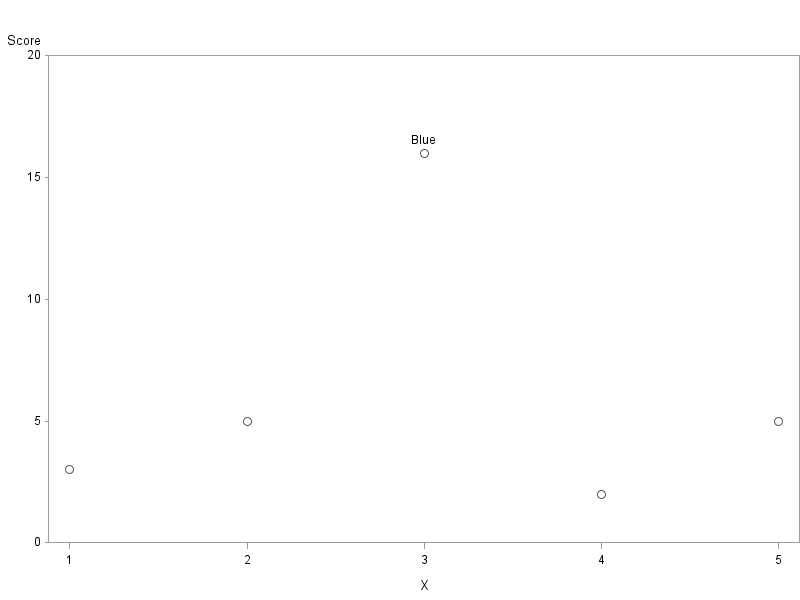
Here's one way to do it, using Proc Gplot, and pointlabel ...
data mydata;
length color $10;
input X color Score;
datalines;
1 Yellow 3
2 Red 5
3 Blue 16
4 Purple 2
5 Orange 5
;
run;
proc sort data=mydata out=mydata;
by descending score;
run;
data mydata; set mydata;
if _n_ = 1 then label_text=color;
run;
symbol1 value=circle height=3pct color=gray55 pointlabel=("#label_text");
axis1 order=(0 to 20 by 5) minor=none offset=(0,0);
axis2 minor=none offset=(3,3);
proc gplot data=mydata;
plot score*x / vaxis=axis1 haxis=axis2;
run;
Catch up on SAS Innovate 2026
Nearly 200 sessions are now available on demand with the SAS Innovate Digital Pass.
Explore Now →Learn how use the CAT functions in SAS to join values from multiple variables into a single value.
Find more tutorials on the SAS Users YouTube channel.
SAS Training: Just a Click Away
Ready to level-up your skills? Choose your own adventure.


