- Home
- /
- Programming
- /
- Graphics
- /
- Re: Is there a way to increase the spacing between the datalabel and i...
- RSS Feed
- Mark Topic as New
- Mark Topic as Read
- Float this Topic for Current User
- Bookmark
- Subscribe
- Mute
- Printer Friendly Page
- Mark as New
- Bookmark
- Subscribe
- Mute
- RSS Feed
- Permalink
- Report Inappropriate Content
Is there a way to increase the spacing between the datalabel and its marker in SGPLOT? If it matters this is going into a rtf.
Thanks
EJ
Accepted Solutions
- Mark as New
- Bookmark
- Subscribe
- Mute
- RSS Feed
- Permalink
- Report Inappropriate Content
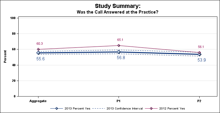
Since you are using a macro to control where the series labels are drawn (top, bottom), and your data is always 0-100, you can also control their distance of the label. I have modified your macro to do that. Essentailly, do not use the Series label option, but instead overlay a scatter plot with data label (and markersize=0). The Y variable for the marker position is computed in yval and yval2 based on the macro variables cvpos and pvpos. Delta is adjustable, default=3%. Second graph uses 6%.

- Mark as New
- Bookmark
- Subscribe
- Mute
- RSS Feed
- Permalink
- Report Inappropriate Content
You may want to mention which version of SAS. With all of the changes is the ODS graphics procedures the answers may well be version dependent. I know I spent some time with version 9.2.3 on this and never got a satisfactory solution.
- Mark as New
- Bookmark
- Subscribe
- Mute
- RSS Feed
- Permalink
- Report Inappropriate Content
We are on 9.4 TS1M1
EJ
- Mark as New
- Bookmark
- Subscribe
- Mute
- RSS Feed
- Permalink
- Report Inappropriate Content
There is no built-in option to increase spacing. The data labels positions are shifted to avoid collision. With SAS 9.3, DataLabelPosition option is added so you can specify a fixed data label position (no shifting). One way to increase space would be to prefix non-breaking space(s) (nbsp="A0"x) to the label.
Of course, this increases the potential for collisions.
data class;
set sashelp.class;
name='A0'x || 'A0'x || name;
run;
ods html close;
ods rtf startpage=no;
ods graphics / reset width=5in height=3in noscale imagename='Class';
proc sgplot data=sashelp.class;
scatter x=height y=weight / datalabel=name datalabelpos=right;
run;
ods graphics / reset width=5in height=3in noscale imagename='Class_Space';
proc sgplot data=class;
scatter x=height y=weight / datalabel=name datalabelpos=right;
run;
ods rtf close;
- Mark as New
- Bookmark
- Subscribe
- Mute
- RSS Feed
- Permalink
- Report Inappropriate Content
Thanks Sanjay,
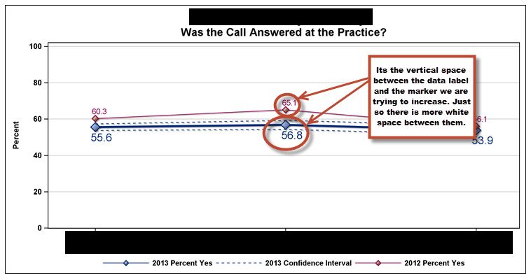
I realized now that I should have been more specific. We are using the series plots to get horizontal line plots with the datalabel either at the top or bottom position. So its actually the vertical space between label and marker that we are trying to increase.
If I understand correctly, wouldnt the nbsp would only help in the horizontal space?
EJ
- Mark as New
- Bookmark
- Subscribe
- Mute
- RSS Feed
- Permalink
- Report Inappropriate Content
Are you setting a fixed DataLabelPosition, or allowing collision avoidance? It helps to have a working program with data. Use simulated data if confidential.
- Mark as New
- Bookmark
- Subscribe
- Mute
- RSS Feed
- Permalink
- Report Inappropriate Content
Here is the code that produces the graphs, attached is the dataset and screenshot trying to explain what we are trying to do:
proc template;
define style styles.defstyle;
parent=styles.default;
class graphgridlines /
contrastcolor=lightgrey;
class graphbackground /
color=white;
end;
run;
Title f=Arial h=14pt color=black bold "Study Summary:";
options nonumber nodate nomprint nomlogic nosymbolgen;
ods graphics / reset width=7.75in height=4in imagefmt=emf;
ods rtf file='temp.doc' image_dpi=300 style=defstyle ;
%macro linegph(title,question,cvpos,pvpos);
proc sgplot data=allresults_t (where =(question="&question")) /*dattrmap=attrmap*/;
title2 f=Arial h=12pt color=black bold "&title";
/*Current year line and upper and lower range*/
series x=plan y=percent / FILLEDOUTLINEDMARKERS lineattrs=(color=a002C77FF pattern=Solid thickness=3)
markers markerattrs=(color=a002C77FF size=12 symbol=Diamondfilled)
markeroutlineattrs=(color=a002C77FF thickness=.75) /*attrid=line*/
datalabel datalabelpos=&cvpos datalabelattrs=(color=a002C77FF size=12pt)
dataskin=crisp name="new" legendlabel="2013 Percent Yes"
;
series x=plan y=upperrange / lineattrs=(color=a002C77FF pattern=Shortdash thickness=1)
/*attrid=upper*/ dataskin=crisp name="newcl" legendlabel="2013 Confidence Interval";
series x=plan y=lowerrange / lineattrs=(color=a002C77FF pattern=Shortdash thickness=1)
/*attrid=upper*/ dataskin=crisp ;
/*Last years line*/
series x=plan y=percent2 / FILLEDOUTLINEDMARKERS lineattrs=(color=a91004B05 pattern=Solid thickness=1)
markers markerattrs=(color=a91004B05 size=8 symbol=Diamondfilled)
markeroutlineattrs=(color=a91004B05 thickness=1) /*attrid=line*/
datalabel datalabelpos=&pvpos datalabelattrs=(color=a91004B05 size=8pt)
dataskin=crisp name="old" legendlabel="2012 Percent Yes"
;
yaxis grid min=0 max=100 offsetmax=.02 offsetmin=0
valueattrs=(Color=Black Family=Arial Size=8pt weight=bold)
Label="Percent" labelAttrs=(Color=Black Family=Arial Size=8pt weight=bold)
;
xaxis splitchar="/" splitjustify=center fitpolicy=splitalways
values=("AGGREGATE" "P1" "P2")
valuesdisplay=("Aggregate" "P1" "P2")
type=discrete valueattrs=(Color=Black Family=Arial Size=8pt weight=bold)
display=(NOLABEL) offsetmin=.10
;
keylegend "new" "newcl" "old" / down=1 autoitemsize noborder position=bottom title=''
valueattrs=(Color=Black Family=Arial Size=8pt weight=bold);
run;
%mend linegph;
%linegph(Was the Call Answered at the Practice?,CALL_ANSWERED,bottom,top);
%linegph(Does the Provider Accept the Plan?,PLAN_ACCEPTED,top,bottom);
%linegph(Is the Physican Accepting New Medicaid Patients?,ACCEPT_NEW_MEDICAID_PATIENTS,top,bottom);
%linegph(Does the Provider Require an Application or Prescreen Before Accepting New Patients?,APPLICATION_PRESCREEN,top,bottom);
%linegph(Does the First Available Routine Appointement Meet Contract Requirements?,FIRST_AVAIL_APP_ROUNTINE_CONTRAC,top,bottom);
%let c1 = a002C77FF;
%let c2 = a91004BFF;
%let c3 = a002C7705;
%let c4 = a91004B05;
proc sgplot data=allresults_t (where =(question="CALL_ANSWERED")) /*dattrmap=attrmap*/;
title2 f=Arial h=12pt color=black bold "Plan's Primary Care Provider Population and Sample";
/*Current year bars */
vbar plan / response=population stat=mean nostatlabel name="newp" barwidth=.20 dataskin=crisp
datalabel datalabelpos=data datalabelattrs=(color=&c1 size=8pt weight=bold)
discreteoffset=-.20 fillattrs=(color=&c1)
legendlabel="2013 Population"
outlineattrs=(color=&c1) transparency=.02
;
vbar plan / response=sample stat=mean nostatlabel name="news" barwidth=.15 dataskin=crisp
datalabel datalabelpos=data datalabelattrs=(color=&c2 size=8pt weight=bold)
discreteoffset=-.10 fillattrs=(color=&c2)
legendlabel="2013 Sample"
outlineattrs=(color=&c2) transparency=.02
;
/*Last years bars*/
vbar plan / response=population2 stat=mean nostatlabel name="oldp" barwidth=.20 dataskin=crisp
datalabel datalabelpos=data datalabelattrs=(color=&c3 size=8pt weight=bold)
discreteoffset=.13 fillattrs=(color=&c3)
legendlabel="2012 Population"
outlineattrs=(color=&c3) transparency=.30
;
vbar plan / response=sample2 stat=mean nostatlabel name="olds" barwidth=.15 dataskin=crisp
datalabel datalabelpos=data datalabelattrs=(color=&c4 size=8pt weight=bold)
discreteoffset=.23 fillattrs=(color=&c4)
legendlabel="2012 Sample"
outlineattrs=(color=&c4) transparency=.30
;
yaxis grid min=0 max=3000 offsetmax=.02 offsetmin=0
valueattrs=(Color=Black Family=Arial Size=8pt weight=bold)
Label="Number of Primary Care Providers" labelAttrs=(Color=Black Family=Arial Size=8pt weight=bold)
;
xaxis splitchar="/" splitjustify=center fitpolicy=splitalways
values=("AGGREGATE" "P1" "P2")
valuesdisplay=("Aggregate" "P1" "P2")
type=discrete valueattrs=(Color=Black Family=Arial Size=8pt weight=bold)
display=(NOLABEL) offsetmin=.15 ;
keylegend "newp" "news" "oldp" "olds" / down=1 autoitemsize noborder position=bottom title=''
valueattrs=(Color=Black Family=Arial Size=8pt weight=bold);
run;
ods rtf close;

- Mark as New
- Bookmark
- Subscribe
- Mute
- RSS Feed
- Permalink
- Report Inappropriate Content
Since you are using a macro to control where the series labels are drawn (top, bottom), and your data is always 0-100, you can also control their distance of the label. I have modified your macro to do that. Essentailly, do not use the Series label option, but instead overlay a scatter plot with data label (and markersize=0). The Y variable for the marker position is computed in yval and yval2 based on the macro variables cvpos and pvpos. Delta is adjustable, default=3%. Second graph uses 6%.

- Mark as New
- Bookmark
- Subscribe
- Mute
- RSS Feed
- Permalink
- Report Inappropriate Content
Thanks Sanjay! This makes lots of sense. I didnt even consider ploting the labels seperately!
Thanks so much!
EJ
- Mark as New
- Bookmark
- Subscribe
- Mute
- RSS Feed
- Permalink
- Report Inappropriate Content
You may get away with changing the size and resolution of your graph. Check the difference between these two graphs:
ods listing;
ods graphics / reset;
proc sgplot data=sashelp.class;
scatter y=weight x=height / datalabel=name;
run;
ods listing image_dpi=300;
ods graphics / height=300 width=400;
proc sgplot data=sashelp.class;
scatter y=weight x=height / datalabel=name;
run;
PG
April 27 – 30 | Gaylord Texan | Grapevine, Texas
Registration is open
Walk in ready to learn. Walk out ready to deliver. This is the data and AI conference you can't afford to miss.
Register now and lock in 2025 pricing—just $495!
Learn how use the CAT functions in SAS to join values from multiple variables into a single value.
Find more tutorials on the SAS Users YouTube channel.
SAS Training: Just a Click Away
Ready to level-up your skills? Choose your own adventure.


