- Home
- /
- Programming
- /
- Graphics
- /
- Re: Is it possible to a regression to a box plot using proc gplot?
- RSS Feed
- Mark Topic as New
- Mark Topic as Read
- Float this Topic for Current User
- Bookmark
- Subscribe
- Mute
- Printer Friendly Page
- Mark as New
- Bookmark
- Subscribe
- Mute
- RSS Feed
- Permalink
- Report Inappropriate Content
I have been asked to add a regression line to an already existing box plot. The box plot was created using proc gplot.
I fairly new to creating graphs I need the laid out for me.
Thanks.
- Mark as New
- Bookmark
- Subscribe
- Mute
- RSS Feed
- Permalink
- Report Inappropriate Content
That makes little sense because they don't show the same thing, the axis are not the same. One shows distribution and one shows fit.
You need to include sample data, what your code is so far and an example of what you want as output, a hand drawn image is fine.
I suggest not using GPLOT because it's older and has less options so you should switch your code to SGPLOT or SGTEMPLATE if necessary, and for a graph type like this it may be.
@cjkim1030 wrote:
I have been asked to add a regression line to an already existing box plot. The box plot was created using proc gplot.
I fairly new to creating graphs I need the laid out for me.
Thanks.
- Mark as New
- Bookmark
- Subscribe
- Mute
- RSS Feed
- Permalink
- Report Inappropriate Content
Hi Reeza,
This is the code. I didn't write it, but have been asked to update it.
options nobyline ;
* Create the Graphical Display;
* Set standard print controls and graph options;
GOPTIONS RESET=ALL;
GOPTIONS DEVICE=ps300 GACCESS=GSASFILE
%if &page1=1 %then %do ;
GSFMODE=replace
%end;
%else %do ;
GSFMODE=append
%end ;
FTEXT=COMPLEX GUNIT=PCT HTEXT=2
CBACK=WHITE COLORS=(BLACK)
ROTATE=LANDSCAPE
NOPROMPT;
filename gsasfile "&outfile";
* Print plot to output file;
legend1 value=('Median (Line in box)' 'Geometric Mean ' 'Individual ') label=(' ');
symbol1 i = boxt5 bwidth=4 c=BLACK h=2 ;
symbol2 v=dot l=2 c=BLACK h=3.5;
symbol3 v=x l=2 c=black h=1;
axis1 order="C2D1" "C3D1" "C4D1" "C5D1" "C6D1" split='|' label=(" ") offset=(7, 7);
axis2 order=0 to 300 by 25 label=(h=2.5 angle=90 "&l_pparm") ;
axis3 minor=none label=("");
proc gplot data=grapha ;
TITLE1 J=LEFT "&title1" J=RIGHT "Page 1 of 1";
TITLE2 J=LEFT "&title2";
TITLE3 J=LEFT "&title3" h=3.5;
TITLE4 J=LEFT "&title4";
TITLE5 J=C "&pparmt";
FOOTNOTE1 J=LEFT "&foot1";
FOOTNOTE2 J=LEFT "&foot2";
FOOTNOTE3 J=LEFT "&foot3";
FOOTNOTE4 J=LEFT "&foot4";
FOOTNOTE5 J=LEFT "&foot5";
FOOTNOTE6 J=LEFT "&foot6";
FOOTNOTE7 J=LEFT "&foot7";
FOOTNOTE8 J=LEFT "&foot8";
FOOTNOTE9 J=LEFT "&foot9";
plot pkpraw*cpevent1=sortby / skipmiss
vaxis=axis2
haxis=axis1
legend=legend1;
format pkpraw pkdot 8.1;
run;
quit;
The output looks like:
- Mark as New
- Bookmark
- Subscribe
- Mute
- RSS Feed
- Permalink
- Report Inappropriate Content
You need to include sample data, what your code is so far and an example of what you want as output, a hand drawn image is fine.
- Mark as New
- Bookmark
- Subscribe
- Mute
- RSS Feed
- Permalink
- Report Inappropriate Content
Unfortunately, I can't include any data. Is It possible to point me in a particular direction?
- Mark as New
- Bookmark
- Subscribe
- Mute
- RSS Feed
- Permalink
- Report Inappropriate Content
You can't include real data. Make fake data. Redo your code using a similar data set or a data set from SASHELP - cars, class and heart are all commonly used ones. And you still need to show what you expect as output, that's the starting point really.
@cjkim1030 wrote:
Unfortunately, I can't include any data. Is It possible to point me in a particular direction?
- Mark as New
- Bookmark
- Subscribe
- Mute
- RSS Feed
- Permalink
- Report Inappropriate Content
- Mark as New
- Bookmark
- Subscribe
- Mute
- RSS Feed
- Permalink
- Report Inappropriate Content
It might be possible with careful use of symbol statement definitions, adding perhaps one or more variables and use of the OVERLAY option but I am not going to attempt it. The relationship of the two elements might not be very obvious.
Below is an example of showing a regression above a horizontal box plot so that the xaxis is common to both.
proc template;
  define statgraph boxandreg;
  begingraph / designwidth=600px designheight=400px;
    entrytitle "Distribution of Vehicle Horsepower";
      layout lattice / rowweights=(.85 .15) columndatarange=union rowgutter=2px;
        columnaxes;
          columnaxis / display=(ticks tickvalues label) label='Horsepower';
        endcolumnaxes;
      layout overlay / yaxisopts=(offsetmin=.03 griddisplay=auto_on);
      layout gridded / columns=2 autoalign=(topleft) border=true
                       opaque=true backgroundcolor=GraphWalls:color;
      entry halign=left "N";       entry halign=left eval(strip(put(n(horsepower),12.0)));
      entry halign=left "Mean";    entry halign=left eval(strip(put(mean(horsepower),12.2)));
      entry halign=left "Std Dev"; entry halign=left eval(strip(put(stddev(horsepower),12.2)));
      endlayout;
        regressionplot x=horsepower y=mpg_city;
      endlayout;
      layout overlay;
        boxplot y=horsepower / orient=horizontal primary=true boxwidth=.9 datatransparency=0.4;
      endlayout;
    endlayout;
  endgraph;
  end;
run;


proc sgrender data=sashelp.cars template=boxandreg ;
run;
You could also add a SCATTERPLOT in the same layout area as the Regression to get the individual points plotted.
- Mark as New
- Bookmark
- Subscribe
- Mute
- RSS Feed
- Permalink
- Report Inappropriate Content
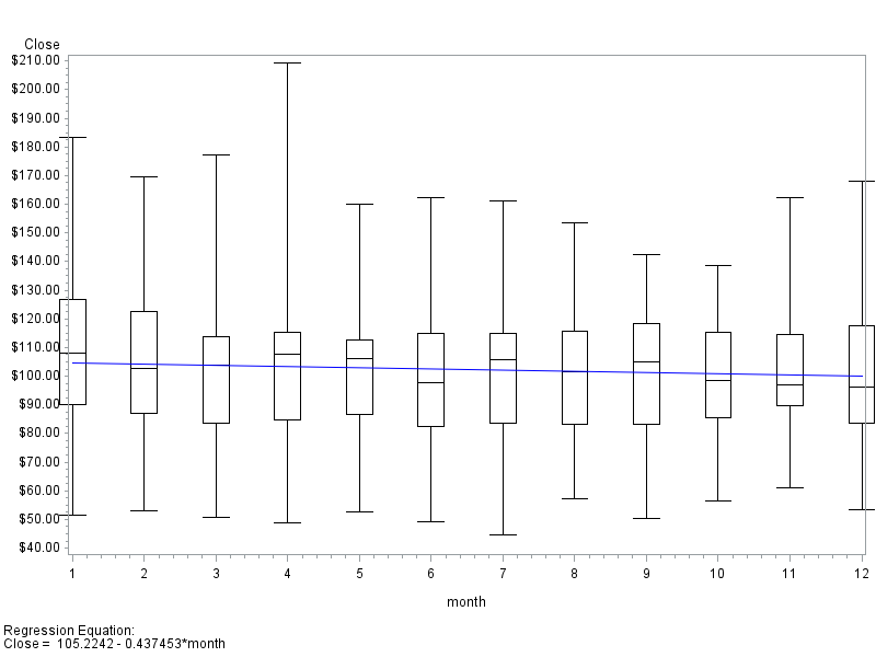
Whether it's a good idea or not, here's a minimal example showing one way to do it with proc gplot (using sample data from the sashelp library)...
data foo; set sashelp.stocks (where=(stock='IBM'));
month=.; month=put(date,month.);
run;
symbol1 interpol=boxt5 bwidth=4 c=black h=2;
symbol2 interpol=rl c=blue;
proc gplot data=foo;
plot close*month=1 close*month=2 / overlay regeqn;
run;
Catch up on SAS Innovate 2026
Dive into keynotes, announcements and breakthroughs on demand.
Explore Now →Learn how use the CAT functions in SAS to join values from multiple variables into a single value.
Find more tutorials on the SAS Users YouTube channel.
SAS Training: Just a Click Away
Ready to level-up your skills? Choose your own adventure.


