- Home
- /
- Programming
- /
- Graphics
- /
- Interaction Plot
- RSS Feed
- Mark Topic as New
- Mark Topic as Read
- Float this Topic for Current User
- Bookmark
- Subscribe
- Mute
- Printer Friendly Page
- Mark as New
- Bookmark
- Subscribe
- Mute
- RSS Feed
- Permalink
- Report Inappropriate Content
Hi everyone,
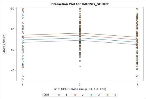
I'd like to get help with generating a similar plot as below. The data has the continuous variable COST and two categorical variables A and B. I wanted to compare COST of different groups of A and B through the visualization.
Anyone has a suggestion about where to start? PROC ANOVA, PROC SGPLOT or PLOT GLM?
Thanks a lot!
Accepted Solutions
- Mark as New
- Bookmark
- Subscribe
- Mute
- RSS Feed
- Permalink
- Report Inappropriate Content
I would use PROC GLM. Something like the following should get you started.
data A;
call streaminit(123);
do A = 1 to 3;
   s = 10*(A-2)**2;
   mean = 70 + 3*(A-2)**2;
   do B = 1 to 4;
      do i = 1 to 10;
         COST = B + rand("Normal", mean, s);
         output;
      end;
   end;
end;
run;

ods graphics on;
proc glm data=A;
class A B;
model COST = A | B;
run;- Mark as New
- Bookmark
- Subscribe
- Mute
- RSS Feed
- Permalink
- Report Inappropriate Content
I would use PROC GLM. Something like the following should get you started.
data A;
call streaminit(123);
do A = 1 to 3;
   s = 10*(A-2)**2;
   mean = 70 + 3*(A-2)**2;
   do B = 1 to 4;
      do i = 1 to 10;
         COST = B + rand("Normal", mean, s);
         output;
      end;
   end;
end;
run;

ods graphics on;
proc glm data=A;
class A B;
model COST = A | B;
run;Catch up on SAS Innovate 2026
Dive into keynotes, announcements and breakthroughs on demand.
Explore Now →Learn how use the CAT functions in SAS to join values from multiple variables into a single value.
Find more tutorials on the SAS Users YouTube channel.
SAS Training: Just a Click Away
Ready to level-up your skills? Choose your own adventure.


