- Home
- /
- Programming
- /
- Graphics
- /
- Re: Increase spacing in SGPLOT legend
- RSS Feed
- Mark Topic as New
- Mark Topic as Read
- Float this Topic for Current User
- Bookmark
- Subscribe
- Mute
- Printer Friendly Page
- Mark as New
- Bookmark
- Subscribe
- Mute
- RSS Feed
- Permalink
- Report Inappropriate Content
Accepted Solutions
- Mark as New
- Bookmark
- Subscribe
- Mute
- RSS Feed
- Permalink
- Report Inappropriate Content
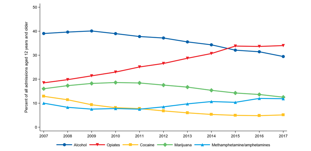
I assigned labels however, I left your code 99% intact but wrapped inside an absolute layout (could use gridded also) and specified the dimension that you can change. You did not specify the output format so I picked pdf
data prim_sub_use; set xl.sheet1;
label
Alcohol	='^_^_Alcohol^_'
Opiates	='^_^_Opiates^_'
Cocaine	='^_^_Cocaine^_'
Marijuana='^_^_Marijuana/hashish^_'
Methamphetamine_amphetamines='^_Methamphetamine/amphetamines^_'
;
run;
ods escapechar='^';
ods _all_ close;
options nonumber nodate orientation=landscape papersize=letter nocenter
	leftmargin=.5in rightmargin=.5in topmargin=.5in bottommargin=.5in;
ods pdf file="~/img/abuse.pdf" dpi=300 notoc;
ods layout absolute;
ods region x=0in y=0in width=10in;
ods graphics on /noborder height=7.5in width=10in scale=on;
proc sgplot data=prim_sub_use noborder nowall
		description='Primary substance use at admission, 2007-2017';
	series x=Year y=Alcohol/markers markerattrs=(symbol=CircleFilled
		color='#0060A9' size=12) lineattrs=(color='#0060A9' thickness=3);
	series x=Year y=Opiates/markers markerattrs=(symbol=TriangleDownFilled size=12
		color='#ed1c24') lineattrs=(color='#ed1c24' thickness=3 pattern=solid);
	series x=Year y=Cocaine/markers markerattrs=(symbol=SquareFilled
		color='#ffc222' size=12) lineattrs=(color='#ffc222' thickness=3
		pattern=solid);
	series x=Year y=Marijuana/markers markerattrs=(symbol=DiamondFilled
		color='#64c069' size=12) lineattrs=(color='#64c069' thickness=3
		pattern=solid) ; * legendlabel="Marijuana/hashish";
	series x=Year y=Methamphetamine_amphetamines/markers
		markerattrs=(symbol=TriangleFilled size=12 color='#00a2e5')
		lineattrs=(color='#00a2e5' thickness=3 pattern=solid);
	yaxis label='Percent of all admissions aged 12 years and older' VALUES=(0 TO 50 BY 10) offsetmax=0 offsetmin=0;
	xaxis label='Admission Year' VALUES=(2007 TO 2017 BY 1) display=(nolabel 		noticks);
	keylegend/noborder linelength=30;
run;
ods graphics off;
ods layout end;
ods pdf close;
ods _ALL_ CLOSE;
- Mark as New
- Bookmark
- Subscribe
- Mute
- RSS Feed
- Permalink
- Report Inappropriate Content
I don't know. I don't remember anything like that. The first thing I would try is adding one or more nonbreaking spaces to the end of the drug name in a DATA step before you run sgplot.
drug = trim(drug) || 'A0'x;
- Mark as New
- Bookmark
- Subscribe
- Mute
- RSS Feed
- Permalink
- Report Inappropriate Content
- Mark as New
- Bookmark
- Subscribe
- Mute
- RSS Feed
- Permalink
- Report Inappropriate Content
If you are using a formatted numeric variable to get your drug names, then you will need to modify the approach accordingly.
- Mark as New
- Bookmark
- Subscribe
- Mute
- RSS Feed
- Permalink
- Report Inappropriate Content
- Mark as New
- Bookmark
- Subscribe
- Mute
- RSS Feed
- Permalink
- Report Inappropriate Content
drug2='A0A0'x||strip(vvalue(drug))||'A0A0'x;
Where the number of A0 that you repeat will be the number of non-breaking spaces you add to the value. You would then group by DRUG2 instead of drug.
- Mark as New
- Bookmark
- Subscribe
- Mute
- RSS Feed
- Permalink
- Report Inappropriate Content
I might be tempted to try something like
Keylegend / across=3 down=2;
and maybe play around with the LINELENGTH option to see about making the length of the lines shorter.
- Mark as New
- Bookmark
- Subscribe
- Mute
- RSS Feed
- Permalink
- Report Inappropriate Content
- Mark as New
- Bookmark
- Subscribe
- Mute
- RSS Feed
- Permalink
- Report Inappropriate Content
@martyvd wrote:
That may be an option, but I'd really prefer the legend to all be on 1 line if possible.
There is only so much space available. If the values are long enough there just is not much space left between the lines.
Did you try anything with the LINELENGTH to shorten the displayed line segments in the legend?
- Mark as New
- Bookmark
- Subscribe
- Mute
- RSS Feed
- Permalink
- Report Inappropriate Content
- Mark as New
- Bookmark
- Subscribe
- Mute
- RSS Feed
- Permalink
- Report Inappropriate Content
chicklet and the label. As Rick suggested, you would have to add a NBSP
space before each value of group values to add some white space.
Or, if you want to make the legend more bolder, you can use KEYLEGEND
options to adjust the size of the chicklets - FILLASPECT, FILLHEIGHT, SCALE.
- Mark as New
- Bookmark
- Subscribe
- Mute
- RSS Feed
- Permalink
- Report Inappropriate Content
- Mark as New
- Bookmark
- Subscribe
- Mute
- RSS Feed
- Permalink
- Report Inappropriate Content
The NBSP suggestion originally came from Warren. Sorry about the incorrect attribution.
Also, my suggested usage of KEYLEGEND options may be more applicable for filled chicklets.
- Mark as New
- Bookmark
- Subscribe
- Mute
- RSS Feed
- Permalink
- Report Inappropriate Content
I am sure it can be done. Can you share your code and data (dummied up if it's confidential)
- Mark as New
- Bookmark
- Subscribe
- Mute
- RSS Feed
- Permalink
- Report Inappropriate Content
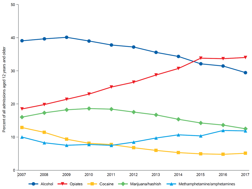
proc sgplot data=prim_sub_use noborder nowall description='Primary substance use at admission, 2007-2017';
series x=Year y=Alcohol/markers markerattrs=(symbol=CircleFilled color='#0060A9' size=12) lineattrs=(color='#0060A9' thickness=3);
series x=Year y=Opiates/markers markerattrs=(symbol=TriangleDownFilled size=12 color='#ed1c24') lineattrs=(color='#ed1c24' thickness=3 pattern=solid);
series x=Year y=Cocaine/markers markerattrs=(symbol=SquareFilled color='#ffc222' size=12) lineattrs=(color='#ffc222' thickness=3 pattern=solid);
series x=Year y=Marijuana/markers markerattrs=(symbol=DiamondFilled color='#64c069' size=12) lineattrs=(color='#64c069' thickness=3 pattern=solid) legendlabel="Marijuana/hashish";
series x=Year y=Methamphetamine_amphetamines/markers markerattrs=(symbol=TriangleFilled size=12 color='#00a2e5') lineattrs=(color='#00a2e5' thickness=3 pattern=solid);
yaxis label='Percent of all admissions aged 12 years and older' VALUES = (0 TO 50 BY 10) offsetmax=0 offsetmin=0;
xaxis label='Admission Year' VALUES = (2007 TO 2017 BY 1) display=(nolabel noticks);
keylegend/noborder linelength=30;
run;
Catch up on SAS Innovate 2026
Nearly 200 sessions are now available on demand with the SAS Innovate Digital Pass.
Explore Now →Learn how use the CAT functions in SAS to join values from multiple variables into a single value.
Find more tutorials on the SAS Users YouTube channel.
SAS Training: Just a Click Away
Ready to level-up your skills? Choose your own adventure.


