- Home
- /
- Programming
- /
- Graphics
- /
- Incorporate bar chart into line chart
- RSS Feed
- Mark Topic as New
- Mark Topic as Read
- Float this Topic for Current User
- Bookmark
- Subscribe
- Mute
- Printer Friendly Page
- Mark as New
- Bookmark
- Subscribe
- Mute
- RSS Feed
- Permalink
- Report Inappropriate Content
Hi everyone,
I would like to ask for help with plot in SAS. Suppose my data looks like that:
| year | fluctuation | NBER recession |
| 1999 | 0.001489 | 0 |
| 2000 | 0.002258 | 0 |
| 2001 | 0.002622 | 1 |
| 2002 | 0.002956 | 0 |
| 2003 | 0.002748 | 0 |
| 2004 | 0.002323 | 0 |
| 2005 | 0.002908 | 0 |
| 2006 | 0.002745 | 0 |
| 2007 | 0.00355 | 0 |
| 2008 | 0.005463 | 1 |
| 2009 | 0.011543 | 1 |
| 2010 | 0.010604 | 0 |
| 2011 | 0.009717 | 0 |
| 2012 | 0.007647 | 0 |
| 2013 | 0.005348 | 0 |
| 2014 | 0.003628 | 0 |
| 2015 | 0.002861 | 0 |
| 2016 | 0.002681 | 0 |
| 2017 | 0.002595 | 0 |
| 2018 | 0.00218 | 0 |
| 2019 | 0.002333 | 0 |
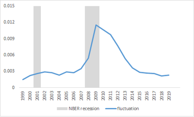
I want to plot the fluctuation line. At the same time, I want to highlight the year defined as recession.
The chart I want to come up with looks like that. This is the chart I got from Excel. It looks simple, buy it's pretty time-consuming. So I hope that I can do it in SAS.
Here is the code I am using to draw the fluctuation line only:
ods graphics;
PROC SGPLOT DATA=test;
xaxis label = 'Year';
yaxis label = 'Fluctuation';
series x=year y=fluctuation/ legendlabel='Fluctuation' lineattrs=(pattern=solid color=blue);
run;
Thank you so much in advance.
Regards,
Windy.
Accepted Solutions
- Mark as New
- Bookmark
- Subscribe
- Mute
- RSS Feed
- Permalink
- Report Inappropriate Content
Looks like a use case for the BLOCK plot. See the last example in this blog.
https://blogs.sas.com/content/graphicallyspeaking/2014/04/14/the-block-plot/
This is now also available in SGPLOT.
https://documentation.sas.com/doc/en/pgmsascdc/9.4_3.5/grstatproc/n0ikbvq5nwz6ezn1czzi40aw048o.htm
- Mark as New
- Bookmark
- Subscribe
- Mute
- RSS Feed
- Permalink
- Report Inappropriate Content
Do you want to do this in code or in the SAS Visual Analytics application?
-------------------------------------------------------------------------
Four tips to remember when you contact SAS Technical Support
Tricks for SAS Visual Analytics Report Builders
SAS Visual Analytics Learning Center
- Mark as New
- Bookmark
- Subscribe
- Mute
- RSS Feed
- Permalink
- Report Inappropriate Content
I would like to do this in code.
- Mark as New
- Bookmark
- Subscribe
- Mute
- RSS Feed
- Permalink
- Report Inappropriate Content
Looks like a use case for the BLOCK plot. See the last example in this blog.
https://blogs.sas.com/content/graphicallyspeaking/2014/04/14/the-block-plot/
This is now also available in SGPLOT.
https://documentation.sas.com/doc/en/pgmsascdc/9.4_3.5/grstatproc/n0ikbvq5nwz6ezn1czzi40aw048o.htm
- Mark as New
- Bookmark
- Subscribe
- Mute
- RSS Feed
- Permalink
- Report Inappropriate Content
Here is an SGPlot example using block plot:
data MSevents;
  input Date date9. Release $5.;
  label Release="Windows Release";
datalines;
01jun1990 3.0
01sep1995 95
01jul1998 98
01mar2000 2000
01nov2001 XP
run;

proc sort data=sashelp.stocks(keep=date stock close) out=MSstock;
  where stock="Microsoft";
  by date;
run;

data events(drop=temp);
  retain temp;
  merge MSstock MSevents(in=r);
  by date;
  if first.date and r then temp=release;
  release=temp;
run;

title "Microsoft Stock Pricing Against Releases";
proc sgplot data=events;
   block X=Date Block=Release / filltype=alternate valueHAlign=center valueVAlign=top;
   Series X=Date Y=Close;
run;- Mark as New
- Bookmark
- Subscribe
- Mute
- RSS Feed
- Permalink
- Report Inappropriate Content
Thank you so much @Jay54 and @DanH_sas for your help. I am able to come up with the code for my case as follows. The only problem is I choose the Gray color, but it doesn't look like the one from excel. I guess it's not too important.
ods graphics;
PROC SGPLOT DATA=data;
xaxis label = 'Year' values=(1999 to 2019 by 2);
yaxis label = 'Fluctuation';
block X=year Block=NBER / fillattrs=(color=GRAY transparency=1) filltype=alternate valueHAlign=center valueVAlign=top novalues nooutline;
series x=year y=fluctuation/ legendlabel='Fluctuation' / lineattrs=(pattern=solid color=blue);
run;
ods graphics off;
- Mark as New
- Bookmark
- Subscribe
- Mute
- RSS Feed
- Permalink
- Report Inappropriate Content
You can use the FILLATTRS and ALTFILLATTRS on the BLOCK to control the color of the alternating blocks. The color you want is cxd9d9d9. For example:
fillattrs=(color=white) altfillattrs=(color=cxd9d9d9)
- Mark as New
- Bookmark
- Subscribe
- Mute
- RSS Feed
- Permalink
- Report Inappropriate Content
- Mark as New
- Bookmark
- Subscribe
- Mute
- RSS Feed
- Permalink
- Report Inappropriate Content
Can I ask for one more thing? How can I add the block label to the legend to tell the reader that the block shows NBER recession?
- Mark as New
- Bookmark
- Subscribe
- Mute
- RSS Feed
- Permalink
- Report Inappropriate Content
When a BLOCK plot has a FILLTYPE of ALTERNATE, it cannot be put into a legend, as each value in the block is not guaranteed to have a unique color (FILLTYPE=MULTICOLOR (the default) can be put in a legend). However, there is a simple way to add what you want via the LEGENITEM statement. This statement give you the ability to add items to a legend tat cannot be picked up from a plot. Below, I modified my original example to include the legend item information you requested:
title "Microsoft Stock Pricing Against Releases";
proc sgplot data=events;
   block X=Date Block=Release / filltype=alternate valueHAlign=center valueVAlign=top
         fillattrs=(color=white) altfillattrs=(color=cxd9d9d9);
   Series X=Date Y=Close / name="series";
   legenditem name="block" type=fill / fillattrs=(color=cxd9d9d9) label="NBER";
   keylegend "block" "series";
run;- Mark as New
- Bookmark
- Subscribe
- Mute
- RSS Feed
- Permalink
- Report Inappropriate Content
It's working perfectly.
- Mark as New
- Bookmark
- Subscribe
- Mute
- RSS Feed
- Permalink
- Report Inappropriate Content
Catch up on SAS Innovate 2026
Nearly 200 sessions are now available on demand with the SAS Innovate Digital Pass.
Explore Now →Learn how use the CAT functions in SAS to join values from multiple variables into a single value.
Find more tutorials on the SAS Users YouTube channel.
SAS Training: Just a Click Away
Ready to level-up your skills? Choose your own adventure.


