- Home
- /
- Programming
- /
- Graphics
- /
- How to show name of a specific point on GPLOT
- RSS Feed
- Mark Topic as New
- Mark Topic as Read
- Float this Topic for Current User
- Bookmark
- Subscribe
- Mute
- Printer Friendly Page
- Mark as New
- Bookmark
- Subscribe
- Mute
- RSS Feed
- Permalink
- Report Inappropriate Content
Hello to whomever can help
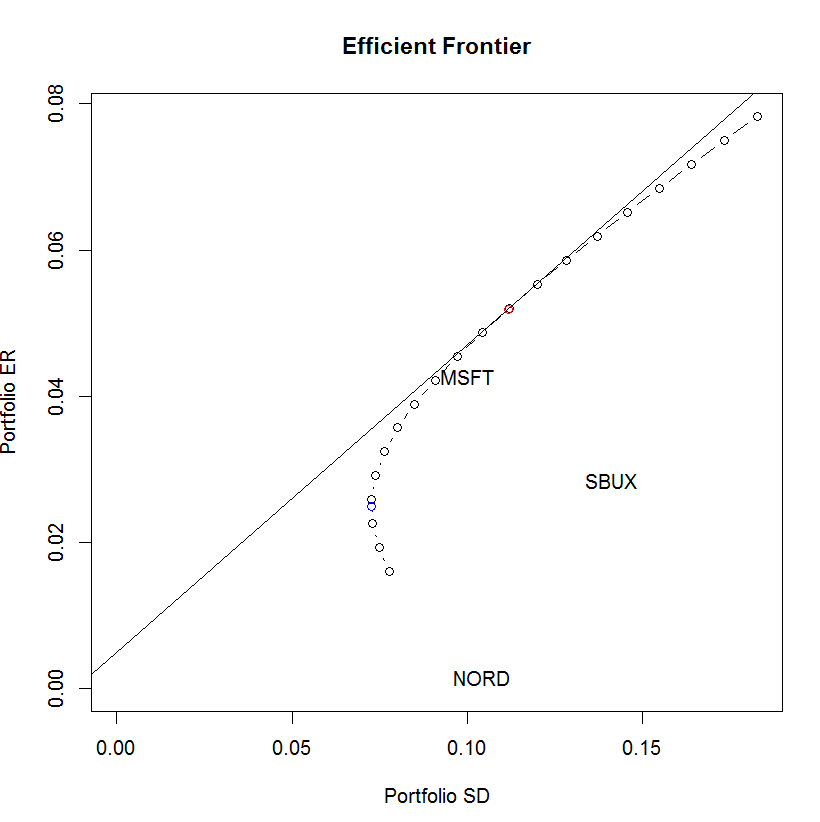
Please see the following R program and its graph output:
plot(ef, plot.assets=T)
points(gmin.port$sd, gmin.port$er, col="blue")
points(tan.port$sd, tan.port$er, col="red")
sr.tan = (tan.port$er - rk.free)/tan.port$sd
abline(a=rk.free, b=sr.tan)
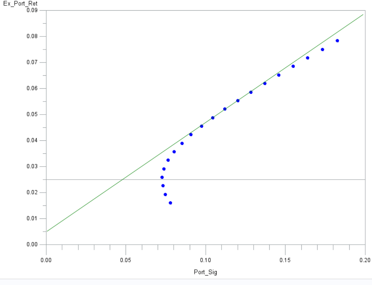
I can plot everything that on this R graph above on GPLOT except those names of points, MSFT, NORD and SBUX.
So what should I do?
The following is my GPLOT output and program. it does not have everything yet, such as title, but iknow how to put it up there.
Thank you!
goptions reset=all border;

symbol1 value=dot color=blue;
symbol2 value=none interpol=join color=green;
axis1 order=(0 to 0.09 by 0.01) offset=(0,0)
	major=(height=2)
	minor=(height=1);
axis2 order=(0 to 0.2 by 0.05) offset=(0,0)
	major=(height=2)
	minor=(height=1);

proc gplot data=proj.TanLine;
	plot ex_port_ret*port_sig=1
	 	 Ex_tan_ret*Tan_port_sig=2/overlay
								vaxis=axis1
								vminor=1
								haxis=axis2
								hminor=4
								vref=0.024891845;
run;
quit;- Mark as New
- Bookmark
- Subscribe
- Mute
- RSS Feed
- Permalink
- Report Inappropriate Content
Firstly, I would stongly advise to move to sgplot or graph template language, they are far more controllable. As I don't use gplot anymore - moved to modern tech, I can only advise using sgplot/gtl.
What I would do is to create your graph, then have your point, defined in two seprate variables, and overlay that plot with marker labels turned on:
data inter;
  set your_data;
  lab="MSFT";
  labx=0.08;
  laby=0.04;
run;
proc splot;
  ... your plots;
  scatter x=y=mpg_city /  group=type markerchar=lab;
run;
This does your graph, then overlays the scatter and places the text from LAB at the point LABX/LABY. You can find plenty of examples of sgplot/gtl over at:
Catch up on SAS Innovate 2026
Dive into keynotes, announcements and breakthroughs on demand.
Explore Now →Learn how use the CAT functions in SAS to join values from multiple variables into a single value.
Find more tutorials on the SAS Users YouTube channel.
SAS Training: Just a Click Away
Ready to level-up your skills? Choose your own adventure.


