Turn on suggestions
Auto-suggest helps you quickly narrow down your search results by suggesting possible matches as you type.
Showing results for
- Home
- /
- Programming
- /
- Graphics
- /
- Re: How to set background colors in sgplot conditioned on both x- and ...
Options
- RSS Feed
- Mark Topic as New
- Mark Topic as Read
- Float this Topic for Current User
- Bookmark
- Subscribe
- Mute
- Printer Friendly Page
🔒 This topic is solved and locked.
Need further help from the community? Please
sign in and ask a new question.
- Mark as New
- Bookmark
- Subscribe
- Mute
- RSS Feed
- Permalink
- Report Inappropriate Content
Posted 06-15-2018 10:04 AM
(2028 views)
Hi
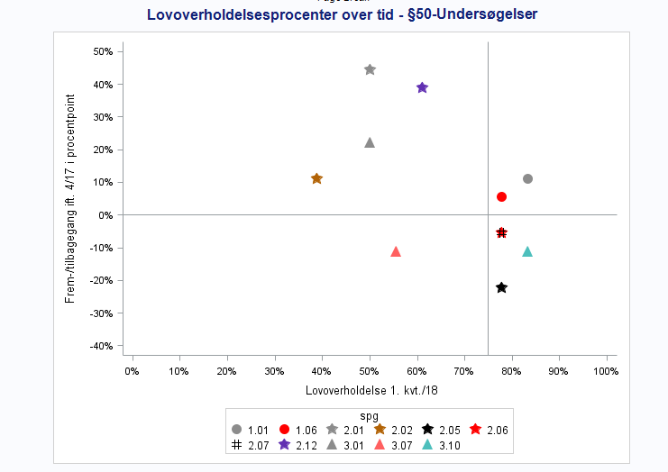
I've made the following scatterplot with sgplot and would like to add background colors, so that:
- the top right corner (defined by x>0.75, y>0) is green
- the bottom left corner (define by x<=0.75, y<=0) is red
- the top left and bottom right corners (x<=0.75, y>0 and x>0-75, y<0) are yellow
Is there a way of doing this in proc sgplot (I have attached my data as a xlsx-file)?
Graph:
Code:
title "Lovoverholdelsesprocenter over tid - §50-Undersøgelser";
 proc sgplot data=graf dattrmap=attrmap_bu noborder ;
  where sagstrin ? "2" and 'Med i Baselin'n ne '';
  scatter x=pct_118 y=diff / group=spg attrid=spg;
  styleattrs datacolors=(red yellow green);
  xaxis min=-0 max=1 values=(0 to 1 by 0.1) fitpolicy=rotate valuesrotate=diagonal valueattrs=(Family=Helvetica Size=8) label="Lovoverholdelse 1. kvt./18";
  yaxis min=-0.4 max=0.5 values=(-0.4 to 0.5 by 0.1) valueattrs=(Family=Helvetica Size=8) label="Frem-/tilbagegang ift. 4/17 i procentpoint";
  refline 0 /axis=y;
  refline 0.75 /axis=x;
  *keylegend "underniv" / across=3 noborder valueattrs=(Family=Helvetica Size=7);
run;
1 ACCEPTED SOLUTION
Accepted Solutions
- Mark as New
- Bookmark
- Subscribe
- Mute
- RSS Feed
- Permalink
- Report Inappropriate Content
If you know the data extents, use POLYGON plot to display the 4 regions you want.
2 REPLIES 2
- Mark as New
- Bookmark
- Subscribe
- Mute
- RSS Feed
- Permalink
- Report Inappropriate Content
If you know the data extents, use POLYGON plot to display the 4 regions you want.
- Mark as New
- Bookmark
- Subscribe
- Mute
- RSS Feed
- Permalink
- Report Inappropriate Content
Thanks for the help!
How to Concatenate Values
Learn how use the CAT functions in SAS to join values from multiple variables into a single value.
Find more tutorials on the SAS Users YouTube channel.
SAS Training: Just a Click Away
Ready to level-up your skills? Choose your own adventure.


