- Home
- /
- Programming
- /
- Graphics
- /
- Re: How to plot some events over latitude and longitude data
- RSS Feed
- Mark Topic as New
- Mark Topic as Read
- Float this Topic for Current User
- Bookmark
- Subscribe
- Mute
- Printer Friendly Page
- Mark as New
- Bookmark
- Subscribe
- Mute
- RSS Feed
- Permalink
- Report Inappropriate Content
I have 3 columns in a dataset:
Latitude Logitude Phone
-89.2132 179.9323 A
34.1231 -85.123 B
23.45 -34.23 A
.....
It is a customer level data, where phone category can be A or B, I want to plot these categories over the Latitude and Logitude data in SAS, where A and B can take 2 different colors.
- Mark as New
- Bookmark
- Subscribe
- Mute
- RSS Feed
- Permalink
- Report Inappropriate Content
Is there supposed to be a map involved?
What units are those latitude and longititude values supposed to be in? Latitude typically uses degrees with a range of -90 to 90 and longitude -180 to 180 degrees.
- Mark as New
- Bookmark
- Subscribe
- Mute
- RSS Feed
- Permalink
- Report Inappropriate Content
- Mark as New
- Bookmark
- Subscribe
- Mute
- RSS Feed
- Permalink
- Report Inappropriate Content
Hi
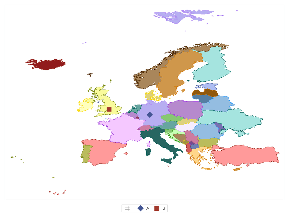
with SAS/GRAPH you will get libraries named MAPS and MAPSGFK using the provided data and ODS GRAPHICS you can create maps. See the attachment for the example.
Here is an example:
/*
 * create the map data
 * use the resolution var to have less data points
 * create a new ID var for drawing the map
 */
data map_data;
  length id_c $ 32;
  set mapsgfk.europe;
  where
    resolution <= 3
  ;
  id_c = catx("_", id, segment);
run;

/*
 * create the data for locations
 * NOTE: use a different name for the latitude and longitude variables
 */
data locations;
  infile cards;
  input
    lat2
    Long2
    Phone $
  ;
cards;
50.598726 9.450487 A
52.201658 -1.730536 B
;

/*
 * concat the two data sets
 */
data plotdata;
  set map_data locations;
run;


/*
 * draw the map using SGPLOT
 * the POLYGON will draw the map
 * the SCATTER will plot data points
 */
ods graphics / width=1600 height=1200 ;

proc sgplot data=plotdata  ;
  styleattrs
    datasymbols=(diamondFilled squareFilled)
  ;
  polygon x=long y=lat id=id_c / group=id fill  outline name="map";

  scatter x=long2 y=lat2 / group=Phone markerattrs=(size=15) name="loc";
  keylegend "loc";
  xaxis display=none;
  yaxis display=none;
run;
Bruno

- Mark as New
- Bookmark
- Subscribe
- Mute
- RSS Feed
- Permalink
- Report Inappropriate Content
- Mark as New
- Bookmark
- Subscribe
- Mute
- RSS Feed
- Permalink
- Report Inappropriate Content
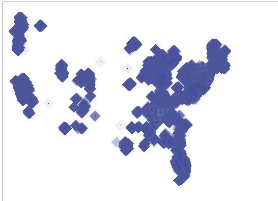
If you have overplotting, you can use transparency to attempt to reduce overplotting:
scatter x=long2 y=lat2 / group=Phone name="loc" transparency=0.9;If you have millions of points, you might also consider plotting the density of the data, rather than individual markers. You can use PROC KDE or check out the hexagonal binning macro that can create a density map.
- Mark as New
- Bookmark
- Subscribe
- Mute
- RSS Feed
- Permalink
- Report Inappropriate Content
I tried the transparency option as well. But the graph looks really bad.

- Mark as New
- Bookmark
- Subscribe
- Mute
- RSS Feed
- Permalink
- Report Inappropriate Content
Hi
I would make the marker size smaller.
Some questions:
Please explain, what the viewer of the graph should be able to read out of this graph?
Do many points have the same coordinates, for instance based on the ZIP code?
Bruno
- Mark as New
- Bookmark
- Subscribe
- Mute
- RSS Feed
- Permalink
- Report Inappropriate Content
For your questions:
1. I want to see the density of both the cases across the longitude and latitude.
2. About the 95% of the points have different coordinates. 5% might be same.
Catch up on SAS Innovate 2026
Dive into keynotes, announcements and breakthroughs on demand.
Explore Now →Learn how use the CAT functions in SAS to join values from multiple variables into a single value.
Find more tutorials on the SAS Users YouTube channel.
SAS Training: Just a Click Away
Ready to level-up your skills? Choose your own adventure.


