- Home
- /
- Programming
- /
- Graphics
- /
- Re: How to plot regression line using just some part of points
- RSS Feed
- Mark Topic as New
- Mark Topic as Read
- Float this Topic for Current User
- Bookmark
- Subscribe
- Mute
- Printer Friendly Page
- Mark as New
- Bookmark
- Subscribe
- Mute
- RSS Feed
- Permalink
- Report Inappropriate Content
Hi!
I have data with two variables: month and total. Data containes of 70 observations. I want to plot a graph similar to the graph shown below:

- Mark as New
- Bookmark
- Subscribe
- Mute
- RSS Feed
- Permalink
- Report Inappropriate Content
So what precisely is your question?
If you have have no idea where to strait I suggest robslink.com and/or SGPLOT documentation.
I think a BLOCK statement or POLYGON along with series or Reg line will work.
- Mark as New
- Bookmark
- Subscribe
- Mute
- RSS Feed
- Permalink
- Report Inappropriate Content
If I used this code:
Proc sgplot data=example;
scatter x=month y=total;
reg x=month y=total;
run;
the reg statement would use all data point to plot regression line, but I want that it would use just first 59 point, but the line would plot for all datapoints. I want to see, if graphically it is visible that there is any change after point 60
- Mark as New
- Bookmark
- Subscribe
- Mute
- RSS Feed
- Permalink
- Report Inappropriate Content
To me, this graph looks like a TimeSeries forecast plot, with the fit computed from the data on the left, and projected into future. If you need the fit line computed this way, I suggest posting on the "SAS Forecasting and Econometrics" community.
If you have already computed the regression line as shown, then it is easy to plot it like you want using SGPLOT procedure. First, break up the Y data into two columns (Y1, Y2), one for the left dates (with missing values for the rest), one for the right. Then, use two series plot statements to draw each line, Y1 x date and Y2 x date using two different line patterns. With SAS9.40M3, you can use a block plot to draw the shaded regions and also draw the axis lines like in the graph by using the AxisExtent=Data option on the STYLEATTRS statement.
- Mark as New
- Bookmark
- Subscribe
- Mute
- RSS Feed
- Permalink
- Report Inappropriate Content
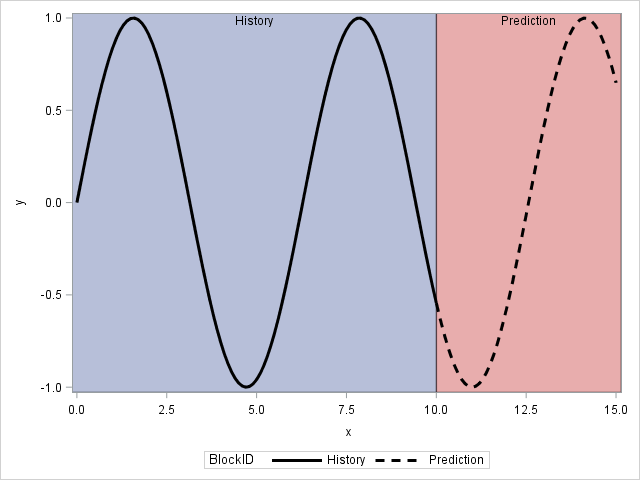
Use the BLOCK statement in PROC SGPLOT for the background. You can use style attributes and the GROUP= option in the SERIES statement to change the line style from solid to dashed:
data A;
BlockID="History   ";
do x = 0 to 10 by 0.1;
   y = sin(x);
   output;
end;
BlockID="Prediction";
do x = 10 to 15 by 0.1;
   y = sin(x);
   output;
end;

run;

ods graphics / attrpriority=none;
proc sgplot data=A;
styleattrs DATALINEPATTERNS=(solid dash);
block x=x block=BlockID / transparency=0.5;
series x=x y=y / group=BlockID lineattrs=(color=black thickness=3);
run;Learn how use the CAT functions in SAS to join values from multiple variables into a single value.
Find more tutorials on the SAS Users YouTube channel.
SAS Training: Just a Click Away
Ready to level-up your skills? Choose your own adventure.


