- Home
- /
- Programming
- /
- Graphics
- /
- Re: How to make 'Schematic Plots' with selected data labeled? Univaria...
- RSS Feed
- Mark Topic as New
- Mark Topic as Read
- Float this Topic for Current User
- Bookmark
- Subscribe
- Mute
- Printer Friendly Page
- Mark as New
- Bookmark
- Subscribe
- Mute
- RSS Feed
- Permalink
- Report Inappropriate Content
SAS Folks-
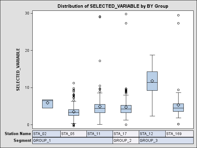
I just had a wonderful surprise in PROC UNIVARIATE – a bonus box plot with bars at the bottom that show groupings.
PROC UNIVARIATE PLOTS ;
BY SEGMENT STATION ;
VAR SELECTED_VARIABLE ;
RUN ;
In the documentation, it is identified as “Schematic Plots” under the PLOTS option. “If you use a BY statement, side-by-side box plots that are labeled ‘Schematic Plots’ appear after the univariate analysis for the last BY group.”
From the LOG, it looks like the template is SSPlots, and I have attached a generalized example.
Output Added:
-------------
Name: SSPlots
Label: Panel 1
Template: base.univariate.Graphics.SSPlots
Path: Univariate.SSPlots
-------------
The wonderful part of this graphic is the bars on the bottom showing the groupings. To make this graphic even better, I would like to label the points by a code (character) that is in another variable (DATA_CODE), but I don’t see any options that seem to relate.
My understanding of ODS and templates is vague at best, but it seems that if the labeling is not available in UNIVARIATE, something like this may possibly be done in SGPLOT/SGPANEL with VBOX, but I don’t see a way to generate the grouping bars. (I have SAS/GRAPH as well, so I’m not restricted to SG procs)
It would also be fine to do color coding by DATA_CODE, if a symbol could be overlaid. For example, if DATA_CODE contains ”X” then display a symbol in red, if DATA_CODE contains “Q” then display in yellow (or whatever, just as long as it is different, and can be seen).
If someone knows how to do this, or has a reference, I would be very grateful for your help. I have lots of groupings, and this would be a wonderful tool to look at data within and across a group simultaneously.
Thanks for any help you can give me!
Wendy T.


Accepted Solutions
- Mark as New
- Bookmark
- Subscribe
- Mute
- RSS Feed
- Permalink
- Report Inappropriate Content
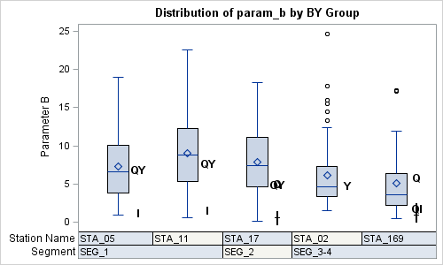
Here is a stab at what you can do using GTL directly. This is using your data set and param_b as analysis variable. Code is attached.

- Mark as New
- Bookmark
- Subscribe
- Mute
- RSS Feed
- Permalink
- Report Inappropriate Content
I believe you can do it if you dump out the data using ODS OUTPUT to a data set A and use a customized template. Add a column B to the data providing the label character for the observations to be labelled, and missing for others. Then, add a SCATTERPLOT to the SSPLOTS template, with the same X, Y and GROUP variables and use the option MARKERCHARACTER=B. Run the template with proc SGRENDER and the new data set. To move the label characters a bit to the right (as in your illustration), use DISCRETEOFFSET=0.2. You may need to try some other values..
- Mark as New
- Bookmark
- Subscribe
- Mute
- RSS Feed
- Permalink
- Report Inappropriate Content
Thanks Sanjay - I'll try to figure out how to do the customized template.
Wendy T.
- Mark as New
- Bookmark
- Subscribe
- Mute
- RSS Feed
- Permalink
- Report Inappropriate Content
Sanjay-
I’m still playing with this graphic, and I’m obviously missing something. I have figured out that the important bit of the SSPlots template is in the middle.
Layout Lattice / rowaxeslabelalign=0 rowweights=_ROWWEIGHTS
columndatarange=unionall pad=(bottom=0.01);
Layout Overlay / xaxisopts=(display=(line)) yaxisopts=(label=
_VARLABEL);
BoxplotParm x=BOXGROUP y=VALUE stat=STAT / tip=(MIN Q1 MEDIAN
Q3 MAX MEAN STD N) outliertip=(Y);
EndLayout;
I have attempted various combinations. If I use BoxPlotParm, a scatterplot includes the group N as one of the points.
BoxPlotParm y=VALUE x=BOXGROUP stat=STAT ;
ScatterPlot y=VALUE x=BOXGROUP / DISCRETEOFFSET=0.5 ;
If I use BoxPlot, the group N then intrudes in the box plot as well.
BoxPlot y=VALUE x=BOXGROUP;
ScatterPlot y=VALUE x=BOXGROUP / DISCRETEOFFSET=0.5 ;
I don’t think an extra dataset will help, as the labels I would like to see are not restricted to outliers.
I also have tried SGPANEL, but generated an error that I could not mix VBOX with any other plot type.
Any ideas?
Wendy T.
- Mark as New
- Bookmark
- Subscribe
- Mute
- RSS Feed
- Permalink
- Report Inappropriate Content
Hey Wendy,
Can you share your code and data (maybe anonymized)? What release of SAS are you using?
- Mark as New
- Bookmark
- Subscribe
- Mute
- RSS Feed
- Permalink
- Report Inappropriate Content
Sanjay-
Here's a tiny dataset and the basic code. I actually have many more segments, stations, parameters and years of values. I have done a macro by parameter, as the output then will display by parameter in the frame, and most importantly, the graphics will have a name that relates to the parameter. IMAGENAME really isn't as nice as the option from GPLOT where I could name output with #BYVAL(). The contents of variable BAD_CODES is what I would like to use for labeling, at any position.
I have all the stats output available in files elsewhere, so what I'm after is just the nice combined graphic at the very end. If there is a way to do this directly without invoking UNIVARIATE, that would be even better. Any other suggestions you have would be most welcome.
Thank you so much for taking time to look at my code and data - I really appreciate it!
Wendy T.
ps we are using SAS 9.3 TS1M2 via remote login from Windows to a Windows server.
%LET OUTDIR=&TEMP_OUTPUT.\univariate ;
%LET BASE=boxes ;
ODS LISTING CLOSE ;
ODS TRACE ON ;
ODS HTML newfile=none headtext='<style>p,hr {display:none} </style>'
PATH="&OUTDIR\" (URL=NONE)
body="body_&BASE..htm" (TITLE="GRAF_OUTPUT") contents="contents_&BASE..htm" frame="frame_&BASE..htm" STYLE=STYLES.DEFAULT ;
%MACRO BOXPARAM(PARAM) ;
ODS GRAPHICS ON / RESET=INDEX IMAGENAME="&PARAM" HEIGHT=480px WIDTH=640px ;
DATA &PARAM ; SET EXAMPLE_DATA (KEEP=STATION SASDATE DATETIME &PARAM &PARAM._ SEGMENT );
BAD_CODES=&PARAM._ ;
IF FINDC(BAD_CODES ,'QYJ') EQ 0 THEN BAD_CODES = ' ' ;
PROC SORT ; BY SEGMENT STATION ;
RUN ;
ODS PROCLABEL "Parameter &PARAM " ;
PROC UNIVARIATE PLOTS DATA=&PARAM ;
BY SEGMENT STATION ;
VAR &PARAM ;
RUN ;
%MEND ;
%BOXPARAM(PARAM_A) ;
%BOXPARAM(PARAM_B) ;
ODS HTML CLOSE ;
ODS LISTING ;
RUN ;
- Mark as New
- Bookmark
- Subscribe
- Mute
- RSS Feed
- Permalink
- Report Inappropriate Content
Here is a stab at what you can do using GTL directly. This is using your data set and param_b as analysis variable. Code is attached.

- Mark as New
- Bookmark
- Subscribe
- Mute
- RSS Feed
- Permalink
- Report Inappropriate Content
Sanjay-
This is going to be a wonderful tool for looking at our data.
I was able to download your code, and it's elegant. I'm sure I can use this as a base for other graphics, and learning more about GTL.
Thanks so much for doing this for me - I very much appreciate all your time and effort in answering all our questions!
Wendy T.
- Mark as New
- Bookmark
- Subscribe
- Mute
- RSS Feed
- Permalink
- Report Inappropriate Content
I can't find the buttons to mark this as answered...
Wendy T.
- Mark as New
- Bookmark
- Subscribe
- Mute
- RSS Feed
- Permalink
- Report Inappropriate Content
That button will only show on the screen for the one who posted the question. Maybe one of the other readers can help. Are you OK if I post this example on Graphically Speaking? I assume the data is not confidential. If it is, I can obfuscate it. This could be useful for other readers too. ![]()
- Mark as New
- Bookmark
- Subscribe
- Mute
- RSS Feed
- Permalink
- Report Inappropriate Content
Sanjay-
I would be honored if you would like to put this example on your blog! Please feel free to post the data as well.
It was actually your 'Graphically Speaking' post on Custom Box Plots that got me started on viewing individual values and codes in conjunction with a box plot - the SAS 9.4 'jittering' example of Distribution on Mileage by Type.
I don't see the buttons even though I posted the original question, but will try again later.
Thanks again!
Wendy T.
ps the buttons came up as soon as I saved this message, and I was able to mark the question as answered. ![]()
- Mark as New
- Bookmark
- Subscribe
- Mute
- RSS Feed
- Permalink
- Report Inappropriate Content
April 27 – 30 | Gaylord Texan | Grapevine, Texas
Registration is open
Walk in ready to learn. Walk out ready to deliver. This is the data and AI conference you can't afford to miss.
Register now and save with the early bird rate—just $795!
Learn how use the CAT functions in SAS to join values from multiple variables into a single value.
Find more tutorials on the SAS Users YouTube channel.
SAS Training: Just a Click Away
Ready to level-up your skills? Choose your own adventure.


