- Home
- /
- Programming
- /
- Graphics
- /
- Re: How to graph overlapping bell curves?
- RSS Feed
- Mark Topic as New
- Mark Topic as Read
- Float this Topic for Current User
- Bookmark
- Subscribe
- Mute
- Printer Friendly Page
- Mark as New
- Bookmark
- Subscribe
- Mute
- RSS Feed
- Permalink
- Report Inappropriate Content
Hi! This is a real beginner question. I want to graph two normal bell curves with different means and standard deviations, such that I get three colors, e.g., yellow for bell curve one only, blue for bell curve two only, and green for the overlap region (area under both bell curves). Alternative would be cross-hatching. I just want to easily distinguish the three possibilities. Do I have to generate normal random samples first? This is strictly for pictorial purposes, so I want the curves to look smooth, not like connect-the-dots. I hope this is as easy as it sounds. Thanks!
- Mark as New
- Bookmark
- Subscribe
- Mute
- RSS Feed
- Permalink
- Report Inappropriate Content
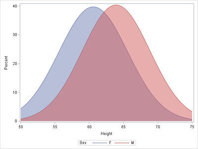
Here's one approach:
proc univariate data=sashelp.class noprint;
class sex;
histogram height/ nobars normal(noprint);
ods ouput histogram=hist;
run;
data hist;
set hist;
lower=0;
run;
proc sgplot data=hist;
series x=CurveX y=CurveY/group=Class1;
band x=CurveX lower=lower upper=CurveY/group=Class1 transparency=.5;
run;
- Mark as New
- Bookmark
- Subscribe
- Mute
- RSS Feed
- Permalink
- Report Inappropriate Content
Hi @Zard ! Thank you so much for your code. From the picture you posted, it looks like it would do the trick. There was a small typo ("output" misspelled as "ouput") that the compiler understood how to compensate for, but ultimately I was unable to run it, got the following error, which might be peculiar to my installation:
WARNING: Unsupported device 'SVG' for TAGSETS.SASREPORT13(EGSR) destination. Using default device 'PNG'.
NOTE: 18810 bytes written to
...
ERROR: Insufficient authorization to access /sasgrid/prd/config/app/Lev1/SASApp/sasgraph.svg.
WARNING: Output 'histogram' was not created. Make sure that the output object name, label, or path is spelled correctly. Also,
verify that the appropriate procedure options are used to produce the requested output object. For example, verify that
the NOPRINT option is not used.
Do you know how I could get around this?
- Mark as New
- Bookmark
- Subscribe
- Mute
- RSS Feed
- Permalink
- Report Inappropriate Content
Sorry about the typo!
Try adding the statement
ODS _ALL_ CLOSE;
at the beginning of your program. If you are specifying an ODS destination, with an ODS PDF or ODS RTF statement, for example, you might need to modify the syntax there as well. I'm not an expert in this area, so if this doesn't work, include your full code or log and someone else might weigh in, or you could contact Technical Support.
- Mark as New
- Bookmark
- Subscribe
- Mute
- RSS Feed
- Permalink
- Report Inappropriate Content
Hi @Top_Katz,
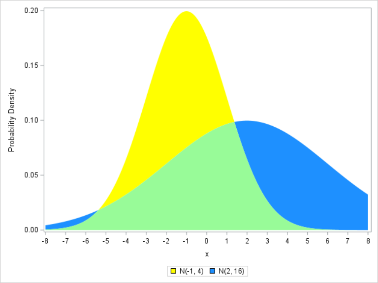
A similar approach can be used for arbitrarily specified probability densities:
data have;
do x=-8 to 8 by 0.01;
  y1=pdf('normal',x,-1,2);
  y2=pdf('normal',x,2,4);
  m=min(y1,y2);
  output;
end;
run;

proc sgplot data=have;
band x=x upper=y1 lower=m / fillattrs=(color=yellow)     legendlabel='N(-1, 4)' name='N1';
band x=x upper=y2 lower=m / fillattrs=(color=dodgerblue) legendlabel='N(2, 16)' name='N2';
band x=x upper=m  lower=0 / fillattrs=(color=palegreen);
xaxis values=(-8 to 8);
yaxis label='Probability Density';
keylegend 'N1' 'N2';
run;- Mark as New
- Bookmark
- Subscribe
- Mute
- RSS Feed
- Permalink
- Report Inappropriate Content
Hi @FreelanceReinh ! Thank you so much for your code! Beautiful, just what I wanted, it ran like a charm and gave me the picture that you displayed. Much appreciated!
Catch up on SAS Innovate 2026
Nearly 200 sessions are now available on demand with the SAS Innovate Digital Pass.
Explore Now →Learn how use the CAT functions in SAS to join values from multiple variables into a single value.
Find more tutorials on the SAS Users YouTube channel.
SAS Training: Just a Click Away
Ready to level-up your skills? Choose your own adventure.


