- Home
- /
- Programming
- /
- Graphics
- /
- Re: How to draw a Triangle SAMPLE Plot by use a given dataset?
- RSS Feed
- Mark Topic as New
- Mark Topic as Read
- Float this Topic for Current User
- Bookmark
- Subscribe
- Mute
- Printer Friendly Page
- Mark as New
- Bookmark
- Subscribe
- Mute
- RSS Feed
- Permalink
- Report Inappropriate Content
Dear ALL,
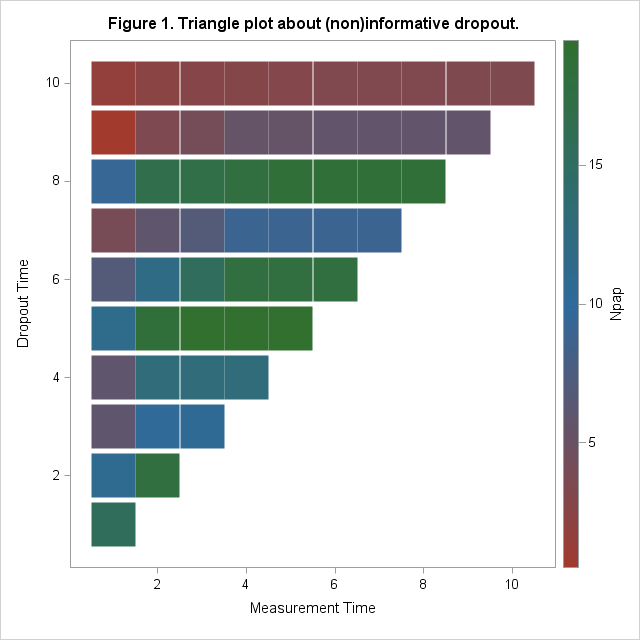
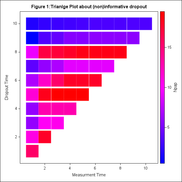
Just see a blog addressing that a Triangle Plot can be plotted by use the sample graph code. The author modified the dataset in SAS example, but I found there should be something wrong, as the dataset finally is not right, and also with the defined template, I can't get the plot below:
in sum, please help me: 1. correct the code in DATA tumor_ module; 2. correct the TEMPLATE so that can produce the sample graph I uploaded.
Thank you in advance,
Frank

data Tumor;
infile datalines missover;
input ID Time Dead Dose P1-P15;
label ID='Subject ID';
datalines;
1 47 1 1.0 0 5 6 8 10 10 10 10
2 71 1 1.0 0 0 0 0 0 0 0 0 1 1 1 1 1 1 1
3 81 0 1.0 0 1 1 1 1 1 1 1 1 1 1 1 1 1 1
4 81 0 1.0 0 0 0 0 0 0 0 0 0 0 0 0 0 0 0
5 81 0 1.0 0 0 0 0 0 0 0 0 0 0 0 0 0 0 0
6 65 1 1.0 0 0 0 1 1 1 1 1 1 1 1 1 1
7 71 0 1.0 0 0 0 0 0 0 0 0 0 0 0 0 0 0 0
8 69 0 1.0 0 0 0 0 0 0 0 0 0 0 0 0 0 0
9 67 1 1.0 0 0 1 1 2 2 2 2 3 3 3 3 3 3
10 81 0 1.0 0 0 0 0 0 0 0 0 0 0 0 0 0 0 0
11 37 1 1.0 9 9 9
12 81 0 1.0 0 0 0 0 0 0 0 0 0 0 0 0 0 0 0
13 77 0 1.0 0 0 0 0 1 1 1 1 1 1 1 1 1 1 1
14 81 0 1.0 0 0 0 0 0 0 0 0 0 0 0 0 0 0 0
15 81 0 1.0 0 0 0 0 0 0 0 0 0 0 0 0 0 0 0
16 54 0 2.5 0 1 1 1 2 2 2 2 2 2 2 2
17 53 0 2.5 0 0 0 0 0 0 0 0 0 0 0 0
18 38 0 2.5 5 13 14
19 54 0 2.5 2 6 6 6 6 6 6 6 6 6 6 6
20 51 1 2.5 15 15 15 16 16 17 17 17 17 17 17
21 47 1 2.5 13 20 20 20 20 20 20 20
22 27 1 2.5 22
23 41 1 2.5 6 13 13 13
24 49 1 2.5 0 3 3 3 3 3 3 3 3
25 53 0 2.5 0 0 1 1 1 1 1 1 1 1 1 1
26 50 1 2.5 0 0 2 3 4 6 6 6 6 6
27 37 1 2.5 3 15 15
28 49 1 2.5 2 3 3 3 3 4 4 4 4
29 46 1 2.5 4 6 7 9 9 9 9
30 48 0 2.5 15 26 26 26 26 26 26 26
31 54 0 10.0 12 14 15 15 15 15 15 15 15 15 15 15
32 37 1 10.0 12 16 17
33 53 1 10.0 3 6 6 6 6 6 6 6 6 6 6 6
34 45 1 10.0 4 12 15 20 20 20
35 53 0 10.0 6 10 13 13 13 15 15 15 15 15 15 20
36 49 1 10.0 0 2 2 2 2 2 2 2 2
37 39 0 10.0 7 8 8
38 27 1 10.0 17
39 49 1 10.0 0 6 9 14 14 14 14 14 14
40 43 1 10.0 14 18 20 20 20
41 28 0 10.0 8
42 34 1 10.0 11 18
43 45 1 10.0 10 12 16 16 16 16
44 37 1 10.0 0 1 1
45 43 1 10.0 9 19 19 19 19
;
run;
data tumor_;
set tumor;
drop p11-p15;
run;
/*==============NOTE TO BELOW COMMENTS================*/
/*There should be something wrong in the below data tumor1:*/
/*since droptime is defined as the last NUMBER of the variable with non-missing value;*/
/*for example: for subject id=1, the last nonmissing variable is P8, thus droptime=8,but the follwong code seems wrong*/
/*please help me to correct so that with this dataset, I can draw a sample graph*/
/*===================NOTE TO ABOVE COMMENTS================*/
/*Re-arrange the data so that we can plot the triangle plot */
data tumor1;
set tumor_;
ARRAY p[10];
do droptime=1 to DIM(p);
if MISSING (p[droptime]) then LEAVE;
end;
droptime=droptime+1;
do MeasureTime=1 to dim(p);
Npap=p[MeasureTime];
output;
end;
keep ID MeasureTime Npap droptime;
run;
PROC MEANS data=tumor1 nway NOPRINT;
CLASS droptime MeasureTime;
VAR Npap;
OUTPUT OUT=meanout mean=mean_Npap;
run;
/*how should change thses code to ensure with the dataset meanout, I can produce a sample graph?*/
proc template;
define statgraph scatterplot;
dynamic _X_ _Y_ _VMCG_ _MSIZE_ _LMCG_;
begingraph;
entrytitle "Figure 1:";
layout overlay;
scatterplot x=_X_ y=_Y_ /name='sca' markercolorgradient=_VMCG_ markerattrs=(symbol=squarefilled size=_MSIZE_);
discretelegend 'sca';
continuouslegend 'sca'/orient=vertical halign=right title=_LMCG_;
endlayout;
endgraph;
end;
run;
ods graphics on/width=1000 height=1000;
proc sgrender data=meanout template=scatterplot;
dynamic _X_='MeasureTime' _Y_='DropTime' _VCMG_='mean_Npap' _MSIZE_='30pt' _LMCG_='Npap';
label MeasureTime="Measurment Time" DropTime="Dropout Time";
run;
Accepted Solutions
- Mark as New
- Bookmark
- Subscribe
- Mute
- RSS Feed
- Permalink
- Report Inappropriate Content
When I replace markercolorgradient=_VMCG_ with the actual variable instead of the dynamic variable, markercolorgradient=mean_Npap then this works. Something about that option maybe doesn't like dynamic variables, though I don't see anything to that effect in the documentation.
I'm using SAS 9.2.3 on a Windows 7 platform.
- Mark as New
- Bookmark
- Subscribe
- Mute
- RSS Feed
- Permalink
- Report Inappropriate Content
If you have SAS 9.3, this will be a lot easier using the HeatMapParm statement.
See: Beer, diapers and heat map - Graphically Speaking
While the example here uses COLORGROUP=var, you can also use COLORRESPONSE=num-var.
- Mark as New
- Bookmark
- Subscribe
- Mute
- RSS Feed
- Permalink
- Report Inappropriate Content
Dear Prof. Sanjay,
Yes I read the link you mentioned below. Since this is my first time to use SAS do the Triangle plot, and I am not very familiar with the GTL. Yes, SAS 9.3 has such statement is more easy to use.
- Mark as New
- Bookmark
- Subscribe
- Mute
- RSS Feed
- Permalink
- Report Inappropriate Content
The triangular part isn't appearing because you need a (where=(mean_npap ne .)) data set option.
I also get warnings about the Continuouslegend assigned to a plot name that isn't assigned to any plot. Haven't figured that one out.
- Mark as New
- Bookmark
- Subscribe
- Mute
- RSS Feed
- Permalink
- Report Inappropriate Content
When I replace markercolorgradient=_VMCG_ with the actual variable instead of the dynamic variable, markercolorgradient=mean_Npap then this works. Something about that option maybe doesn't like dynamic variables, though I don't see anything to that effect in the documentation.
I'm using SAS 9.2.3 on a Windows 7 platform.
- Mark as New
- Bookmark
- Subscribe
- Mute
- RSS Feed
- Permalink
- Report Inappropriate Content
Dear Ballardw,
Thank you so much. I just did as your advice and you are right.
But I have another question about the result: How to control the color in the right gradient? You can see the upper is right, but the sample is dark green (if I am right)

- Mark as New
- Bookmark
- Subscribe
- Mute
- RSS Feed
- Permalink
- Report Inappropriate Content
The ColorMap= option allows you to override the default gradient used by the current active style. It appears that you would have to either add a new style element with the colors you want or may be able to use an existing element if it contains StartColor, NeutralColor and EndColor.
Or experiment with other SAS supplied styles to see if one fits your needs better.
Learn how use the CAT functions in SAS to join values from multiple variables into a single value.
Find more tutorials on the SAS Users YouTube channel.
SAS Training: Just a Click Away
Ready to level-up your skills? Choose your own adventure.


