- Home
- /
- Programming
- /
- Graphics
- /
- Re: How to draw a Parkes (Consensus) Error Grid?
- RSS Feed
- Mark Topic as New
- Mark Topic as Read
- Float this Topic for Current User
- Bookmark
- Subscribe
- Mute
- Printer Friendly Page
- Mark as New
- Bookmark
- Subscribe
- Mute
- RSS Feed
- Permalink
- Report Inappropriate Content
Hey everyone!
This is my first time on this forum so please let me know if you require any further information on the matter.
Basically, I am a hospital physician conducting an experiment looking into whether a glucose meter used heavily within our Department complies with the newly released guidelines. Now part of the new guidelines states the requirement of a Parkes Error Grid for all new meters i.e. they must demonstrate accuracy using this grid (Consensus error grid - Wikipedia, the free encyclopedia). Now I've looked into the grid itself e.g. read the original article and it seems to be an alteration of the original Clarke Error Grid. However, the new Parkes grid has different regions and so I am struggling to make such a graph using SAS; this is only worsened with my lack of experience using this tool! Therefore, I was wondering whether any of you kind people could help me with this matter. I have the paper that provides an outline of the co-ordinates for each region yet, once again, I am kind of stumped on how to approach this.
Thank you for your help.
- Mark as New
- Bookmark
- Subscribe
- Mute
- RSS Feed
- Permalink
- Report Inappropriate Content
At SAS Global Forum 2013, the paper #113-2013 - Creating Clark Error Grid using SAS/GRAPH and Annotate... by Yongyin Wang and John Shin of Medtronic Diabetes discussed using Annotate to create the Clarke Error Grid. Later, I wrote a Blog article on creating a similar Clarke Error Grid Graph using the SGPLOT procedure, without any Annotation. Between these two resources, you should be able to find the information you need for your use case of the Parkes Error Grid. Personally, I would go with the SGPLOT case.
In the SGPLOT case, the grid itself is created simply using the Series Plot statement. The points for the series are defined in the data as vertices of the plot.
- Mark as New
- Bookmark
- Subscribe
- Mute
- RSS Feed
- Permalink
- Report Inappropriate Content
Hey Sanjay,
Thank you for the help, I will try this out later on tonight.
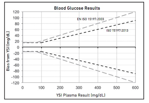
Just another question. How would I go about formulating a difference plot (Bland-Altman plot) using SAS where I can show clearly the limits defined by the guidelines as shown on the attached image (the black and shaded lines). Although I know that it is essentially a Bland-Altman plot, am a bit confused as to how to place the upper and lower limits defined in the EN ISO as a shaded line.
- Mark as New
- Bookmark
- Subscribe
- Mute
- RSS Feed
- Permalink
- Report Inappropriate Content
This seems like an unrelated question. Maybe you can separate it for convenience of other readers.
This graphs seems very straightforward. In the graph above, the upper and lower limits have patterns and different colors, but not realy "shaded". It could be shaded using fill colors if you want. This can be done using the BAND plot, using the X, UPPER and LOWER parameters. You can use GROUPed band in one statement, or overlay two separate bands. You can use FILLED or OUTLINED bands. You can also use a SERIES plot if you want but I would not recommend it. Use STYLE=JOURNAL for gray scale graph with line patterns.
The labels can be placed at the ends using the LABEL option. Or, if you want the label in the middle, you can put the label in another column at a vertex in the middle with others as missing. Then use the DATALABEL option. Or, use a separate overlaid scatter plot with markercharacter. Which release of SAS are you using?
- Mark as New
- Bookmark
- Subscribe
- Mute
- RSS Feed
- Permalink
- Report Inappropriate Content
Thank you for advice Sanjay. However, I am relatively new to the whole SAS scene and am struggling to get to grips with how to go about devising the graphs. Is there any way that a template could be devised which I could simply access and plug my values into? If not, is there any means of discussing this further e.g. over private communication so we can see how to best combat this problem.
With regards to what release of SAS I am using, I am currently utilising version 9.3 of SAS.
Thanks
- Mark as New
- Bookmark
- Subscribe
- Mute
- RSS Feed
- Permalink
- Report Inappropriate Content
Here is a graph with simulated data and bands as shown in your graph. Code is attached.
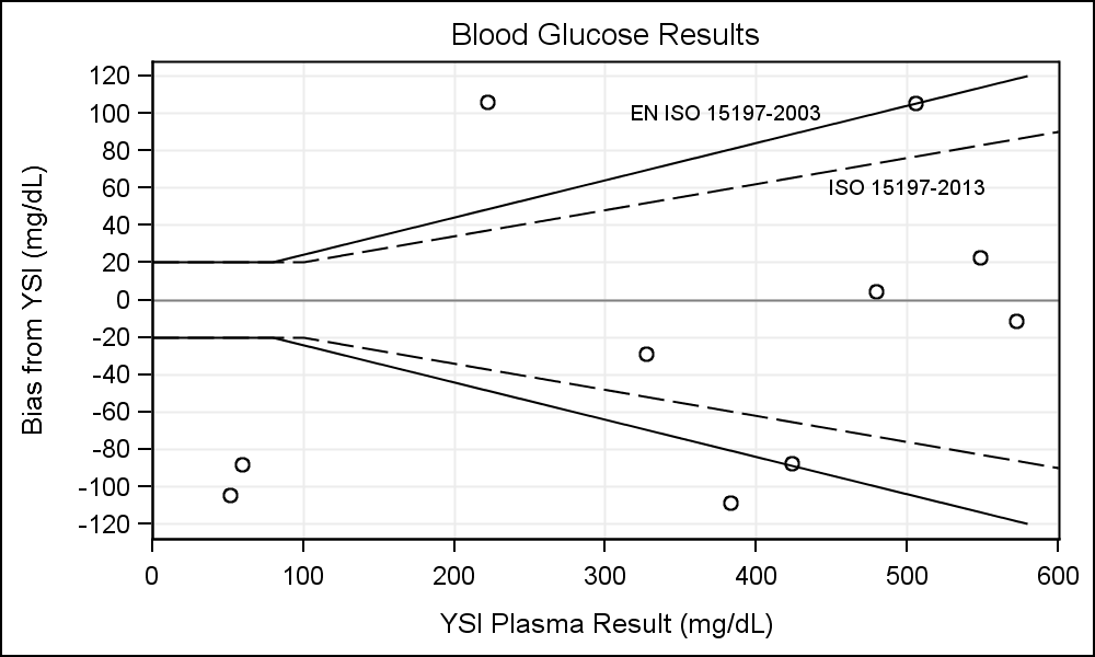
The second scatter plot is used to add the band names. You could also use a legend instead.
- Mark as New
- Bookmark
- Subscribe
- Mute
- RSS Feed
- Permalink
- Report Inappropriate Content
Hello Sanjay,
Thanks for all the help but I need a bit more help if possible. This post will be related to the Bland-Altman plot and I will make a separate post with regards to the Parkes Consensus Grid:
With the Bland-Altman plot, I was wondering whether you could help me with the following:
1) How to insert my own data. Although I know you used simulated data, I am struggling to insert my own data set within the graph. Is there any way you could alter the SAS code so I can start adding my own data. I know I am relatively new so if doing this was obvious then I apologise. If you in the code use a point such as YSI Plasma Result = 500 and Bias from YSI = 40 and another point being x= 300 and y = 100 (both made up results) then I will be able to clearly see where to continue inserting my own data.
2) Is there any way of changing the colour of the lines representing the criteria for 2003 and 2013? Similarly, how would I go about changing the colour of the text too.
3) Is there any way of changing the location of the points from a circle to say a cross?
4) Is there any way to change the font size and font text for both the axis and the labels (EN ISO 15197-2003 and ISO 15197-2013)? I would like to standardise mine to Times New Roman if possible
5) On the axis, the grid seems to go both above 120 and below - 120 on the y axis and slight past the 600 mark on the x axis. Is there any way of removing this so that the graph margin ends at 600 on the x-axis and the origin of the graph is (0,-120) and upper border of the graph stops at (0,120)
Thank you again for the help Sanjay!
- Mark as New
- Bookmark
- Subscribe
- Mute
- RSS Feed
- Permalink
- Report Inappropriate Content
Dear Motiv3,
Did you by any chance find a way to insert your own data? I would very much appreciate it if you would like to share your code!
Thanks you so much in advance!
Kind regards,
Rody
- Mark as New
- Bookmark
- Subscribe
- Mute
- RSS Feed
- Permalink
- Report Inappropriate Content
Once again Sanjay, thank you for the help but I am struggling to get to grips with constructing the Parkes Error Grid. Being so new to using SAS, it's a real struggle trying to construct this grid and I was wondering whether you could possibly help me formulate the SAS code.
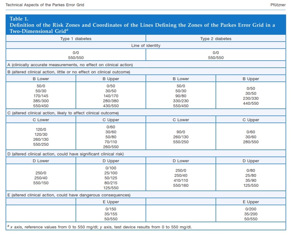
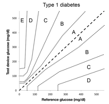
1) One issue I am having is with the new region co-ordinates. I've attached the actual paper to this post (page 2 and 3 of the PDF - refer to the co-ordinates to make the grid for Type 1 Diabetes Mellitus). I just can't seem to get it to work.
2) If we can devise a way to get the above co-ordinates into your SGPLOT method (as on your blog) will all the other attributes you had in your Clarkes grid be transferred over e.g. colour scheme, percentage of points within each grid? If so, could you possibly integrate this within the code for the new Parkes grid?
3) I also can't seem to get my data across into the graph as points. Could you possibly in the code put in some values ive made up e.g. reference glucose = 200 and test device glucose = 400. If i can see where this data has been placed within the code, I can go from there and use my own data.
Apologies for all the questions but I really do appreciate the great help you've given me!
- Mark as New
- Bookmark
- Subscribe
- Mute
- RSS Feed
- Permalink
- Report Inappropriate Content
I think some self-study is in order. I suggest you review the documentation for the SGPLOT procedure to get a handle of the features available to you. I would recomment my book SG Procedures by Example to get started. You can also refer to many articles on my blog. While I can certainly help out on specific questions, writing up whole programs is beyond what I can do. Maybe someone else will chime in. Good luck.
- Mark as New
- Bookmark
- Subscribe
- Mute
- RSS Feed
- Permalink
- Report Inappropriate Content
Ah that is fair enough Sanjay,
If you could possibly help with with my queries on the Bland Altman Plot and any you feel you can answer on the Parkes Error Grid then I would be extremely grateful.
Thank you.
- Mark as New
- Bookmark
- Subscribe
- Mute
- RSS Feed
- Permalink
- Report Inappropriate Content
The data set I created for the points only has X & Y columns. I assume you data is similar. You can merge your data to the Band and labels data exactly the same way. If you are using a group variable with band plot, the colors come from GraphData1 and GraphData2 style elements. With SAS 9.3, you will need to derive your own style, and change these colors to the ones you want. To use a different marker, just use MARKERATTRS=(SYMBOL=PLUS) in the scatter plot statement after the /. Or any other supported symbol. The space beyong 120 is the offset needed to draw a marker that may land at the edge. Aet XAXIS or YAXIS OFFSETMIN of OFFSETMax to zero. Note, any markers falling on the edges will be truncated.
- Mark as New
- Bookmark
- Subscribe
- Mute
- RSS Feed
- Permalink
- Report Inappropriate Content
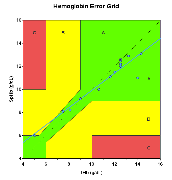
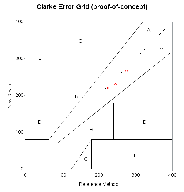
Here are 2 examples created using SAS/Graph gplot - click the links to see the SAS code ...
http://robslink.com/SAS/democd61/hemoglobin_error_grid_info.htm
http://robslink.com/SAS/democd61/clarke_error_grid_info.htm
- Mark as New
- Bookmark
- Subscribe
- Mute
- RSS Feed
- Permalink
- Report Inappropriate Content
thanks a lot for providing the reference. The code pasted was worked well.
I am New to SAS and facing difficulty while constructing this.could you please tell me how to get percentage for different zones.in the mentioned code.
- Mark as New
- Bookmark
- Subscribe
- Mute
- RSS Feed
- Permalink
- Report Inappropriate Content
I'm not sure what u r asking. I also forwarded your message to Scott Pardo also on the original paper. He. Is the statistician.
April 27 – 30 | Gaylord Texan | Grapevine, Texas
Registration is open
Walk in ready to learn. Walk out ready to deliver. This is the data and AI conference you can't afford to miss.
Register now and save with the early bird rate—just $795!
Learn how use the CAT functions in SAS to join values from multiple variables into a single value.
Find more tutorials on the SAS Users YouTube channel.
SAS Training: Just a Click Away
Ready to level-up your skills? Choose your own adventure.


