- Home
- /
- Programming
- /
- Graphics
- /
- How to display Regression Line and R-Squared value
- RSS Feed
- Mark Topic as New
- Mark Topic as Read
- Float this Topic for Current User
- Bookmark
- Subscribe
- Mute
- Printer Friendly Page
- Mark as New
- Bookmark
- Subscribe
- Mute
- RSS Feed
- Permalink
- Report Inappropriate Content
Hi,
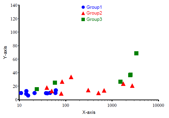
I have SAS 9.2 and I need to display the linear regression line and R-Squared or the p-value on the plot. I have three groups and my plot looks something like attached.
Is it possible to display the regression line superimposed on the colored dots? I am trying the following for scatter plot and regression analysis:
proc gplot data = plot_data anno= anno ;
plot yaxis*xaxis=cohort_no /vaxis=axis1 haxis=axis nolegend noframe;
run;
proc reg data = plot_data anno= anno1 ;
model yaxis = xaxis;
plot yaxis*xaxis ;
run;
Thanks a lot

Accepted Solutions
- Mark as New
- Bookmark
- Subscribe
- Mute
- RSS Feed
- Permalink
- Report Inappropriate Content
Most statisticians do not use the old PLOTS statement anymore. Instead, most use ODS statistical graphics, which are produced automatically by most SAS/STAT procedures. See the following two examples:
ods graphics on;
proc reg data =sashelp.class plots=FitPlot(stats=DEFAULT);
model weight = height;
quit;

proc glm data =sashelp.class plots=FitPlot;
class sex;
model weight = height | sex;
quit;
For an overview, see Rodriguez (2009) "Getting Started with ODS Statistical Graphics in SAS 9.2."
- Mark as New
- Bookmark
- Subscribe
- Mute
- RSS Feed
- Permalink
- Report Inappropriate Content
If you want to continue with GPLOT your solution would involve setting a Symbol statement to show the desired regression for each level of your cohort_no.
Something like
symbol1 i=RL color=red;
The i or Interpol option R is for regression options are availble for showing confidence limits of individual responses or the mean and the interval for the confidence limits as well.
- Mark as New
- Bookmark
- Subscribe
- Mute
- RSS Feed
- Permalink
- Report Inappropriate Content
Thanks for the reply.
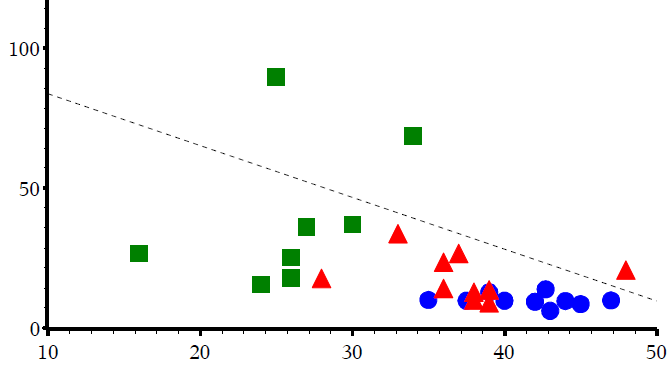
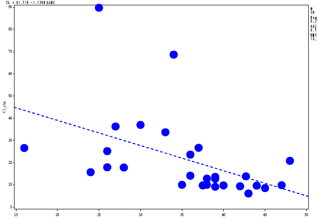
I amting two get different regression line plots, when I use PROC REG and when I use proc gplot see below, could you help me why?
Code:
For R squared value using proc reg
proc reg data = plot_data outest=reg_val outsscp=sscp1 rsquare;
model yaxis = xaxis ;
plot yaxis*xaxis;
run;
quit;
for scatter plot using gplot
symbol1 i=none v=dot w=2 l=3 h=4 color=blue;
symbol2 i=none v=C w=2 l=4 h=2.5 f=marker color=red;
symbol3 i=none v=U w=2 l=4 h=2.5 f=marker color=green;
symbol4 i=none w=2 l=3 h=3 i=rl color=black;
proc gplot data = plot_data anno= anno1 ;
plot yaxis*xaxis=cohort_no /vaxis=axis1 haxis=axis2 nolegend noframe;
plot2 yaxis*xaxis/ noaxis;
run;
quit;


Catch up on SAS Innovate 2026
Dive into keynotes, announcements and breakthroughs on demand.
Explore Now →Learn how use the CAT functions in SAS to join values from multiple variables into a single value.
Find more tutorials on the SAS Users YouTube channel.
SAS Training: Just a Click Away
Ready to level-up your skills? Choose your own adventure.


