- Home
- /
- Programming
- /
- Graphics
- /
- How to code the plot showing the incidence over time
- RSS Feed
- Mark Topic as New
- Mark Topic as Read
- Float this Topic for Current User
- Bookmark
- Subscribe
- Mute
- Printer Friendly Page
- Mark as New
- Bookmark
- Subscribe
- Mute
- RSS Feed
- Permalink
- Report Inappropriate Content
Hi all,
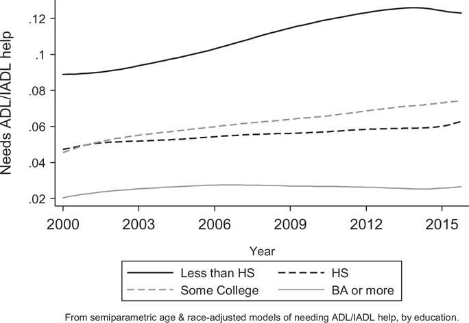
I am wondering how can plot the following figure showing the incidence over time. This figure is from the published paper Zajacova A, Montez JK. Physical Functioning Trends among US Women and Men Age 45-64 by Education Level. Biodemography Soc Biol. 2017;63(1):21-30. doi: 10.1080/19485565.2016.1263150. PMID: 28287310; PMCID: PMC5494255.
I am wondering how to code this kind of figure. I would really appreciate your help.
Accepted Solutions
- Mark as New
- Bookmark
- Subscribe
- Mute
- RSS Feed
- Permalink
- Report Inappropriate Content
The data set should contain a variable for the Xaxis, the Yaxis and a group variable, such as education.
The type of graph would be a Series, if the data has lots of dates for the example, or a Spline to smooth data .
If the data consists of one value per year then likely a Spline. Your SAS install should have the SASHELP.STOCKS data set that would allow you to run the following example:
proc sgplot data=sashelp.stocks;
   title "Series plot of daily opening stock prices";
   series x=date y=open /group=stock ;
run;

proc summary  data=sashelp.stocks nway;
   class stock date;
   format date year4.;
   var open;
   output out=splineplot (drop=_type_ _freq_) mean=;
run;

proc sgplot data=splineplot;
   title "Spline plot of annual average opening stock prices";
   spline x=date y=open /group=stock ;
run;
proc sgplot data=splineplot;
   title "Series plot of annual average opening stock prices";
   series x=date y=open /group=stock ;
run;
The examples show daily data, then summarize the values to one value per year and plot with both a Spline and Series plot. Splines apply smoothing functions to make nicer curves. You see the role of Group variable to create different line types and legend entries to describe the lines.
Read the description of Spline for some details affecting interpretation of the appearance in the online help.
There are many options to control appearance once you get a basic graph of the type you want.
@YYK273 wrote:
Hi all,
I am wondering how can plot the following figure showing the incidence over time. This figure is from the published paper Zajacova A, Montez JK. Physical Functioning Trends among US Women and Men Age 45-64 by Education Level. Biodemography Soc Biol. 2017;63(1):21-30. doi: 10.1080/19485565.2016.1263150. PMID: 28287310; PMCID: PMC5494255.
I am wondering how to code this kind of figure. I would really appreciate your help.
- Mark as New
- Bookmark
- Subscribe
- Mute
- RSS Feed
- Permalink
- Report Inappropriate Content
It would certainly help to see a portion of your SAS data set (not an Excel file). Please provide the data as working SAS data step code, as shown in these examples and instructions. Do not provide data in other form. Do not ignore this request.
In general this is done via PROC SGPLOT. Depending on your data, we can be more specific.
Paige Miller
- Mark as New
- Bookmark
- Subscribe
- Mute
- RSS Feed
- Permalink
- Report Inappropriate Content
- Mark as New
- Bookmark
- Subscribe
- Mute
- RSS Feed
- Permalink
- Report Inappropriate Content
The data set should contain a variable for the Xaxis, the Yaxis and a group variable, such as education.
The type of graph would be a Series, if the data has lots of dates for the example, or a Spline to smooth data .
If the data consists of one value per year then likely a Spline. Your SAS install should have the SASHELP.STOCKS data set that would allow you to run the following example:
proc sgplot data=sashelp.stocks;
   title "Series plot of daily opening stock prices";
   series x=date y=open /group=stock ;
run;

proc summary  data=sashelp.stocks nway;
   class stock date;
   format date year4.;
   var open;
   output out=splineplot (drop=_type_ _freq_) mean=;
run;

proc sgplot data=splineplot;
   title "Spline plot of annual average opening stock prices";
   spline x=date y=open /group=stock ;
run;
proc sgplot data=splineplot;
   title "Series plot of annual average opening stock prices";
   series x=date y=open /group=stock ;
run;
The examples show daily data, then summarize the values to one value per year and plot with both a Spline and Series plot. Splines apply smoothing functions to make nicer curves. You see the role of Group variable to create different line types and legend entries to describe the lines.
Read the description of Spline for some details affecting interpretation of the appearance in the online help.
There are many options to control appearance once you get a basic graph of the type you want.
@YYK273 wrote:
Hi all,
I am wondering how can plot the following figure showing the incidence over time. This figure is from the published paper Zajacova A, Montez JK. Physical Functioning Trends among US Women and Men Age 45-64 by Education Level. Biodemography Soc Biol. 2017;63(1):21-30. doi: 10.1080/19485565.2016.1263150. PMID: 28287310; PMCID: PMC5494255.
I am wondering how to code this kind of figure. I would really appreciate your help.
Catch up on SAS Innovate 2026
Dive into keynotes, announcements and breakthroughs on demand.
Explore Now →Learn how use the CAT functions in SAS to join values from multiple variables into a single value.
Find more tutorials on the SAS Users YouTube channel.
SAS Training: Just a Click Away
Ready to level-up your skills? Choose your own adventure.


