- Home
- /
- Programming
- /
- Graphics
- /
- How to change the unit margins on xaxis (lengthen margin or smaller fo...
- RSS Feed
- Mark Topic as New
- Mark Topic as Read
- Float this Topic for Current User
- Bookmark
- Subscribe
- Mute
- Printer Friendly Page
- Mark as New
- Bookmark
- Subscribe
- Mute
- RSS Feed
- Permalink
- Report Inappropriate Content
Hi all,
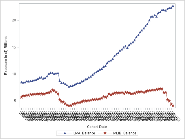
I used a sgplot in SAS 9.3 EG to plot the relationship between two types of account balances. The x-axis shows dates in character format, such as YYYYMM, from 2007 to 2013. Please see the image below.

The dates on the x-axis is very messy looking, so I was hoping to do either one of the following to clean this up.
1. Provide x-axis in greater margins, maybe only show a few period dates.
2. Print smaller fonts, hopefully these dates will fit onto the axis.
The code I have is attached as follows:
proc sgplot data=Exposure_Amt uniform=scale;
series x=PROC_YYMM_DT y=LMA_Balance / markers markerattrs= (symbol=trianglefilled);
series x=PROC_YYMM_DT y=MLIB_Balance / markers markerattrs= (symbol=starfilled);
xaxis label = 'Cohort Date' values=(200701 to 201312 by 10000);
yaxis label = 'Exposure in ($) Billions';
title 'Total Outstanding Balance';
run;
where Exposure_Amt was imported from an Excel worksheet in this format:
| PROC_YYMM_DT | LMA_Balance | MLIB_Balance |
| 200701 | 8.47 | 5.66 |
| 200702 | 8.40 | 5.96 |
| 200703 | 8.49 | 5.96 |
| 200704 | 8.68 | 6.05 |
| 200705 | 8.66 | 6.05 |
| 200706 | 8.67 | 6.24 |
| 200707 | 8.71 | 6.15 |
| 200708 | 8.85 | 6.27 |
| 200709 | 8.95 | 6.29 |
| 200710 | 9.11 | 6.34 |
| 200711 | 9.33 | 6.28 |
| 200712 | 9.41 | 6.34 |
| 200801 | 9.17 | 6.27 |
| 200802 | 9.30 | 6.38 |
| 200803 | 9.58 | 6.46 |
| 200804 | 10.02 | 6.57 |
| 200805 | 10.25 | 6.72 |
| 200806 | 10.19 | 7.00 |
| 200807 | 10.04 | 6.90 |
| 200808 | 10.12 | 6.66 |
| 200809 | 10.16 | 6.36 |
| 200810 | 8.72 | 5.19 |
| 200811 | 8.39 | 4.84 |
| 200812 | 8.31 | 4.75 |
I read online you could use the values=( by ) statement under xaxis, but only for numerical values. Any input on this will be greatly appreciated.
Accepted Solutions
- Mark as New
- Bookmark
- Subscribe
- Mute
- RSS Feed
- Permalink
- Report Inappropriate Content
SGPANEL is available in SAS 9.3.
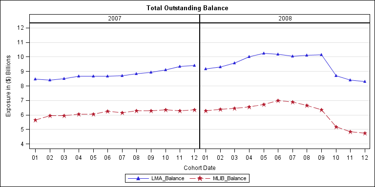
I am not sure what you want, but one way is what I have shown below. I made your date character, extracted year and month, and used SGPANEL to make this graph using SAS 9.3. This cleans up the axis. You can format the axis values 1-12 to Jan, Feb, etc. if you want. You can also make your date as numeric with a date format.
You can place the cells side by side (as below), or stacked.

data exposure;
input date $ LMA_Balance MLIB_Balance;
year=substr(date, 1, 4);
month=substr(date, 5, 2);
datalines;
200701 8.47 5.66
200702 8.40 5.96
200703 8.49 5.96
200704 8.68 6.05
200705 8.66 6.05
200706 8.67 6.24
200707 8.71 6.15
200708 8.85 6.27
200709 8.95 6.29
200710 9.11 6.34
200711 9.33 6.28
200712 9.41 6.34
200801 9.17 6.27
200802 9.30 6.38
200803 9.58 6.46
200804 10.02 6.57
200805 10.25 6.72
200806 10.19 7.00
200807 10.04 6.90
200808 10.12 6.66
200809 10.16 6.36
200810 8.72 5.19
200811 8.39 4.84
200812 8.31 4.75
;
run;
ods html close;
ods listing;
ods graphics / reset width=8in height=4in imagename='Exposure';
proc sgpanel data=exposure;
panelby year / layout=panel columns=2 onepanel uniscale=row novarname;
series x=month y=LMA_Balance / markers markerattrs= (symbol=trianglefilled);
series x=month y=MLIB_Balance / markers markerattrs= (symbol=starfilled);
colaxis label = 'Cohort Date' values=(200701 to 201312 by 10000);
rowaxis label = 'Exposure in ($) Billions' values=(5 to 12 by 1) grid;
title 'Total Outstanding Balance';
run;
- Mark as New
- Bookmark
- Subscribe
- Mute
- RSS Feed
- Permalink
- Report Inappropriate Content
I might try something like:
xaxis label = 'Cohort Date' values=(200701 to 201401 by 100);
I think you are getting to many as the current version the upper bound is not greater than the increment of 10000 added to the base value of 200701.
xaxis label = 'Cohort Date' values=(200701 to 201312 by 10000);
- Mark as New
- Bookmark
- Subscribe
- Mute
- RSS Feed
- Permalink
- Report Inappropriate Content
Sorry, it didn't work... ![]()
I thought about converting the whole x-axis to numerical value, but then the gap between 200712 and 200801 would be much bigger than the gap between 200709 and 200712.
- Mark as New
- Bookmark
- Subscribe
- Mute
- RSS Feed
- Permalink
- Report Inappropriate Content
Personally, I would use a Date format on the column mapped to the x-axis with real SAS date values. You will then get a nice "Time" axis that will only show the necessary tick values. If you must have a character axis, you can set the Fit policy on the X axis to "THIN".
Please always include the SAS release number. SAS 9.4 allows you to break the axis. Or, you can separate the 2007 and 2008 values using a class variable into two side by side cells using SGPANEL.
- Mark as New
- Bookmark
- Subscribe
- Mute
- RSS Feed
- Permalink
- Report Inappropriate Content
Thanks Sanjay. I'm using SAS 9.3 and seems like sgpanel is only for 9.4. And we won't have that until late May i think.
So, in this scenerio i have, what other options do I have? Could I simply reduce the size of the font instead to make this work?
- Mark as New
- Bookmark
- Subscribe
- Mute
- RSS Feed
- Permalink
- Report Inappropriate Content
SGPANEL is available in SAS 9.3.
I am not sure what you want, but one way is what I have shown below. I made your date character, extracted year and month, and used SGPANEL to make this graph using SAS 9.3. This cleans up the axis. You can format the axis values 1-12 to Jan, Feb, etc. if you want. You can also make your date as numeric with a date format.
You can place the cells side by side (as below), or stacked.

data exposure;
input date $ LMA_Balance MLIB_Balance;
year=substr(date, 1, 4);
month=substr(date, 5, 2);
datalines;
200701 8.47 5.66
200702 8.40 5.96
200703 8.49 5.96
200704 8.68 6.05
200705 8.66 6.05
200706 8.67 6.24
200707 8.71 6.15
200708 8.85 6.27
200709 8.95 6.29
200710 9.11 6.34
200711 9.33 6.28
200712 9.41 6.34
200801 9.17 6.27
200802 9.30 6.38
200803 9.58 6.46
200804 10.02 6.57
200805 10.25 6.72
200806 10.19 7.00
200807 10.04 6.90
200808 10.12 6.66
200809 10.16 6.36
200810 8.72 5.19
200811 8.39 4.84
200812 8.31 4.75
;
run;
ods html close;
ods listing;
ods graphics / reset width=8in height=4in imagename='Exposure';
proc sgpanel data=exposure;
panelby year / layout=panel columns=2 onepanel uniscale=row novarname;
series x=month y=LMA_Balance / markers markerattrs= (symbol=trianglefilled);
series x=month y=MLIB_Balance / markers markerattrs= (symbol=starfilled);
colaxis label = 'Cohort Date' values=(200701 to 201312 by 10000);
rowaxis label = 'Exposure in ($) Billions' values=(5 to 12 by 1) grid;
title 'Total Outstanding Balance';
run;
- Mark as New
- Bookmark
- Subscribe
- Mute
- RSS Feed
- Permalink
- Report Inappropriate Content
Thanks Sanjay. This produces output a bit different from what I was expecting, but might work even better.
Again, thanks for your help on this.
- Mark as New
- Bookmark
- Subscribe
- Mute
- RSS Feed
- Permalink
- Report Inappropriate Content
This is just one suggestion to show you what is possible.
- Mark as New
- Bookmark
- Subscribe
- Mute
- RSS Feed
- Permalink
- Report Inappropriate Content
If the variable isn't numeric the whole "from to by" structure doesn't really work.
- Mark as New
- Bookmark
- Subscribe
- Mute
- RSS Feed
- Permalink
- Report Inappropriate Content
I assumed the data on x axis was character since there are so many rotated tick values By default, SGPLOT will not display so many rotated tick values for numeric data. You will get only a few "nice" values.
Catch up on SAS Innovate 2026
Dive into keynotes, announcements and breakthroughs on demand.
Explore Now →Learn how use the CAT functions in SAS to join values from multiple variables into a single value.
Find more tutorials on the SAS Users YouTube channel.
SAS Training: Just a Click Away
Ready to level-up your skills? Choose your own adventure.


