- Home
- /
- Programming
- /
- Graphics
- /
- Re: How do I plot diary data using SGPLOT HIGHLOW
- RSS Feed
- Mark Topic as New
- Mark Topic as Read
- Float this Topic for Current User
- Bookmark
- Subscribe
- Mute
- Printer Friendly Page
- Mark as New
- Bookmark
- Subscribe
- Mute
- RSS Feed
- Permalink
- Report Inappropriate Content
I have plots I created in SGPLOT to show the use of three product forms over time. There is a plot for each panelist and all of the products used show up as a rectangle. There are three product types - sometimes they overlap and there can be many uses. The data are formatted such that each row is a product used and each subject can have any number of uses (usually < 20).
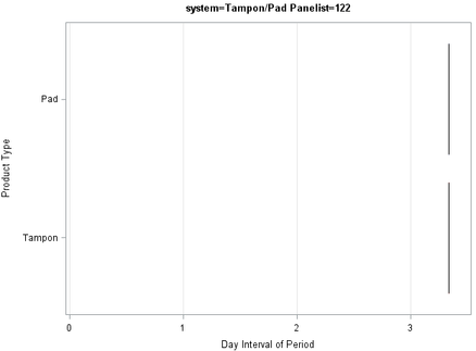
I used SGPLOT highlow to basically draw a series of rectangles for each product used and the type of product on the y-axis but the code is no longer working and I am unsure what changed. The data is the same as before but now I only see a single line at the end of the plot rather than rectangles. What would cause that?
proc sgplot data=use noautolegend nocycleattrs; highlow y=form low=on high=off / group=abs2type=bar barwidth=0.8 lineattrs=(color=black pattern=1) name='Form' x2axis; *--Assign dummy plot to create independent X2 axis--*; scatter x=day_int y=form / markerattrs=(size=0);
Accepted Solutions
- Mark as New
- Bookmark
- Subscribe
- Mute
- RSS Feed
- Permalink
- Report Inappropriate Content
Hard to tell without seeing your current graph and your data. But looking at your code, nothing guarantees that your X1 and X2 axes will line up properly. It would be a lot safer to convert your on and off dates into days since beginning and drop the dummy plot.
- Mark as New
- Bookmark
- Subscribe
- Mute
- RSS Feed
- Permalink
- Report Inappropriate Content
I am not sure I am understanding what you mean by " I only see a single line at the end of the plot rather than rectangles".
I don't see anything that jumps out as "being a single line". The only thing I see are black lines that look a lot like they would come from almost overlapping areas.
- Mark as New
- Bookmark
- Subscribe
- Mute
- RSS Feed
- Permalink
- Report Inappropriate Content
Hard to tell without seeing your current graph and your data. But looking at your code, nothing guarantees that your X1 and X2 axes will line up properly. It would be a lot safer to convert your on and off dates into days since beginning and drop the dummy plot.
- Mark as New
- Bookmark
- Subscribe
- Mute
- RSS Feed
- Permalink
- Report Inappropriate Content
This worked - I created a lag variable for the day interval variable and used those in the highlow. Thank you!
- Mark as New
- Bookmark
- Subscribe
- Mute
- RSS Feed
- Permalink
- Report Inappropriate Content
Apologies - I only included what the plot used to look like. It now looks like this:
- Mark as New
- Bookmark
- Subscribe
- Mute
- RSS Feed
- Permalink
- Report Inappropriate Content
Hi, hard to understand what you really want in this. Seem like a Gantt chart to me. Hard to see what has gone wrong withut the data in a better form. Maby a vector plot can work better.
- Mark as New
- Bookmark
- Subscribe
- Mute
- RSS Feed
- Permalink
- Report Inappropriate Content
I tried a GANTT plot but it puts each product use on its own line vs showing all the uses of a form in a row (like in the first picture). I wasn't able to figure out what to change to make GANTT work. Thank you for the suggestion.
- Mark as New
- Bookmark
- Subscribe
- Mute
- RSS Feed
- Permalink
- Report Inappropriate Content
There is a keep at same line example. It is a long time since I used that but there is a good example for a salesman visiting several cities.
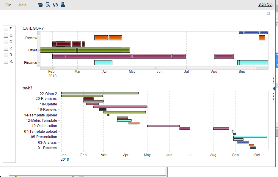
This is an example using two gant viewers in VA. The top one has over lapping dates as you had some challenges with using high-low. If you have VA available that might be the best solution, because of mouse over etc. The gantt procedure is a bit quarrelsome to get nics.
Catch up on SAS Innovate 2026
Dive into keynotes, announcements and breakthroughs on demand.
Explore Now →Learn how use the CAT functions in SAS to join values from multiple variables into a single value.
Find more tutorials on the SAS Users YouTube channel.
SAS Training: Just a Click Away
Ready to level-up your skills? Choose your own adventure.


