- Home
- /
- Programming
- /
- Graphics
- /
- How do I make PCA dots be identified?
- RSS Feed
- Mark Topic as New
- Mark Topic as Read
- Float this Topic for Current User
- Bookmark
- Subscribe
- Mute
- Printer Friendly Page
- Mark as New
- Bookmark
- Subscribe
- Mute
- RSS Feed
- Permalink
- Report Inappropriate Content
I have been doing PCA in SAS University Edition recently and now, I have got 800 observations plotted on the graph. My problem is that each individual dot could not be distinguised due to the large number of samples that we have. Is there a way for me to make the dots and labels smaller for overlap avoidance? Or, can we fish out which samples we are interested in through gating?
Thanks
- Mark as New
- Bookmark
- Subscribe
- Mute
- RSS Feed
- Permalink
- Report Inappropriate Content
What does your code look like?
- Mark as New
- Bookmark
- Subscribe
- Mute
- RSS Feed
- Permalink
- Report Inappropriate Content
- Mark as New
- Bookmark
- Subscribe
- Mute
- RSS Feed
- Permalink
- Report Inappropriate Content
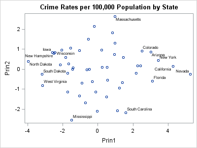
I'm going to assume that you are most interested in labeling the extreme observations. The easiest way to control the labels is to use the OUT= option on the PROC PRINCOMP statement to write the PC scores to a data set. Then use some distance criterion to identify the extreme observations. You can then create a label variable that is blank for non-extreme observations and non-blank for extreme observations.
The following example uses the data from the Getting Started example in the doc. It creates a new character variable that is non-blank for observations that are more than 2.5 units away from the origin in the coordinates of the first two PCs:
%let OutlierDist = 2.5;
data Outliers;
set Crime_Components;
dist = Euclid(Prin1, Prin2);
ObsLabel = ifc(dist > &OutlierDist, State, " ");
run;

proc sgplot data=Outliers;
scatter x=Prin1 y=Prin2 / datalabel=ObsLabel;
run;Catch up on SAS Innovate 2026
Dive into keynotes, announcements and breakthroughs on demand.
Explore Now →Learn how use the CAT functions in SAS to join values from multiple variables into a single value.
Find more tutorials on the SAS Users YouTube channel.
SAS Training: Just a Click Away
Ready to level-up your skills? Choose your own adventure.


