- Home
- /
- Programming
- /
- Graphics
- /
- How do I create an Epi Curve with Proc sgplot?
- RSS Feed
- Mark Topic as New
- Mark Topic as Read
- Float this Topic for Current User
- Bookmark
- Subscribe
- Mute
- Printer Friendly Page
- Mark as New
- Bookmark
- Subscribe
- Mute
- RSS Feed
- Permalink
- Report Inappropriate Content
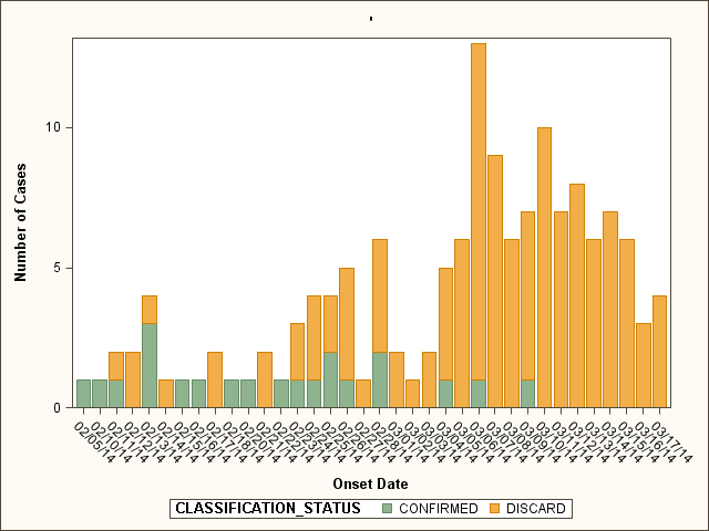
I have a dataset with case ID, classification status, disease, and symptom onset date. I want to create a graph where the x axis is onset date and the y axis is the number of cases with that onset date. I can manage to get a graph with the code below, but i want to include dates on the x axis even if there are no cases with that onset date.
proc sgplot data=cases;
vbar onset / group=classification_status;
xaxis label='Onset Date';
yaxis label='Number of Cases';
where disease='MEAS' and classification_status in ('CONFIRMED','DISCARD') and onset>19758 and onset<19800;
format onset mmddyy8.;
run;

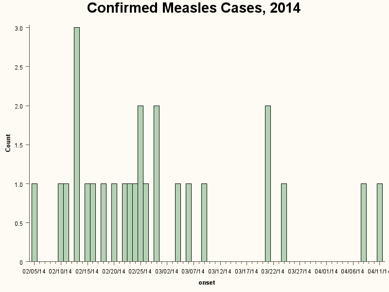
I have also been able to use proc univariate to display a graph that includes onset dates with 0 cases, but I am unable to use a group statement to color the bars according to classification status.
proc univariate data=cases plot noprint;
var onset;
where disease='MEAS' and classification_status in ('CONFIRMED','DISCARD') and onset>19758 and onset<19900;
format onset mmddyy8.;
histogram / noframe vscale=count midpoints= 19759, 19760, 19761, 19762, 19763,...etc...19800;
run;

so the first graph the first graph shows groups with different colors and the second graph shows dates with 0 counts. i want to have both in 1 chart!
also would like to extend the x axis or rotate the labels so the dates aren't all squished together.
i would appreciate any suggestions. thanks!
Accepted Solutions
- Mark as New
- Bookmark
- Subscribe
- Mute
- RSS Feed
- Permalink
- Report Inappropriate Content
Do you want to show 0 or have no bar for the dates without any cases?
If no value you should be able to get that by adding a value list to your XAXIS definition like values=("15FEB2014"D to "17MAR2014"D by day)
Note: the date literals MUST be in the format above "ddMMMyy"d
- Mark as New
- Bookmark
- Subscribe
- Mute
- RSS Feed
- Permalink
- Report Inappropriate Content
Repost this under the Graphics community and then the SAS graphics guru will assist ![]()
- Mark as New
- Bookmark
- Subscribe
- Mute
- RSS Feed
- Permalink
- Report Inappropriate Content
Do you want to show 0 or have no bar for the dates without any cases?
If no value you should be able to get that by adding a value list to your XAXIS definition like values=("15FEB2014"D to "17MAR2014"D by day)
Note: the date literals MUST be in the format above "ddMMMyy"d
- Mark as New
- Bookmark
- Subscribe
- Mute
- RSS Feed
- Permalink
- Report Inappropriate Content
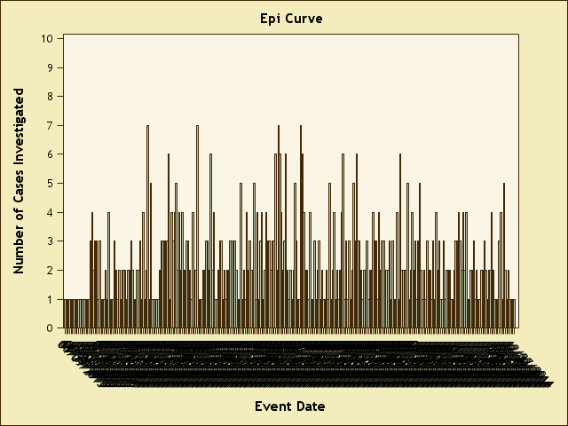
That's exactly what i'm looking for I think. So now I have
proc sgplot data=timeliness2;
vbar event_dt;
title 'Epi Curve';
xaxis label='Event Date' values = ('01JAN2014'd to '31DEC2014'd by day) /*Horizontal axis*/;
yaxis label='Number of Cases Investigated' values = (0 to 10 by 1) /*Vertical axis*/;
run;
But the x axis is still all squished together.

How can I space things out?
- Mark as New
- Bookmark
- Subscribe
- Mute
- RSS Feed
- Permalink
- Report Inappropriate Content
Since the category values are dates in chronological order, you might just want to thin them with a policy. Given the number of values, ROTATETHIN might be your best choice:
xaxis fitpolicy=rotatethin;
- Mark as New
- Bookmark
- Subscribe
- Mute
- RSS Feed
- Permalink
- Report Inappropriate Content
I want to show dates with 0 cases. The code below shows me everything except the dates with 0 cases. Also, I'm operating with SAS 9.2, otherwise i would try the high low statement. ![]()
proc sgplot data=disease1_mumps;
title 'Confirmed and Probable Mumps Cases, 2015';
vbar event_date2 / barwidth=1 group=classification_status;
xaxis label='Onset Date' values = ('01JAN2015'd to '13APR2015'd by day) fitpolicy=rotatethin;
yaxis label='Number of Cases' values = (0 to 10 by 1) ;
where classification_status in ('Confirmed','Probable') and event_date2>='01JAN2015'd;
run;
- Mark as New
- Bookmark
- Subscribe
- Mute
- RSS Feed
- Permalink
- Report Inappropriate Content
It seems you are counting on the VBAR statement to compute the frequencies for date values. If some dates are just not in the data, they will not be computed as zero frequencies. They will be missing from the x axis. However, the x-axis is discrete, so these missing date values will get compressed out. Setting axis values = ('01JAN2015'd to '13APR2015'd by day) will not help.
Can you make your date variable as SAS time value and summarize the frequencies by date using proc MEANS in advance. Then, you could then use a NEEDLE plot of frequency by Date (with a time format). Now you will get the x axis as numeric (TIME) axis, with each value correctly positioned on each date, and missing dates will be spaced out. The clutter on the x axis will also go away.
- Mark as New
- Bookmark
- Subscribe
- Mute
- RSS Feed
- Permalink
- Report Inappropriate Content
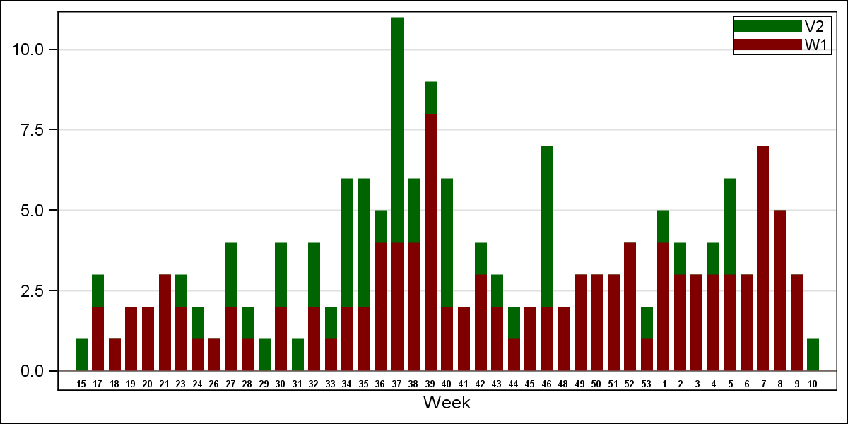
I was asked a similar question by another SAS user. Here is the graph we came up with. She wanted the data as a "stacked" bar, with two virus cases (V2 and W1) by week, but without overdrawing of the week values from one year to the next. Note the X axis is over 2 years, with values by onset week. Your EPI graph looks very similar to this. See article at : http://blogs.sas.com/content/graphicallyspeaking/2014/06/16/grouped-timeline/
The above article used only week values 1-52, and a x axis of type TIME. But actually there is a week 53 with only 1 or 2 days. Keeping all 53 weeks creates an overlap between the short 53rd week and week 1. To address this, I redid the graph with a discrete x axis, and can likely go back to using a bar chart. I will post article soon.

- Mark as New
- Bookmark
- Subscribe
- Mute
- RSS Feed
- Permalink
- Report Inappropriate Content
I worked on this graph to see if something better can be generated. Some ideas are posted in a new article in the Graphically Speaking blog: Epidemic Curve Graph - Graphically Speaking
- Mark as New
- Bookmark
- Subscribe
- Mute
- RSS Feed
- Permalink
- Report Inappropriate Content
Thanks everyone!
Catch up on SAS Innovate 2026
Dive into keynotes, announcements and breakthroughs on demand.
Explore Now →Learn how use the CAT functions in SAS to join values from multiple variables into a single value.
Find more tutorials on the SAS Users YouTube channel.
SAS Training: Just a Click Away
Ready to level-up your skills? Choose your own adventure.


