Turn on suggestions
Auto-suggest helps you quickly narrow down your search results by suggesting possible matches as you type.
Showing results for
- Home
- /
- Programming
- /
- Graphics
- /
- Re: How do I add specific sections in figures ?
Options
- RSS Feed
- Mark Topic as New
- Mark Topic as Read
- Float this Topic for Current User
- Bookmark
- Subscribe
- Mute
- Printer Friendly Page


Calcite | Level 5
- Mark as New
- Bookmark
- Subscribe
- Mute
- RSS Feed
- Permalink
- Report Inappropriate Content
Posted 04-01-2021 10:51 AM
(1807 views)
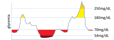
Hi, any idea how can I do to program the below in SAS ? I mean, the sections in yellow and red that are based on 'y' values of 54 mg/dL, 70 mg/dL, 180 mg/dL and 250 mg/dL ?
Any advice is welcome!
Thanks!
2 REPLIES 2


Opal | Level 21
- Mark as New
- Bookmark
- Subscribe
- Mute
- RSS Feed
- Permalink
- Report Inappropriate Content
An example:
data graph;
set sashelp.stocks;
where stock="IBM";
v6min=min(6000000, volume);
v12max=min(15000000, max(volume, 12000000));
v15max=max(15000000, volume);
run;

proc sgplot data=graph noautolegend;
series x=date y=volume;

band x=date lower=v6min upper=6000000 /
    fillattrs=(color=green) nooutline noextend;
band x=date lower=12000000 upper=v12max /
    fillattrs=(color=yellow) nooutline noextend;
band x=date lower=15000000 upper=v15max /
    fillattrs=(color=red) nooutline noextend;

refline 6000000 12000000 15000000/ axis=y label=("Low" "Mid" "High") labelloc=inside;
xaxis offsetmax=0.1;
quit;
PG
Calcite | Level 5
- Mark as New
- Bookmark
- Subscribe
- Mute
- RSS Feed
- Permalink
- Report Inappropriate Content
thanks a lot really helpful ! Many thanks !

Call for content now open!
It's your turn to help shape SAS Innovate 2027. Share your expertise and inspire the SAS community.
How to Concatenate Values
Learn how use the CAT functions in SAS to join values from multiple variables into a single value.

Find more tutorials on the SAS Users YouTube channel.
SAS Training: Just a Click Away
Ready to level-up your skills? Choose your own adventure.
Discussion stats
-
2 replies
-
04-01-2021 10:51 AM
-
1808 views
-
6 likes
-
2 in conversation
-

