- Home
- /
- Programming
- /
- Graphics
- /
- Re: How could I get 2 y axis with 1 x axis for each plot in a panel?
- RSS Feed
- Mark Topic as New
- Mark Topic as Read
- Float this Topic for Current User
- Bookmark
- Subscribe
- Mute
- Printer Friendly Page
- Mark as New
- Bookmark
- Subscribe
- Mute
- RSS Feed
- Permalink
- Report Inappropriate Content
Dear All,
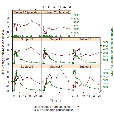
I would like to plot the Drug PK concentration versus QTcF(a index of ECG) for each Subject over time. PK concentration will use the Y2 axis as the scale mark while QTcF use Y axis as the scale, the x axis will be used at the same time by PK and QTcF for each subject (see below graph), however I searched the Guidelines and found no way to do so. I guess the only option can reach this target is to use the GTL, but I am not experienced on this. I am wondering we need to use the Layout datapanel with Layout Overlay together in GTL?
Hope you can help me.
Regards,
Frank

Accepted Solutions
- Mark as New
- Bookmark
- Subscribe
- Mute
- RSS Feed
- Permalink
- Report Inappropriate Content
Here is a very simple example that you give you the ability to produce your plot. Let me know if you have any questions about it.
Thanks!
Dan
proc template;
define statgraph y2panel;
begingraph;
layout datapanel classvars=(sex) / columns=2 headerlabeldisplay=value;
layout prototype;
seriesplot x=name y=height / lineattrs=graphdata1 display=(markers);
seriesplot x=name y=weight / yaxis=y2 lineattrs=graphdata2 display=(markers);
endlayout;
endlayout;
endgraph;
end;
run;
proc sgrender data=sashelp.class template=y2panel; run;
- Mark as New
- Bookmark
- Subscribe
- Mute
- RSS Feed
- Permalink
- Report Inappropriate Content
Hi Dan,
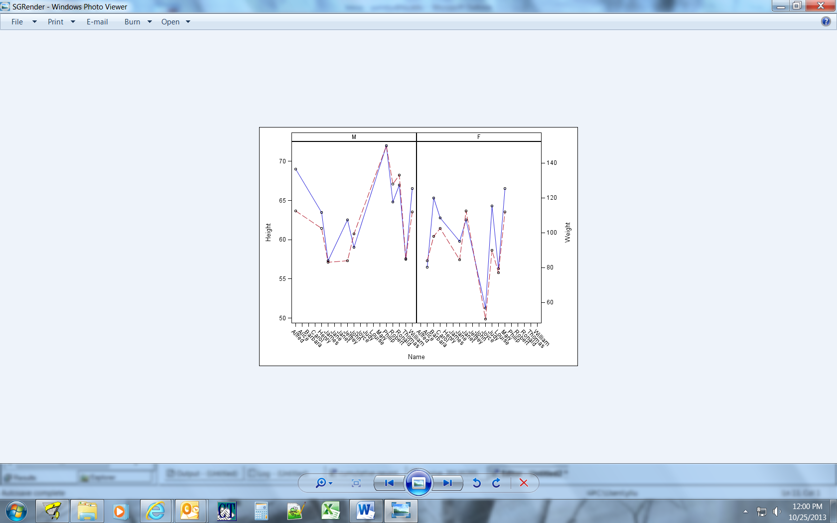
Below is waht I got by your code. why the graph on the left labeled as 'M'? isn't for all students? Thanks!

- Mark as New
- Bookmark
- Subscribe
- Mute
- RSS Feed
- Permalink
- Report Inappropriate Content
Because some are male and some are female. To have only female names for the "F" cell and male names for the "M" cell, add COLUMNDATARANGE=UNION to the LAYOUT DATAPANEL after the "/". Sorry about the confusion.
-- Dan
- Mark as New
- Bookmark
- Subscribe
- Mute
- RSS Feed
- Permalink
- Report Inappropriate Content
Note, however, for the original use case that was posted, the COLUMNDATARANGE option should not be used. That option improves the output for the data I used in my example,
- Mark as New
- Bookmark
- Subscribe
- Mute
- RSS Feed
- Permalink
- Report Inappropriate Content
So cool!
Frank
- Mark as New
- Bookmark
- Subscribe
- Mute
- RSS Feed
- Permalink
- Report Inappropriate Content
Dear Linlin,
I am very glad you can provide this question, which is helpful when I did my plot. Thank you.
Regards,
Frank
- Mark as New
- Bookmark
- Subscribe
- Mute
- RSS Feed
- Permalink
- Report Inappropriate Content
Dear Dan,
Your answer is quite helpful, but may I ask how to add legend below the plot (like red line is Height and blue is weight)?
I just read the SAS guideline book and it impressed me only if we use the OVERYLAY layout, can we add the legend, is this the case? If so, does this there is no way to add the legend below the figure?
Thank you so much.
Frank
- Mark as New
- Bookmark
- Subscribe
- Mute
- RSS Feed
- Permalink
- Report Inappropriate Content
Sorry, I forgot to add the legend. Here you go:
proc template;
define statgraph y2panel;
begingraph;
layout datapanel classvars=(sex) / columns=2 headerlabeldisplay=value;
layout prototype;
seriesplot x=name y=height / lineattrs=graphdata1 display=(markers) name="a";
seriesplot x=name y=weight / yaxis=y2 lineattrs=graphdata2 display=(markers) name="b";
endlayout;
sidebar / spacefill=false;
discretelegend "a" "b";
endsidebar;
endlayout;
endgraph;
end;
run;
proc sgrender data=sashelp.class template=y2panel; run;
- Mark as New
- Bookmark
- Subscribe
- Mute
- RSS Feed
- Permalink
- Report Inappropriate Content
Dear Dan,
May I seek your answer to 'How can I re-value the scale in the y2 axis? For example, in the PROC GPLOT, we can set the values list in the axis property, but after I read the documentation, it seems we can not use this in PROC TEMPLATE'. Any comment are appreciated.
Regards,
Frank
- Mark as New
- Bookmark
- Subscribe
- Mute
- RSS Feed
- Permalink
- Report Inappropriate Content
Yes, you can set the axis tick values in GTL. If you are in a DATA PANEL, like the example above, use the TICKVALUELIST option inside either the ROWAXISOPTS or COLUMNAXISOPTS option, depending on the axis you want to control. There is also a VIEWMIN/VIEWMAX option to control the limits of the axis. For layout OVERLAYs, you would use the same options inside of XAXISOPTS/YAXISOPTS/X2AXISOPTS/Y2AXISOPTS. Does this answer your question?
Thanks!
Dan
Learn how use the CAT functions in SAS to join values from multiple variables into a single value.
Find more tutorials on the SAS Users YouTube channel.
SAS Training: Just a Click Away
Ready to level-up your skills? Choose your own adventure.


