- Home
- /
- Programming
- /
- Graphics
- /
- How Can I Display Confidence Interval like Prediction Limit by PROC SG...
- RSS Feed
- Mark Topic as New
- Mark Topic as Read
- Float this Topic for Current User
- Bookmark
- Subscribe
- Mute
- Printer Friendly Page
- Mark as New
- Bookmark
- Subscribe
- Mute
- RSS Feed
- Permalink
- Report Inappropriate Content
Hi, All:
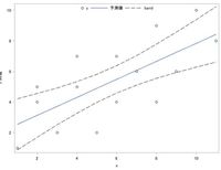
I'm making linear regression graph (with xx%CI), and I have trouble changing xx%CI's display.
I want xx%CI graph with dashed line (which expresses confidence limit) like Prediction Limit's display,
but now, I have regression line graph with xx%CI's shaded area by submitting following code.
data test;
    input x y @@;
    datalines;
    10 10 4 5 2 5 2 4 8 4 9 6 7 6 5 2
    1 1 3 2 4 7 6 7 8 9 11 8 6 4
    ;
run;
proc sgplot data=test;
    reg x=x y=y / cli clm clmattrs=(clmlineattrs=(pattern=dash color=black));
    keylegend / noborder location=outside position=top;
run;
I tried by using CLMLINEATTRS= option, but I can't understand what changed.
I want xx%CI's display which is expressed by dashed line & no shaded area, and also want to change xx%CI's label 's symbol (from shaded square to dash line).
By using Graphics Designer & following Generated Code, I accomplished my objective.
But I want to accomplish it by PROC SGPLOT, not by PROC TEMPLATE&SGRENDER.
ods output outputstatistics=pred(keep=observation predictedvalue lowerclmean upperclmean
                                 rename=(predictedvalue=pred lowerclmean=lower upperclmean=upper));
proc reg data=test;
    model y=x / r clm alpha=.1;
run;
quit;
data test_1(drop=observation);
    merge test pred;
run;
proc template;
define statgraph sgdesign;
dynamic _HEIGHT _UPPER _LOWER _HEIGHT2 _PREDICT _HEIGHT3 _WEIGHT;
begingraph;
   layout lattice / rowdatarange=data columndatarange=data rowgutter=10 columngutter=10;
      layout overlay;
         bandplot x=_HEIGHT limitupper=_UPPER limitlower=_LOWER / name='band' display=(OUTLINE) connectorder=axis extend=true outlineattrs=(color=CX000000 pattern=MEDIUMDASH );
         seriesplot x=_HEIGHT2 y=_PREDICT / name='series' connectorder=xaxis;
         scatterplot x=_HEIGHT3 y=_WEIGHT / name='scatter';
         discretelegend 'scatter' 'series' 'band' / opaque=false border=false halign=center valign=top displayclipped=true down=1 order=columnmajor location=inside;
      endlayout;
   endlayout;
endgraph;
end;
run;
proc sgrender data=test_1 template=sgdesign;
dynamic _HEIGHT="x" _UPPER="upper" _LOWER="lower" _HEIGHT2="x" _PREDICT="pred" _HEIGHT3="x" _WEIGHT="y";
run;
Thank you for your kind cooperation.
Accepted Solutions
- Mark as New
- Bookmark
- Subscribe
- Mute
- RSS Feed
- Permalink
- Report Inappropriate Content
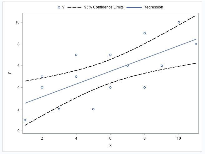
This code may do what you want.
The documentation for the REG statement includes these two sentences:
CLMLINEATTRS= has no effect unless you change the display options in the style element to display outlines. See the preceding code example.
But I didn't see any preceding code example. Googling "CLMLINEATTRS=style-element <(options)>" helped me find the code example in the PBSPLINE statement documentation for PROG SGPLOT in the SAS 9.3 ODS Graphics: Procedures Guide, Third Edition. That's the PROC TEMPLATE below, which is how you turn on the fill outline.
I don't see the code example in the most recent version of the online documentation for the PBSPLINE statement in PROC SGPLOT.
proc template;
  define style MyStyleDefault;
  parent=Styles.htmlblue;
  style GraphBand from GraphBand /
      DisplayOpts = "Fill outline";
  end;
run;

ods html5 (id=web) style= MyStyleDefault;

data test;
	input x y @@;
	datalines;
    10 10 4 5 2 5 2 4 8 4 9 6 7 6 5 2
    1 1 3 2 4 7 6 7 8 9 11 8 6 4
    ;
run;

proc sgplot data=test;
	reg x=x y=y / clm clmattrs=(clmfillattrs=(color=white)
	                            clmlineattrs=(pattern=mediumdash color=black thickness=2))
	              nolegclm;
	keylegend "y" "band" "fit" / noborder location=outside position=top;
	legenditem type=line name="band" / label="95% Confidence Limits"
	                                   lineattrs=(pattern=mediumdash
	                                              color=black
	                                              thickness=2);
	legenditem type=marker name="y" / label="y" markerattrs=(symbol=circle);
	legenditem type=line name="fit" / label="Regression" lineattrs=(pattern=solid
	                                                                thickness=2);
run;
The screen shot below is the graphic from the code.

- Mark as New
- Bookmark
- Subscribe
- Mute
- RSS Feed
- Permalink
- Report Inappropriate Content
Hi, Suzanne:
Thank you for your reply and your attached picture is just my wanted.
But LEGENDITEM statement in PROC SGPLOT applies to SAS9.4M5 or to the latter, and unfortunately, mine is SAS9.4M3.
After I questioned this, I tried another method and got the following "closer" to my objective.
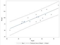
proc sgplot data=SASHELP.CLASSFIT;
    band x=HEIGHT UPPER=UPPER LOWER=LOWER /  nofill LINEATTRS=(color=CX000000 pattern=SHORTDASH );
    series x=HEIGHT y=PREDICT;
    scatter x=HEIGHT y=WEIGHT;
run;
It's like my goal and I thought I accomplished, but........
data test;
    input x y @@;
    datalines;
    10 10 4 5 2 5 2 4 8 4 9 6 7 6 5 2
    1 1 3 2 4 7 6 7 8 9 11 8 6 4
    ;
run;
ods output outputstatistics=pred(keep=observation predictedvalue lowerclmean upperclmean
                                 rename=(predictedvalue=pred lowerclmean=lower upperclmean=upper));
proc reg data=test;
    model y=x / p clm alpha=.1;
run;
quit;
data test_1(drop=observation);
    merge test pred;
run;
proc sgplot data=test_1;
    reg x=x y=y / clm filledoutlinedmarkers;
run;
proc sgplot data=test_1;
    band x=x upper=upper lower=lower / nofill lineattrs=(color=cx000000 pattern=shortdash);
    series x=x y=pred;
    scatter x=x y=y;
run;
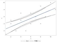
I can't understand why multiple CI lines are displayed, and what the difference is between SASHELP.CLASSFIT data & my TEST_1 data.
Please give me some advice. Thank you for your kind cooperation.
- Mark as New
- Bookmark
- Subscribe
- Mute
- RSS Feed
- Permalink
- Report Inappropriate Content
The documentation for the BAND statement includes the following note:
| Note: | The input data should be sorted by the X or Y variable. If the data is not sorted, the graph might produce unpredictable results. |
When I did a sort by X, the graph looked like what you want. When I did a sort by Y, it didn't look like what you want.
- Mark as New
- Bookmark
- Subscribe
- Mute
- RSS Feed
- Permalink
- Report Inappropriate Content
Hi, Suzanne:
Thank you for your reply & I'm so sorry for my late response.
Like you said, I sorted data by x, and got my wanted.
Thank you so much.
Catch up on SAS Innovate 2026
Dive into keynotes, announcements and breakthroughs on demand.
Explore Now →Learn how use the CAT functions in SAS to join values from multiple variables into a single value.
Find more tutorials on the SAS Users YouTube channel.
SAS Training: Just a Click Away
Ready to level-up your skills? Choose your own adventure.
