- Home
- /
- Programming
- /
- Graphics
- /
- How Can I Change Band Color "Partly" in Band Graph?
- RSS Feed
- Mark Topic as New
- Mark Topic as Read
- Float this Topic for Current User
- Bookmark
- Subscribe
- Mute
- Printer Friendly Page
- Mark as New
- Bookmark
- Subscribe
- Mute
- RSS Feed
- Permalink
- Report Inappropriate Content
Hi, there:
I'm trying to analyze data using linear mixed effects model, and creating predicted mean graph with band.
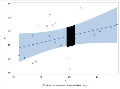
I want to change band color like following code & picture, but I can't find how to do that.
For example, at X between 19.95 and 20.25 accurately, I want to change band color from blue to red.
Please help me. Thank you in advance.
data hospital;
    input hospital physician x y @@;
    datalines;
    1 1 19.4 32.4 1 1 19.3 28.3 1 1 19.2 31.9
    1 2 18.8 18.9 1 2 18.4 20.3 1 2 18.2 21.3
    1 3 19.7 24.8 1 3 20.4 38.6 1 3 20.2 27.4
    1 4 19.3 36.1 1 4 21.7 32.4 1 4 20.8 30.7
    2 1 21.5 31.3 2 1 18.7 28.5 2 1 19.9 20.1
    2 2 18.9 31.8 2 2 18.7 25.1 2 2 19.5 32.9
    2 3 18.7 18.3 2 3 19.4 27.4 2 3 19.5 26.2
    2 4 20.9 28.6 2 4 21.1 29.9 2 4 20.0 16.4
    ;
run;
proc mixed data=hospital alpha=0.1;
    class hospital physician;
    model y=x / ddfm=kr solution outpm=Predicted;
    random int / subject=physician(hospital);
run;
proc sort data=Predicted;
    by x;
run;
proc sgplot data=Predicted;
band x=x lower=Lower upper=Upper / legendlabel="90% CLM";
series x=x y=pred;
scatter x=x y=y;
run;Accepted Solutions
- Mark as New
- Bookmark
- Subscribe
- Mute
- RSS Feed
- Permalink
- Report Inappropriate Content
Hi Kenta, as i understand you need to have youe band changing at 19 even if there are noe real observations there.
The trick will be to make a new variable that always has the values that you need. The way to do that would be to predict your band making certain 19 is a value in the band. Some manipulation in setting missing and values at the right points are needded to make the graph look good.
- Mark as New
- Bookmark
- Subscribe
- Mute
- RSS Feed
- Permalink
- Report Inappropriate Content
Use 2 band plots.
- Mark as New
- Bookmark
- Subscribe
- Mute
- RSS Feed
- Permalink
- Report Inappropriate Content
Hi, Mr. Sanjay:
Thank you for your response, and so sorry for less information.
I already have tried "2 BAND Statements", but I have no idea about what structure PREDICTED dataset should have in this case.
I want to know the best structure.
Thank you.
- Mark as New
- Bookmark
- Subscribe
- Mute
- RSS Feed
- Permalink
- Report Inappropriate Content
You can also take the "grouped band" approach in this case:
data hospital;
    input hospital physician x y @@;
    datalines;
    1 1 19.4 32.4 1 1 19.3 28.3 1 1 19.2 31.9
    1 2 18.8 18.9 1 2 18.4 20.3 1 2 18.2 21.3
    1 3 19.7 24.8 1 3 20.4 38.6 1 3 20.2 27.4
    1 4 19.3 36.1 1 4 21.7 32.4 1 4 20.8 30.7
    2 1 21.5 31.3 2 1 18.7 28.5 2 1 19.9 20.1
    2 2 18.9 31.8 2 2 18.7 25.1 2 2 19.5 32.9
    2 3 18.7 18.3 2 3 19.4 27.4 2 3 19.5 26.2
    2 4 20.9 28.6 2 4 21.1 29.9 2 4 20.0 16.4
    ;
run;
proc mixed data=hospital alpha=0.1;
    class hospital physician;
    model y=x / ddfm=kr solution outpm=Predicted;
    random int / subject=physician(hospital);
run;
proc sort data=Predicted;
    by x;
run;

proc format;
value myfmt 1="Okay"
            2="Critical"
;
run;

data grouped;
set Predicted;
format Areas myfmt.;
if x > 19.95 and x < 20.25 then
   Areas=2;
else
   Areas=1;
run;

proc sgplot data=grouped;
styleattrs datacolors=(lightblue red);
band x=x lower=Lower upper=Upper / group=Areas name="Band";
series x=x y=pred / name="Fit" legendlabel="Fit, with 90% CLM";
scatter x=x y=y;
keylegend "Fit" / position=bottomleft;
keylegend "Band" / position=bottomright;
run;- Mark as New
- Bookmark
- Subscribe
- Mute
- RSS Feed
- Permalink
- Report Inappropriate Content
Hi, Mr. DanH:
Thank you for your response.
"Grouped Band" Approach, I didn't know, and it seems like good.
But for example, if 19 le X le 20, I couldn't create Band between 19 le X le 20 "accurately", because the data PREDICTED has no value "19". I'm sorry, but I want to create band that expresses specific range "accurately".
And blue band protrudes slightly in my result:(
Please help me.
- Mark as New
- Bookmark
- Subscribe
- Mute
- RSS Feed
- Permalink
- Report Inappropriate Content
Hi Kenta, as i understand you need to have youe band changing at 19 even if there are noe real observations there.
The trick will be to make a new variable that always has the values that you need. The way to do that would be to predict your band making certain 19 is a value in the band. Some manipulation in setting missing and values at the right points are needded to make the graph look good.
- Mark as New
- Bookmark
- Subscribe
- Mute
- RSS Feed
- Permalink
- Report Inappropriate Content
Hi, PaalNavestad:
Thank you for your response.
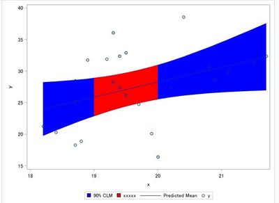
Thanks for your opinion, I got one idea, and I accomplished my objective.
 data hospital;
    input hospital physician x y @@;
    datalines;
    1 1 19.4 32.4 1 1 19.3 28.3 1 1 19.2 31.9
    1 2 18.8 18.9 1 2 18.4 20.3 1 2 18.2 21.3
    1 3 19.7 24.8 1 3 20.4 38.6 1 3 20.2 27.4
    1 4 19.3 36.1 1 4 21.7 32.4 1 4 20.8 30.7
    2 1 21.5 31.3 2 1 18.7 28.5 2 1 19.9 20.1
    2 2 18.9 31.8 2 2 18.7 25.1 2 2 19.5 32.9
    2 3 18.7 18.3 2 3 19.4 27.4 2 3 19.5 26.2
    2 4 20.9 28.6 2 4 21.1 29.9 2 4 20.0 16.4
    ;
run;
proc mixed data=hospital;
    class hospital physician;
    model y=x / ddfm=kr solution outpm=Predicted alpha=.1 alphap=.1;
    random int / subject=physician(hospital);
    store mixed;
run;
data new;
    input x @@;
    datalines;
    19 20
    ;
run;
proc plm source=mixed alpha=.1;
    score data=new out=stat lclm=lower uclm=upper;
run;
data predicted_1;
    set predicted(where=(19 le x le 20))
        stat;
    keep x lower upper;
    rename x=x1 lower=lower1 upper=upper1;
run;
proc sql;
    create table work.predicted_2 as
    select a.*, b.*
    from work.predicted as a
         full join
         work.predicted_1 as b
         on a.x eq b.x1;
quit;
proc sort data=predicted_2;
    by x;
run;
proc sgplot data=Predicted_2;
band x=x lower=Lower upper=Upper / legendlabel="90% CLM" fillattrs=(color=blue);
band x=x1 lower=lower1 upper=upper1 / legendlabel="xxxxx" fillattrs=(color=red);
series x=x y=pred;
scatter x=x y=y;
run;
I predicted for new observation by using STORE statement & PLM Procedure.
Thank you, everyone!! I did it!!
- Mark as New
- Bookmark
- Subscribe
- Mute
- RSS Feed
- Permalink
- Report Inappropriate Content
Glad it worked. Another idea would be to use a block plot to mark the areo interest.
That would create areas of different shades across the whole plot region. The documentation show good examples of how it works.
- Mark as New
- Bookmark
- Subscribe
- Mute
- RSS Feed
- Permalink
- Report Inappropriate Content
Also so nice of you showing with an example how you solved it.![]()
- Mark as New
- Bookmark
- Subscribe
- Mute
- RSS Feed
- Permalink
- Report Inappropriate Content
Hi, PaalNavestad:
Thank you.
I searched BLOCK statement in SGPLOT.
I don't want figure like rectangular block now, but I thank you for advice.
Anyway, thank you!!
Catch up on SAS Innovate 2026
Dive into keynotes, announcements and breakthroughs on demand.
Explore Now →Learn how use the CAT functions in SAS to join values from multiple variables into a single value.
Find more tutorials on the SAS Users YouTube channel.
SAS Training: Just a Click Away
Ready to level-up your skills? Choose your own adventure.


