- Home
- /
- Programming
- /
- Graphics
- /
- Histogram on qualitative data
- RSS Feed
- Mark Topic as New
- Mark Topic as Read
- Float this Topic for Current User
- Bookmark
- Subscribe
- Mute
- Printer Friendly Page

- Mark as New
- Bookmark
- Subscribe
- Mute
- RSS Feed
- Permalink
- Report Inappropriate Content
Hi All,
I would appreciate if anyone can tell me the code to draw a histogram from the following qualitative data.
Thanks,
| Date | Outcome |
| 01-Mar-2014 | Loss |
| 27-Feb-2015 | Profit |
| 27-Feb-2014 | Loss |
| 24-Feb-2014 | Profit |
| 01-Mar-2015 | Loss |
| 26-Feb-2015 | Loss |
| 01-Mar-2015 | Loss |
| 01-Mar-2015 | Loss |
| 01-Mar-2015 | Loss |
| 01-Mar-2015 | Profit |
| 01-Mar-2014 | Profit |
| 01-Mar-2014 | Profit |
| 01-Mar-2014 | Profit |
| 25-Feb-2014 | Profit |
OUTPUT:
Accepted Solutions

- Mark as New
- Bookmark
- Subscribe
- Mute
- RSS Feed
- Permalink
- Report Inappropriate Content
Try something like this:
vbar date / stat=freq
groupdisplay=cluster group=Outcome;
run;
Chris
- Mark as New
- Bookmark
- Subscribe
- Mute
- RSS Feed
- Permalink
- Report Inappropriate Content
Try something like this:
vbar date / stat=freq
groupdisplay=cluster group=Outcome;
run;
Chris
- Mark as New
- Bookmark
- Subscribe
- Mute
- RSS Feed
- Permalink
- Report Inappropriate Content
Thanks Chris, It worked!!!
- Mark as New
- Bookmark
- Subscribe
- Mute
- RSS Feed
- Permalink
- Report Inappropriate Content
Hi Chris,
Do you know by any chance if there is a way to plot the days in the X axis only. I mean Instead of putting all dates, I want to put the days (Monday to Sunday) only. I am not sure if SAS can extract days from dates.
Thanks,
- Mark as New
- Bookmark
- Subscribe
- Mute
- RSS Feed
- Permalink
- Report Inappropriate Content
Of course SAS can do that -- that's the power of SAS formats!
format Date weekdate10.;
vbar date / stat=freq
groupdisplay=cluster group=Outcome;
run;
Chris
- Mark as New
- Bookmark
- Subscribe
- Mute
- RSS Feed
- Permalink
- Report Inappropriate Content
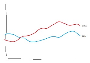
Thanks Chris, I just changes my data and uploaded a new pic, can you please tell me what would be the code for creating a run chart on 2 different year?
I much appreciate your help.
- Mark as New
- Bookmark
- Subscribe
- Mute
- RSS Feed
- Permalink
- Report Inappropriate Content
You new drawing looks like a Series plot. Series plots need two numeric variables: the date for the X axis and then -- in your case -- the frequency/day for the Y axis? You can use PROC FREQ or PROC SQL to calculate those frequencies, then feed that into a SERIES plot (using PROC SGPLOT and the SERIES statement), grouping it by YEAR.
You can find an index of great samples here:
Graphically Speaking Blog, Visual Index
Chris
- Mark as New
- Bookmark
- Subscribe
- Mute
- RSS Feed
- Permalink
- Report Inappropriate Content
Hi Chris,
Your instruction is working, but I have both year data for the month of February and March only. When I plot them with the following code it leaves a huge gap in the middle (from apr 2014 to jan 2015) of the X axis. Can you please help?
proc template;
define statgraph tes1;
begingraph / subpixel=on;
entrytitle 'test title';
layout overlay / xaxisopts=(display=(ticks tickvalues))
yaxisopts=(griddisplay=on);
seriesplot x=Start_date y=count / group=Visit_concern name='a' lineattrs=(thickness=1) smoothconnect=true;
scatterplot x=Start_date y=count / group=Visit_concern markerattrs=(symbol=circlefilled color=white size=1);
/*scatterplot x=Start_date y=count / group=Visit_concern markercharacter=label; --- this brings the circular data points*/
discretelegend 'a' / title='Legend' itemsize=(linelength=10px) location=inside across=1 halign=right valign=top;
endlayout;
endgraph;
end;
run;
.jpg")
Catch up on SAS Innovate 2026
Nearly 200 sessions are now available on demand in the Innovate Hub.
Watch Now →Learn how use the CAT functions in SAS to join values from multiple variables into a single value.

Find more tutorials on the SAS Users YouTube channel.
SAS Training: Just a Click Away
Ready to level-up your skills? Choose your own adventure.
-
7 replies
-
06-21-2015 10:19 PM
-
4863 views
-
6 likes
-
2 in conversation
-
