- Home
- /
- Programming
- /
- Graphics
- /
- Re: Help creating graph with multiple series
- RSS Feed
- Mark Topic as New
- Mark Topic as Read
- Float this Topic for Current User
- Bookmark
- Subscribe
- Mute
- Printer Friendly Page

- Mark as New
- Bookmark
- Subscribe
- Mute
- RSS Feed
- Permalink
- Report Inappropriate Content
Hello,
I am looking to create a graph with the following characteristics:
- X-Axis: Timepoint (months) -12, -6, 0, 6, 12 *Note: the - refers to that many months before study entry
- Y-Axis: Days in Hospital at 12 months before study entry (coincides with -12 m timepoint)
- Y-Axis: Days in Hospital at 6 months before study entry (coincides with -6 m timepoint)
- Y-Axis: Days in Hospital at 6 months post study entry (coincides with 6 m timepoint)
- Days in Hospital at 12 months post study entry (coincides with 12 m timepoint)
Each of those y-axis variables is one variable in the dataset. I want to create a scatterplot in a series format and then have the mean display on the graph. I tried using ODS graphics designer and am only able to create a scatter for one y-axis variable. Is it possible to do a series for this with the graphics editor? If not, how could I go about doing this?
Thanks!

- Mark as New
- Bookmark
- Subscribe
- Mute
- RSS Feed
- Permalink
- Report Inappropriate Content
With SAS/Graph Proc Gplot, you can plot multiple different y-variables on the same graph using the 'overlay' option:
If you have 2 different ranges of values, you can use gplot's "plot2" for the 2nd axis (on the right-hand-side):
http://robslink.com/SAS/democd21/climate.htm
And if you need more than 2 different y-axes, you could get a little tricky with annotate:
http://robslink.com/SAS/democd41/multi_y.htm
For the mean line, you could calculate that value and store it in a macro variable, and then use that value as a 'refline' or annotate a line at that value.
Are any of these similar to what you're wanting? (If not, give some more specifics/details of what you're looking for.)
- Mark as New
- Bookmark
- Subscribe
- Mute
- RSS Feed
- Permalink
- Report Inappropriate Content
Thanks for the info... the range of values on the y-axis is the same for all, so won't be necessary to use 2nd axis I don't think.
How would I set this up in Proc Gplot?
- Mark as New
- Bookmark
- Subscribe
- Mute
- RSS Feed
- Permalink
- Report Inappropriate Content
Using some of the easily-available sample data we ship with SAS, here's a simple example:
symbol1 value=dot interpol=join color=red;
symbol2 value=dot interpol=join color=blue;
symbol3 value=dot interpol=join color=green;
proc gplot data=sashelp.class;
plot age*name=1 weight*name=2 height*name=3 / overlay;
run;
- Mark as New
- Bookmark
- Subscribe
- Mute
- RSS Feed
- Permalink
- Report Inappropriate Content
Thanks, that works. How do I get the plot to not join lines between the datapoints? I just want to show the datapoints on the graph but do not want the points joined in any way.
- Mark as New
- Bookmark
- Subscribe
- Mute
- RSS Feed
- Permalink
- Report Inappropriate Content
If you're asking about gplot ... you can use interpol=none, rather than interpol=join
- Mark as New
- Bookmark
- Subscribe
- Mute
- RSS Feed
- Permalink
- Report Inappropriate Content
Thanks that works! How do I get the x and y axis to join at 0 so that -12 and -6 month timepoints are to the left of the y axis?
- Mark as New
- Bookmark
- Subscribe
- Mute
- RSS Feed
- Permalink
- Report Inappropriate Content
You can specify axis statements (with whatever range you want, using the order= axis option), and assign them to the graph using the haxis and vaxis gplot options.
- Mark as New
- Bookmark
- Subscribe
- Mute
- RSS Feed
- Permalink
- Report Inappropriate Content
I've attached the plot that I have right now and my code is at the bottom of this question screen. Here's what I still need to do with it/some questions:
- Add means as bars on the graph to designate the average of each of the four variables (ERDAYS_PRE_3 ERDAYS_PRE_4 ERDAYS_3 ERDAYS_4)
- Move the y-axis so that it is at 0
- Add in values for ERDAYS_3 - for some reason they don't show up on the graph?
CODE:
/*Setup plot for ER cost driver data*/
symbol1 value=dot interpol=none color=red;
symbol2 value=dot interpol=none color=blue;
symbol3 value=dot interpol=none color=green;
symbol4 value=dot interpol=none color=black;
axis1 order=(-12 to 12 by 1) offset=(0,12)
label=none minor=none;
axis2 order=(0 to 100 by 10) offset=(0,0)
label=none minor=none;
proc gplot data=CostDrivers;
plot ERDAYS_PRE_3*time_6=3 ERDAYS_PRE_4*time_12=4 ERDAYS_4*time12=1 ERDAYS_3*time6=2 / overlay
haxis=axis1
vaxis=axis2;
run;
Thanks for your help!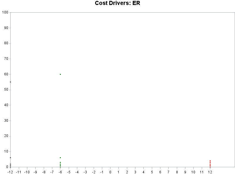
- Mark as New
- Bookmark
- Subscribe
- Mute
- RSS Feed
- Permalink
- Report Inappropriate Content
When you say "add means as bars" - how about a boxplot?
(you can use interpol=boxcti in your symbol statement, for example)
Not quite sure what you're wanting when you say "move the y axis so that it is at zero". Your y axis is starting at zero (as per your axis statement), but I'm not sure how you're wanting to adjust it(?)
If the ERDAYS_3 aren't showing up in the graph, it's likely that their values aren't in the range specified in the axis statemen(?) Try doing a proc print and look at the values. Or alternatively temporarily comment out the axis options and see where/how the values plot, and see if they are outside the desired range.
- Mark as New
- Bookmark
- Subscribe
- Mute
- RSS Feed
- Permalink
- Report Inappropriate Content
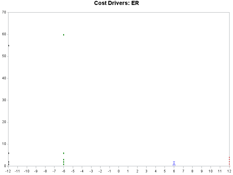
Yes a boxplot would be great. When I updated it that way the only values that show up with the boxplot are for timepoint 6. For the y-axis, I want it to be at x=0 so that the timepoints -12 and -6 are to the left of the y axis.
Code:
symbol1 interpol=boxcti color=red;
symbol2 interpol=boxcti color=blue;
symbol3 interpol=boxcti color=green;
symbol4 interpol=boxcti color=black;
axis1 order=(-12 to 12 by 1) offset=(0,0)
label=none minor=none;
axis2 order=(0 to 70 by 10) offset=(0,0)
label=none minor=none;
proc gplot data=CostDrivers;
plot ERDAYS_PRE_3*time_6=3 ERDAYS_PRE_4*time_12=4 ERDAYS_4*time12=1 ERDAYS_3*time6=2 / overlay
haxis=axis1
vaxis=axis2;
run;
quit;
Here's the updated graph:
- Mark as New
- Bookmark
- Subscribe
- Mute
- RSS Feed
- Permalink
- Report Inappropriate Content
To get both the boxplot, and the points, to show up, you have to plot them both. Something like this...
symbol1 interpol=boxcti color=red;
symbol2 interpol=boxcti color=blue;
symbol3 interpol=boxcti color=green;
symbol4 interpol=boxcti color=black;
symbol5 value=dot interpol=none color=red;
symbol6 value=dot interpol=none color=blue;
symbol7 value=dot interpol=none color=green;
symbol8 value=dot interpol=none color=black;
plot
ERDAYS_PRE_3*time_6=3 ERDAYS_PRE_4*time_12=4 ERDAYS_4*time12=1 ERDAYS_3*time6=2
ERDAYS_PRE_3*time_6=7 ERDAYS_PRE_4*time_12=8 ERDAYS_4*time12=5 ERDAYS_3*time6=6
/ overlay
The y-axis will always show up at the far-left of the graph. There's no option to have it show up in the middle. You could possibly draw an axis in the middle with annotate, but that would take a bit of work...
- Mark as New
- Bookmark
- Subscribe
- Mute
- RSS Feed
- Permalink
- Report Inappropriate Content
Here's an example where I "fake" the y-axis (using annotate) so I can have it in the middle of the graph:

- Mark as New
- Bookmark
- Subscribe
- Mute
- RSS Feed
- Permalink
- Report Inappropriate Content
Use a Scatter plot instead of Series. Add reference lines at x=0 and y=0 and turn off the axis lines. The tick values will still be displayed on the outer edges.

- Mark as New
- Bookmark
- Subscribe
- Mute
- RSS Feed
- Permalink
- Report Inappropriate Content
I think you could also try PROC SGPLOT with either a series or scatter statement.
proc sgplot data=have;
series x=time y=time6;
series x=time y=time12;
series x=time y=time_6;
run;quit;
But from your data it doesn't look like you have 5 series, it looks like you have 5 points really. Where does the 'series' part come in?
.jpg")
Catch up on SAS Innovate 2026
Nearly 200 sessions are now available on demand in the Innovate Hub.
Watch Now →Learn how use the CAT functions in SAS to join values from multiple variables into a single value.

Find more tutorials on the SAS Users YouTube channel.
SAS Training: Just a Click Away
Ready to level-up your skills? Choose your own adventure.
-
15 replies
-
06-10-2013 12:21 PM
-
7415 views
-
0 likes
-
4 in conversation
-
