- Home
- /
- Programming
- /
- Graphics
- /
- Grouping in sgplot : Assign 2 different colors in markerattrs ?
- RSS Feed
- Mark Topic as New
- Mark Topic as Read
- Float this Topic for Current User
- Bookmark
- Subscribe
- Mute
- Printer Friendly Page
- Mark as New
- Bookmark
- Subscribe
- Mute
- RSS Feed
- Permalink
- Report Inappropriate Content
Hello SasCommunity, I need your help.
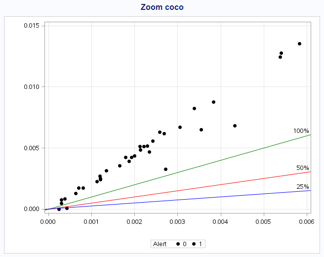
I have 3 columns Coco1, Coco2 and alert. alert is just composed by 0 or 1. I managed to plot Coco1 vs Coco2 by grouping them regarding if alert = 0 or 1 but when I tried to assign the black color for the ones with alert = 0 and the red color for the ones with alert = 1, it doesn't work anymore (all circles are in black).
I tried "styleattrs" or "datacolors = (red black)" next to "data=affichage" but nothing worked.
Here's my code :
proc sgplot data=Affichage;
/*  styleattrs datacolors=(black red) datasymbols=(circlefilled);*/

 scatter x=EC_rate y=NI_rate/ group=alert markerattrs=(color=black symbol=circlefilled); ;

 lineparm x=0 y=0 slope=1/ lineattrs=(color=green) curvelabel="100%";
 lineparm x=0 y=0 slope=.5/ lineattrs=(color=red) curvelabel="50%";
 lineparm x=0 y=0 slope=.25/ lineattrs=(color=blue) curvelabel="25%";
 title "Zoom coco";
 xaxis grid min=0;
 yaxis grid;
run;
Can someone help me please? Thanks in advance
Accepted Solutions
- Mark as New
- Bookmark
- Subscribe
- Mute
- RSS Feed
- Permalink
- Report Inappropriate Content
Use an attributes map:
data attrmap;
retain id "myid";
length markercolor $ 5;
input value $ markercolor $;
cards;
0 red
1 black
;
run;

proc sgplot data=Affichage dattrmap=attrmap;
/*  styleattrs datacolors=(black red) datasymbols=(circlefilled);*/

 scatter x=EC_rate y=NI_rate/ group=alert markerattrs=(color=black symbol=circlefilled) attrid=myid;

 lineparm x=0 y=0 slope=1/ lineattrs=(color=green) curvelabel="100%";
 lineparm x=0 y=0 slope=.5/ lineattrs=(color=red) curvelabel="50%";
 lineparm x=0 y=0 slope=.25/ lineattrs=(color=blue) curvelabel="25%";
 title "Zoom coco";
 xaxis grid min=0;
 yaxis grid;
run;
Take a look at this post for more details.
Hope this helps!
Dan
- Mark as New
- Bookmark
- Subscribe
- Mute
- RSS Feed
- Permalink
- Report Inappropriate Content
Thank you very much for the code. Sorry for the late answer, I tried the code but I get the error :
ERROR 22-322: Expecting a name.
ERROR 200-322: The symbol is not recognized and will be ignored.
Apparently it's because of : attrid="myid"
Do you have an idea about what is the problem?
Thanks in advance
Edit : ok, just in case for someone else, just replace attrid="myid" by attrid=myid
Thank you everyone
- Mark as New
- Bookmark
- Subscribe
- Mute
- RSS Feed
- Permalink
- Report Inappropriate Content
Lose the quotes around myid.
- Mark as New
- Bookmark
- Subscribe
- Mute
- RSS Feed
- Permalink
- Report Inappropriate Content
When you have a group variable that has 2 values, the colors come from the Styles's GraphData1-12 color list. The first group gets GraphData1 (usually blue) and the second will get GraphData2 (often Red). The colors are based on the style. Now, if you set the color to black in the syntax, these group colors are overridden by the single color you set.
If you want certain specific group colors based on group value, you can use the DiscreteAttrMap code suggested by Dan. If you just want two different colors, not specifically based on value, set STYLEATTRS statement with Datacolors=(red black).
Learn how use the CAT functions in SAS to join values from multiple variables into a single value.
Find more tutorials on the SAS Users YouTube channel.
SAS Training: Just a Click Away
Ready to level-up your skills? Choose your own adventure.


