- Home
- /
- Programming
- /
- Graphics
- /
- Grouped simulated bar graphs in proc gplot
- RSS Feed
- Mark Topic as New
- Mark Topic as Read
- Float this Topic for Current User
- Bookmark
- Subscribe
- Mute
- Printer Friendly Page
- Mark as New
- Bookmark
- Subscribe
- Mute
- RSS Feed
- Permalink
- Report Inappropriate Content
Using proc gplot, I currently have scatter plots and simulated bar graphs on the same graph. The simulated bar graph has 2 groupings. However, the outputted graph gives the simulated bars laying on top of one another. Is there anyway I can get grouped simulated bar graphs that instead lay side by side?
- Mark as New
- Bookmark
- Subscribe
- Mute
- RSS Feed
- Permalink
- Report Inappropriate Content
What version of SAS do you have?
- Mark as New
- Bookmark
- Subscribe
- Mute
- RSS Feed
- Permalink
- Report Inappropriate Content
Version 9.2
- Mark as New
- Bookmark
- Subscribe
- Mute
- RSS Feed
- Permalink
- Report Inappropriate Content
For SAS 9.2, you will need to transpose your data so that the two group values are in their own columns. Then, just modify the code below, and you will get your bar-scatter overlay. Run this example to see if this is what you want.
Thanks!
Dan
proc template;
define statgraph bar_scatter;
begingraph;
layout overlay;
barchart x=age y=height / stat=mean discreteoffset=-0.2 barwidth=0.4 fillattrs=graphdata1 name="a";
barchart x=age y=weight / stat=mean discreteoffset=0.2 barwidth=0.4 fillattrs=graphdata2 name="b";
scatterplot x=age y=height / discreteoffset=-0.2 markerattrs=graphdata1;
scatterplot x=age y=weight / discreteoffset=0.2 markerattrs=graphdata2;
discretelegend "a" "b";
endlayout;
endgraph;
end;
run;
proc sgrender data=sashelp.class template=bar_scatter;
run;
- Mark as New
- Bookmark
- Subscribe
- Mute
- RSS Feed
- Permalink
- Report Inappropriate Content
I transposed my data, but the two bars are still laying on top of one another instead of beside each other. Unfortunately I cannot run the example you gave due to the different computers I have available to me, but I noticed the example did not use proc gplot. Is it able to be done using proc gplot (since everything with my graph is the way I want except for the bars not being beside each other) either with the original data or transposed data?
Thanks!
Danielle
- Mark as New
- Bookmark
- Subscribe
- Mute
- RSS Feed
- Permalink
- Report Inappropriate Content
It all depends on exactly how your data is set up...
Assuming it's set up something like this:
data foo;
x=1; y1=5; y2=3; output;
x=2; y1=6; y2=3.5; output;
run;
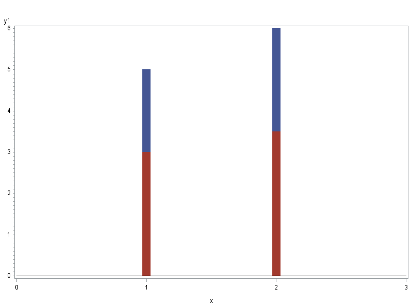
And you're plotting it something like this (using wide gplot 'needles' to simulate bars, and the ones with the exact same x-coordinate are overlapping since they're in the exact same location)...
symbol1 value=none interpol=needle width=15;
axis1 order=(0 to 3 by 1) minor=none;
proc gplot data=foo;
plot y1*x y2*x / overlay vzero haxis=axis1;
run;
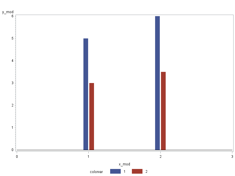
Then you could modify your data by outputting 2 observations for each 1 observation in the original data, and apply a slight offset to the x-coordinate for each bar (a little to the left for one, and a little to the right for the other). The code could be something like this (but as I mentioned before, it all depends on exactly how your data is set up)...
data foo_mod; set foo;
x_mod=x-.04; colorvar=1; y_mod=y1; output;
x_mod=x+.04; colorvar=2; y_mod=y2; output;
run;
proc gplot data=foo_mod;
plot y_mod*x_mod=colorvar / vzero haxis=axis1;
run;
Below are the graphs for 'before' and 'after' ...


- Mark as New
- Bookmark
- Subscribe
- Mute
- RSS Feed
- Permalink
- Report Inappropriate Content
Robert,
I have been following your website and using your fantastic code for a while, and I enjoyed the every bit of it, Thank you very much.
I have an off topic question for you and other SAS/Graph experts: Is SAS GTL to replace SAS/Graph? Is this where SAS is heading to? GTL comes with Base, so users do not have to pay additional for GRAPH.
Haikuo
- Mark as New
- Bookmark
- Subscribe
- Mute
- RSS Feed
- Permalink
- Report Inappropriate Content
I think I will let one of the GTL managers field that question (perhaps Sanjay?)...
- Mark as New
- Bookmark
- Subscribe
- Mute
- RSS Feed
- Permalink
- Report Inappropriate Content
SAS/GRAPH is not being replaced. It continues to be supported and enhanced. GTL and SG procedures are new additions to the tools available in SAS for creating graphs.
- Mark as New
- Bookmark
- Subscribe
- Mute
- RSS Feed
- Permalink
- Report Inappropriate Content
Robert,
I offset the x-variables, and it worked like a charm! The only issue I'm having now is for some reason, the x-axis tick marks are not even remotely close to where the actual bars are. My x-axis should have 12 tick marks. Instead, it is only showing 6 of them, so my bars look like they are being compressed in between tick marks 2 and 5. Is this due to offsetting the x-variables? Or could something else be wrong?
Thanks!
Danielle
- Mark as New
- Bookmark
- Subscribe
- Mute
- RSS Feed
- Permalink
- Report Inappropriate Content
I would need to see your data, and whether or not you have formats assigned to the x values, and what (if any) axis statement you're using for your x-axis, etc.
For example, if your X values are date values (using date formats) and you're using default x-axis (rather than using an axis statement with hardcoded ticks via the order=), etc, etc. With numeric values, the x-axis will default to "round" tickmarks, and if the x-axis has dates then it will pick tickmarks at the beginning of year, month, etc if it can.
Sounds like you'll just need to override the default tickmark values ... but I'd need to know what kind of values/formats/etc you're working with in order to provide you with some sample code.
- Mark as New
- Bookmark
- Subscribe
- Mute
- RSS Feed
- Permalink
- Report Inappropriate Content
Got it to work! My graph looks great now! Thank you!
Catch up on SAS Innovate 2026
Nearly 200 sessions are now available on demand with the SAS Innovate Digital Pass.
Explore Now →Learn how use the CAT functions in SAS to join values from multiple variables into a single value.
Find more tutorials on the SAS Users YouTube channel.
SAS Training: Just a Click Away
Ready to level-up your skills? Choose your own adventure.


