- Home
- /
- Programming
- /
- Graphics
- /
- Grotta bar chart
- RSS Feed
- Mark Topic as New
- Mark Topic as Read
- Float this Topic for Current User
- Bookmark
- Subscribe
- Mute
- Printer Friendly Page
- Mark as New
- Bookmark
- Subscribe
- Mute
- RSS Feed
- Permalink
- Report Inappropriate Content
Hi all,
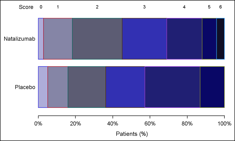
I'm trying to produce similar figure to the one in the shell(see attachments please), I'm having hard time to put score 0 1, 2 3 etc. on the top of first row..Any help is appreciated.
proc sgpanel code:
proc sgpanel data=mrs pctlevel=group dattrmap=attrmap sganno=annods noautolegend;
panelby avisitn / columns=1 novarname HEADERATTRS=(weight=bold);
hbar trtpn / group=aval stat=pct ATTRID=AVAL;
format trtpn trt. avisitn vis.;
colaxis label="Patients (%)" values=(0 to 1 by 0.2) valuesdisplay=('0' '20' '40' '60' '80' '100');
styleattrs datacontrastcolors=(black);
run;
Thanks
Jomaa
Accepted Solutions
- Mark as New
- Bookmark
- Subscribe
- Mute
- RSS Feed
- Permalink
- Report Inappropriate Content
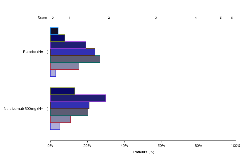
Looks you are using GROUPDISPLAY=CLUSTER. To stack the segments, remove that setting, or use GROUPDISPLAY=STACK which is default.
- Mark as New
- Bookmark
- Subscribe
- Mute
- RSS Feed
- Permalink
- Report Inappropriate Content
Interesting graph. To address your specific question, to add the Score labels, here is what comes to my mind.
Is the score value tied to the color (like a group)? If yes, you could simply use a KEYLEGEND to display these in a legend.
If you need the score displayed as in the visual, then you would presummarize your values by group to get the group statistic that are to be stacked. Then, loop through the group response values and stack them yourself, computing the midpoint of each segment as it would be stacked (and also the low and high values). Then use a HBARPARM to display the bar, or use a HIGHLOW plot with the low and high values you computed. Then, use a TEXT plot to display the score value at the midpoint you computed. You can offset the text plot using DISCRETEOFFSET to move the values up. Or, use an XAXISTABLE to plot the score, and you can also get the label "Score" to the left.
If you send some (simulated) data, maybe we can try it. What SAS release version are you using.
To create the graph like you have, after computing the statistics as above, you could convert it into polygon data, and then display each bar and connections as polygons. This could work. Score would get repeated in each cell. ![]()
- Mark as New
- Bookmark
- Subscribe
- Mute
- RSS Feed
- Permalink
- Report Inappropriate Content
Thanks Sanjay,
the version is 6.1 SAS Enterprise guide.
I tried to use the keylegend as you mentioned but I've been told to produce the figure as similiar as possible to the one in the shell:( ..Also I tried to insert Score 0 1 2 3 manually, unfortunatly it did not displayed nicely..attached is a dummy data..your help is very appreciated.
Jomaa
- Mark as New
- Bookmark
- Subscribe
- Mute
- RSS Feed
- Permalink
- Report Inappropriate Content
Please post the SAS version you are connecting to using EG. EG version is not relevant.
- Mark as New
- Bookmark
- Subscribe
- Mute
- RSS Feed
- Permalink
- Report Inappropriate Content
Sorry , not sure if i got you, what I saw is that SAS EG 6.1 is 'equivalent'/ support sas versions 9.2, 9.3 & 9.4
- Mark as New
- Bookmark
- Subscribe
- Mute
- RSS Feed
- Permalink
- Report Inappropriate Content
You can enter "%put &sysvlong;" in a program window to see the version in the Log window like "9.04.01M4Pmmddyy".
- Mark as New
- Bookmark
- Subscribe
- Mute
- RSS Feed
- Permalink
- Report Inappropriate Content
here we go:) it's
9.04.01M2P072314
- Mark as New
- Bookmark
- Subscribe
- Mute
- RSS Feed
- Permalink
- Report Inappropriate Content
Please send your formats and attribute map. You have 3 levels for TRTPN.
- Mark as New
- Bookmark
- Subscribe
- Mute
- RSS Feed
- Permalink
- Report Inappropriate Content
proc sql;
select count (distinct usubjid) into: n61 from mrs where trtpn=1 and avisitn=6;
select count (distinct usubjid) into: n62 from mrs where trtpn=2 and avisitn=6;
select count (distinct usubjid) into: n63 from mrs where trtpn=3 and avisitn=6;
select count (distinct usubjid) into: n71 from mrs where trtpn=1 and avisitn=7;
select count (distinct usubjid) into: n72 from mrs where trtpn=2 and avisitn=7;
select count (distinct usubjid) into: n73 from mrs where trtpn=3 and avisitn=7;
select count (distinct usubjid) into: n81 from mrs where trtpn=1 and avisitn=8;
select count (distinct usubjid) into: n82 from mrs where trtpn=2 and avisitn=8;
select count (distinct usubjid) into: n83 from mrs where trtpn=3 and avisitn=8;
quit;
proc format;
value trt 1=" Placebo (N= )"
2="Natalizumab 300mg (N= )"
3="Natalizumab 600mg (N= )"
;
value vis 6="Day 5"
7="Day 30"
8="Day 90"
;
value x 0='0';
run;
data annods;
length label $100;
function='text';
x1=18.25; y1=89.85; label="&n61."; output;
x1=18.25; y1=83.5; label="&n62."; output;
x1=18.25; y1=77.70; label="&n63."; output;
x1=18.25; y1=62.75; label="&n71."; output;
x1=18.25; y1=56.65; label="&n72."; output;
x1=18.25; y1=50.55; label="&n73."; output;
x1=18.25; y1=35.25; label="&n81."; output;
x1=18.25; y1=29.50; label="&n82."; output;
x1=18.25; y1=23.50; label="&n83."; output;
run;
/* To associated color to each score*/
data attrmap;
retain id "AVAL";
length value 8.0 fillcolor $9 ;
input value fillcolor $ ;
cards;
0 CXAEADD9
1 CX8585A6
2 CX5C5C73
3 CX3230B2
4 CX201F73
5 CX090766
6 CX100F26
run;
- Mark as New
- Bookmark
- Subscribe
- Mute
- RSS Feed
- Permalink
- Report Inappropriate Content
While this is not a full solution, it is a step in the direction you want. I used SGPLOT, but you can likely split it up using SGPANEL. I used XAXISTABLE to place the group values. This was not doable with HIGHLOW plot due to a defect we found. So, I have to do that using HBARPARM. That is OK, but one has to ensure the groups are stacked in the same order as the values displayed using AxisTable.

- Mark as New
- Bookmark
- Subscribe
- Mute
- RSS Feed
- Permalink
- Report Inappropriate Content
Thanks Sanjay, your output with Hbarparm looks fine to me , however when I run your code I have another format output,,can you please check the attached output please?

- Mark as New
- Bookmark
- Subscribe
- Mute
- RSS Feed
- Permalink
- Report Inappropriate Content
Looks you are using GROUPDISPLAY=CLUSTER. To stack the segments, remove that setting, or use GROUPDISPLAY=STACK which is default.
- Mark as New
- Bookmark
- Subscribe
- Mute
- RSS Feed
- Permalink
- Report Inappropriate Content
Thanks so much Sanjay,,your hep is very appreciated.
- Mark as New
- Bookmark
- Subscribe
- Mute
- RSS Feed
- Permalink
- Report Inappropriate Content
Many users here don't want to download Office files because of virus potential, others have such things blocked by security software.
Images in png form can be posted to the forum directly.
Data in the form of a datastep will let us test code against you data. Since the actual content of data is strongly associated with what the graphic procedures can do at least some data is extremely helpful in general. Instructions here: https://communities.sas.com/t5/SAS-Communities-Library/How-to-create-a-data-step-version-of-your-dat... will show how to turn an existing SAS data set into data step code that can be pasted into a forum code box using the {i} icon or attached as text to show exactly what you have and that we can test code against.
Catch up on SAS Innovate 2026
Dive into keynotes, announcements and breakthroughs on demand.
Explore Now →Learn how use the CAT functions in SAS to join values from multiple variables into a single value.
Find more tutorials on the SAS Users YouTube channel.
SAS Training: Just a Click Away
Ready to level-up your skills? Choose your own adventure.


