- Home
- /
- Programming
- /
- Graphics
- /
- Graph stacked bars ordered by 'segments' value /Base or Enterprise gui...
- RSS Feed
- Mark Topic as New
- Mark Topic as Read
- Float this Topic for Current User
- Bookmark
- Subscribe
- Mute
- Printer Friendly Page
- Mark as New
- Bookmark
- Subscribe
- Mute
- RSS Feed
- Permalink
- Report Inappropriate Content
Good morning,
After searching and searching I´m unable to order the bars of a graph with SAS as I do with excel.
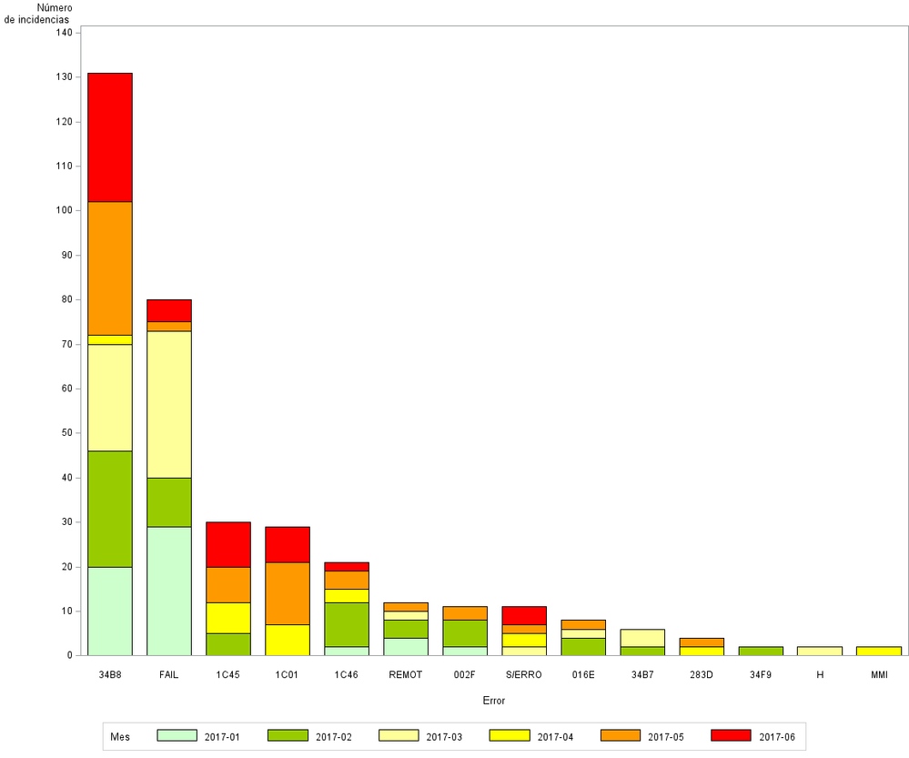
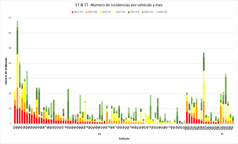
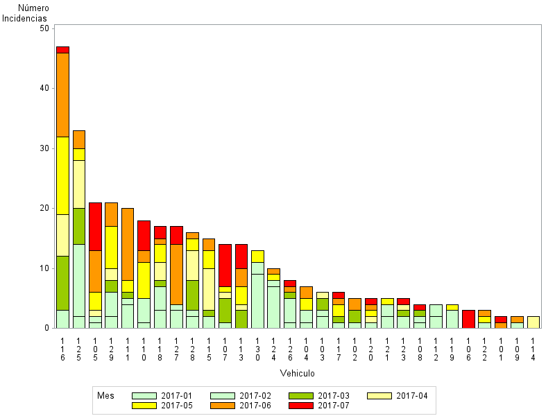
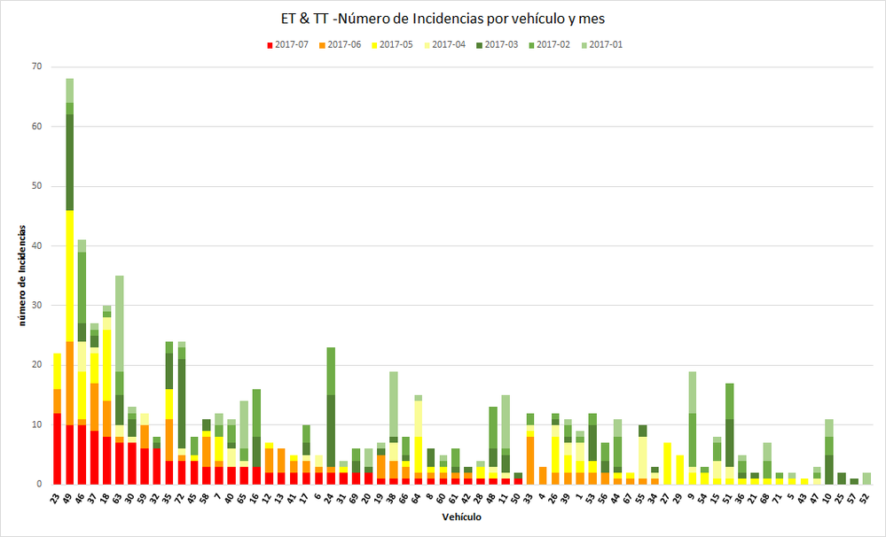
I need the bars ordered by the descending value of each segment of the bar (by month, showing in descending order those that have a higher value in the latest month, then those with higher value in the penultimate month etc.. ). At the moment is showing descending order by the total frequency (all segments, last month + penultimate month etc). I think it is much clearer looking at the graphs below.
Can any one help me please or if not possible with Base SAS or enterprise guide, can any other SAS module do it?
Thanks in advance.


Accepted Solutions
- Mark as New
- Bookmark
- Subscribe
- Mute
- RSS Feed
- Permalink
- Report Inappropriate Content
With the data in the order of the dataset provided this seems to do what is requested:
proc sgplot data=r3gg;
   vbar  vehiculo / response=numiiss group=var_mes grouporder=descending stat=sum;
   xaxis discreteorder=data;
run;
It is very likely that your default display area for the graph will be a bit cramped for the number of categories used.
You might add
ODS Graphics / width=20cm ;
or similar to have more width.
The colors will come from the current ODS style or provide additional information. This is a bare bones example and additional appearance options will be up to you.
Note the AXIS, SYMBOL and PATTERN statements of SAS/Graph will not have any effect on this plot.
- Mark as New
- Bookmark
- Subscribe
- Mute
- RSS Feed
- Permalink
- Report Inappropriate Content
Not really anything to go on here. From what I can see is your values on the X-Axis are different, if thats it then just change your data to reflect what you want in the output. I can't really say anything else as there is no Test data in the form of a datastep, or code etc.
You will find this page helpful for all graphs, best resource:
http://blogs.sas.com/content/graphicallyspeaking/
And a search shows a fair few examples:
- Mark as New
- Bookmark
- Subscribe
- Mute
- RSS Feed
- Permalink
- Report Inappropriate Content
Thanks RW9,
I have been through the info you attach but I can´t see the same 'problem' I have.
The code below is from Enterprise Guide slightly modified. I also attach two examples that may be clearer. What I find is that even if my data is ordered as I want in the data set (i.e. descending month (var_mes), descending value_per_month (numiiss), I loose this order when graphing or proc tabulating. (I already have seen this is not possible to do in proc tabulate, to order by the analysis variable). i also attach the data.
Many thanks in advance.
PROC SORT
	DATA=TMP00001.t4_acumuladoiissveh(KEEP=Vehiculo var_mes numiiss_Mean Tipo_Tren)
	OUT=WORK.SORTTempTableSorted
	;
	BY DESCENDING tipo_tren descending var_mes descending numiiss_mean;
RUN;
	PATTERN1 COLOR=CXCCFFCC;
    PATTERN2 COLOR=CXCCFFCC;
	PATTERN3 COLOR=CX99CC00;
	PATTERN4 COLOR=CXFFFF99;
	PATTERN5 COLOR=YELLOW;
	PATTERN6 COLOR=CXFF9900;
	PATTERN7 COLOR=RED;

	PATTERN8 COLOR = _STYLE_;
	PATTERN9 COLOR = _STYLE_;
	PATTERN10 COLOR = _STYLE_;
	PATTERN11 COLOR = _STYLE_;
	PATTERN12 COLOR = _STYLE_;
	PATTERN13 COLOR = _STYLE_;
Legend1
	FRAME
	label=("Mes")
	;
Axis1
	STYLE=1
	WIDTH=1
	MINOR=NONE
	label=("Número" justify=l "de Incidencias")


;
Axis2
	STYLE=1
	WIDTH=1


;
TITLE;
TITLE1 "Incidencias por vehículo y mes";
FOOTNOTE;
FOOTNOTE1 "";
PROC GCHART DATA=WORK.SORTTempTableSorted
;
	VBAR
	 Vehiculo
 /
	SUMVAR=numiiss_Mean descending
	SUBGROUP=var_mes descending
	CLIPREF
FRAME discrete	TYPE=SUM
	LEGEND=LEGEND1
	DESCENDING
	COUTLINE=BLACK
	RAXIS=AXIS1
	MAXIS=AXIS2
;
	BY DESCENDING Tipo_Tren;
/* -------------------------------------------------------------------
   Fin de código de la tarea
   ------------------------------------------------------------------- */
RUN; QUIT;
%_eg_conditional_dropds(WORK.SORTTempTableSorted);
TITLE; FOOTNOTE;
PATTERN1;
PATTERN2;
PATTERN3;
PATTERN4;
PATTERN5;
PATTERN6;

- Mark as New
- Bookmark
- Subscribe
- Mute
- RSS Feed
- Permalink
- Report Inappropriate Content
Post a sample of your test data in the form of a datastep in the body of the post, using the code window - {i} above post area. Only needs a few lines.
Basically to get the right order you need to set you data correctly. If it is character varaibles, then use a number behind it, then format that rather than letting the procedure sort internally. If this is an automatic calculation in the graph, then take it out of the graphs hands, do the calculation before that and then use that ini your graph rather than let the procedure handle it. Also, move away from the ancient graphing procedures, SGPlot, and Graph Template Language should be used in all cases since version 9 at leats, it allow more flexibility. Examples of the templates or sgplot code can be found in that link. gchart however wont be as it decades out of date.
- Mark as New
- Bookmark
- Subscribe
- Mute
- RSS Feed
- Permalink
- Report Inappropriate Content
With the data in the order of the dataset provided this seems to do what is requested:
proc sgplot data=r3gg;
   vbar  vehiculo / response=numiiss group=var_mes grouporder=descending stat=sum;
   xaxis discreteorder=data;
run;
It is very likely that your default display area for the graph will be a bit cramped for the number of categories used.
You might add
ODS Graphics / width=20cm ;
or similar to have more width.
The colors will come from the current ODS style or provide additional information. This is a bare bones example and additional appearance options will be up to you.
Note the AXIS, SYMBOL and PATTERN statements of SAS/Graph will not have any effect on this plot.
- Mark as New
- Bookmark
- Subscribe
- Mute
- RSS Feed
- Permalink
- Report Inappropriate Content
This is it. thanks very much Ballardw.
Catch up on SAS Innovate 2026
Dive into keynotes, announcements and breakthroughs on demand.
Explore Now →Learn how use the CAT functions in SAS to join values from multiple variables into a single value.
Find more tutorials on the SAS Users YouTube channel.
SAS Training: Just a Click Away
Ready to level-up your skills? Choose your own adventure.


