- Home
- /
- Programming
- /
- Graphics
- /
- Re: Get a break between different types of data using vbar in Sgplot
- RSS Feed
- Mark Topic as New
- Mark Topic as Read
- Float this Topic for Current User
- Bookmark
- Subscribe
- Mute
- Printer Friendly Page
- Mark as New
- Bookmark
- Subscribe
- Mute
- RSS Feed
- Permalink
- Report Inappropriate Content
Hi due to some problems with ActiveX, Chrome and problems with VA in IE we have to rewrite quite an amount of our old graphs using SGplot instead of Gchart, Gplot.
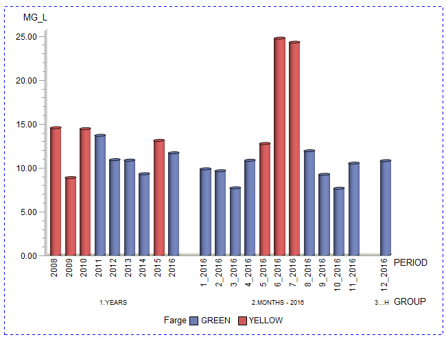
The graph in gchart we are trying to reproduce is given below:
Forget about the Green being blue and yellow being red. That is fixed in the production version.
The main point is the space between 1. YEARS, 2. MONTHS- 2016 3..H on the group axis
The data and code to produce the graph is below
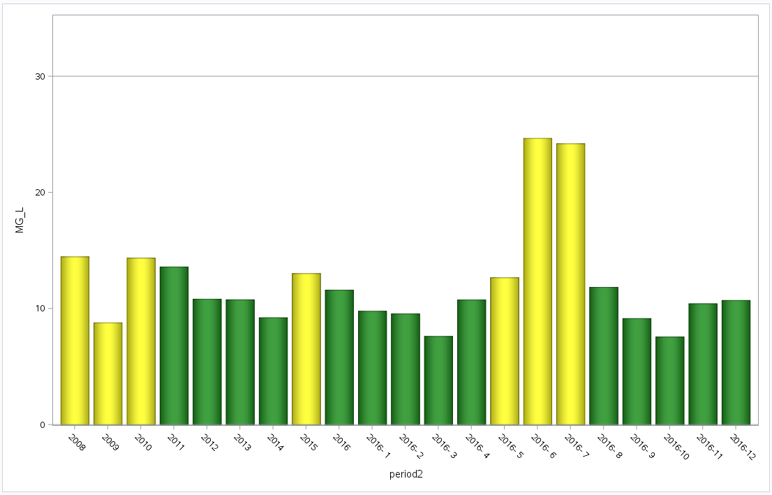
Using SGplot we mange to get the following result in several ways
There are several reasons to use Sgplot instead of gchart gplot, but in this case we have not found an easy way to include extra space between 2016 and 2016-1 as well as between 2016-11 and 2016-12. An option can be sgpanel. This does by default produce equal xaxis (what you usually want. However in this case you only want found values within the group that can be used as the panelby statement. Code to produce the graph is included below.
data WORK.TO_GR_RAW;
  infile datalines dsd truncover;
  input PERIOD:$7. GROUP:$16. MG_L:COMMA8.2 COL:$8.;
datalines4;
2016,1.YEARS,11.61,GREEN
1_2016,2.MONTHS - 2016,9.79,GREEN
2_2016,2.MONTHS - 2016,9.57,GREEN
3_2016,2.MONTHS - 2016,7.62,GREEN
4_2016,2.MONTHS - 2016,10.76,GREEN
5_2016,2.MONTHS - 2016,12.67,YELLOW
6_2016,2.MONTHS - 2016,24.68,YELLOW
7_2016,2.MONTHS - 2016,24.21,YELLOW
8_2016,2.MONTHS - 2016,11.84,GREEN
9_2016,2.MONTHS - 2016,9.16,GREEN
10_2016,2.MONTHS - 2016,7.58,GREEN
11_2016,2.MONTHS - 2016,10.43,GREEN
12_2016,3.CURRENT_MONTH,10.72,GREEN
2008,1.YEARS,14.47,YELLOW
2009,1.YEARS,8.79,YELLOW
2010,1.YEARS,14.36,YELLOW
2011,1.YEARS,13.60,GREEN
2012,1.YEARS,10.83,GREEN
2013,1.YEARS,10.78,GREEN
2014,1.YEARS,9.23,GREEN
2015,1.YEARS,13.03,YELLOW
;;;;

PROC GCHART DATA=WORK.to_gr_raw
;
	VBAR3D	 PERIOD
 /
	SUMVAR=MG_L
	GROUP=GROUP
	SUBGROUP=COL
	SHAPE=CYLINDER
FRAME	DISCRETE
	TYPE=SUM
	COUTLINE=BLACK
	NOZERO
	LREF=1
	CREF=RED
	REF=30
	LEGEND=LEGEND1
	PATTERNID=SUBGROUP
;
/* -------------------------------------------------------------------
   End of task code.
   ------------------------------------------------------------------- */
RUN; QUIT;

/*The Sgplot example*/

/*First create a numeric color control variable to use colorresponse in stead of a dummy group variable.
  Dummy group variable with attribute map ins tead of range attribute map also works*/

data tosgplot;
 set to_gr_raw;

 if col='GREEN' then coln=0;
 if col='YELLOW' then coln=1;
 if col='RED' then coln=2;
 if length(period) = 4 then period2=period;
 else period2=substr(period,4,4)||'-'||substr(period,1,2);


run;

/*Create the range attribute*/
data myrattrmap2;
retain id "myID";
length min $ 5 max $ 5;
input min $ max $ color $ altcolor $;
datalines;
0 0 green green
1 1 yellow yellow
2 2 red red
;
run;
/*Produce the graph*/

proc sgplot data=tosgplot rattrmap=myrattrmap2 noautolegend;

 vbar period2/response=mg_l rattrid=MyID colorresponse=coln dataskin=pressed;
 refline 30/axis=y;
 yaxis max=35;
run;
Accepted Solutions
- Mark as New
- Bookmark
- Subscribe
- Mute
- RSS Feed
- Permalink
- Report Inappropriate Content
Here is a solution using PROC SGPANEL. You can adjust the amount of gap using the SPACING option on the PANELBY statement.
data WORK.TO_GR_RAW;
  infile datalines dsd truncover;
  input PERIOD:$7. GROUP:$16. MG_L:COMMA8.2 COL:$8.;
datalines4;
2016,1.YEARS,11.61,GREEN
1_2016,2.MONTHS - 2016,9.79,GREEN
2_2016,2.MONTHS - 2016,9.57,GREEN
3_2016,2.MONTHS - 2016,7.62,GREEN
4_2016,2.MONTHS - 2016,10.76,GREEN
5_2016,2.MONTHS - 2016,12.67,YELLOW
6_2016,2.MONTHS - 2016,24.68,YELLOW
7_2016,2.MONTHS - 2016,24.21,YELLOW
8_2016,2.MONTHS - 2016,11.84,GREEN
9_2016,2.MONTHS - 2016,9.16,GREEN
10_2016,2.MONTHS - 2016,7.58,GREEN
11_2016,2.MONTHS - 2016,10.43,GREEN
12_2016,3.CURRENT_MONTH,10.72,GREEN
2008,1.YEARS,14.47,YELLOW
2009,1.YEARS,8.79,YELLOW
2010,1.YEARS,14.36,YELLOW
2011,1.YEARS,13.60,GREEN
2012,1.YEARS,10.83,GREEN
2013,1.YEARS,10.78,GREEN
2014,1.YEARS,9.23,GREEN
2015,1.YEARS,13.03,YELLOW
;;;;

data attrmap;
retain id "myid" linecolor "black";
length value $ 6 fillcolor $ 6;
input value $ fillcolor $;
cards;
GREEN  green
YELLOW yellow
;
run;

PROC sgpanel DATA=WORK.to_gr_raw dattrmap=attrmap;
 panelby group / layout=columnlattice onepanel noborder novarname
                 colheaderpos=bottom proportional uniscale=row
                 spacing=15;
 colaxis valuesrotate=vertical;
 refline 30 / lineattrs=(color=red);
 VBAR PERIOD / response=mg_l group=col dataskin=pressed attrid=myid;
 run;
- Mark as New
- Bookmark
- Subscribe
- Mute
- RSS Feed
- Permalink
- Report Inappropriate Content
Hi due to some problems with ActiveX, Chrome and problems with VA in IE we have to rewrite quite an amount of our old graphs using SGplot instead of Gchart, Gplot.
The graph in gchart we are trying to reproduce is given below:
Forget about the Green being blue and yellow being red. That is fixed in the production version.
The main point is the space between 1. YEARS, 2. MONTHS- 2016 3..H on the group axis
The data and code to produce the graph is below
Using SGplot we mange to get the following result in several ways
There are several reasons to use Sgplot instead of gchart gplot, but in this case we have not found an easy way to include extra space between 2016 and 2016-1 as well as between 2016-11 and 2016-12. An option can be sgpanel. This does by default produce equal xaxis (what you usually want. However in this case you only want found values within the group that can be used as the panelby statement. Code to produce the graph is included below.
data WORK.TO_GR_RAW;
  infile datalines dsd truncover;
  input PERIOD:$7. GROUP:$16. MG_L:COMMA8.2 COL:$8.;
datalines4;
2016,1.YEARS,11.61,GREEN
1_2016,2.MONTHS - 2016,9.79,GREEN
2_2016,2.MONTHS - 2016,9.57,GREEN
3_2016,2.MONTHS - 2016,7.62,GREEN
4_2016,2.MONTHS - 2016,10.76,GREEN
5_2016,2.MONTHS - 2016,12.67,YELLOW
6_2016,2.MONTHS - 2016,24.68,YELLOW
7_2016,2.MONTHS - 2016,24.21,YELLOW
8_2016,2.MONTHS - 2016,11.84,GREEN
9_2016,2.MONTHS - 2016,9.16,GREEN
10_2016,2.MONTHS - 2016,7.58,GREEN
11_2016,2.MONTHS - 2016,10.43,GREEN
12_2016,3.CURRENT_MONTH,10.72,GREEN
2008,1.YEARS,14.47,YELLOW
2009,1.YEARS,8.79,YELLOW
2010,1.YEARS,14.36,YELLOW
2011,1.YEARS,13.60,GREEN
2012,1.YEARS,10.83,GREEN
2013,1.YEARS,10.78,GREEN
2014,1.YEARS,9.23,GREEN
2015,1.YEARS,13.03,YELLOW
;;;;

PROC GCHART DATA=WORK.to_gr_raw
;
	VBAR3D	 PERIOD
 /
	SUMVAR=MG_L
	GROUP=GROUP
	SUBGROUP=COL
	SHAPE=CYLINDER
FRAME	DISCRETE
	TYPE=SUM
	COUTLINE=BLACK
	NOZERO
	LREF=1
	CREF=RED
	REF=30
	LEGEND=LEGEND1
	PATTERNID=SUBGROUP
;
/* -------------------------------------------------------------------
   End of task code.
   ------------------------------------------------------------------- */
RUN; QUIT;

/*The Sgplot example*/

/*First create a numeric color control variable to use colorresponse in stead of a dummy group variable.
  Dummy group variable with attribute map ins tead of range attribute map also works*/

data tosgplot;
 set to_gr_raw;

 if col='GREEN' then coln=0;
 if col='YELLOW' then coln=1;
 if col='RED' then coln=2;
 if length(period) = 4 then period2=period;
 else period2=substr(period,4,4)||'-'||substr(period,1,2);


run;

/*Create the range attribute*/
data myrattrmap2;
retain id "myID";
length min $ 5 max $ 5;
input min $ max $ color $ altcolor $;
datalines;
0 0 green green
1 1 yellow yellow
2 2 red red
;
run;
/*Produce the graph*/

proc sgplot data=tosgplot rattrmap=myrattrmap2 noautolegend;

 vbar period2/response=mg_l rattrid=MyID colorresponse=coln dataskin=pressed;
 refline 30/axis=y;
 yaxis max=35;
run;
- Mark as New
- Bookmark
- Subscribe
- Mute
- RSS Feed
- Permalink
- Report Inappropriate Content
Well, the simplest method I can think of is to insert into your data two extra observations which occur at the place you want the space, and set them to zero so they don't display anything. Then in the sgplot, fix the xaxis observations so they dont show up there either:
data WORK.TO_GR_RAW;
  infile datalines dsd truncover;
  input PERIOD:$7. GROUP:$16. MG_L:COMMA8.2 COL:$8.;
datalines4;
2016,1.YEARS,11.61,GREEN
0_2016,2.MONTHS - 2016,0,GREEN
1_2016,2.MONTHS - 2016,9.79,GREEN
2_2016,2.MONTHS - 2016,9.57,GREEN
3_2016,2.MONTHS - 2016,7.62,GREEN
4_2016,2.MONTHS - 2016,10.76,GREEN
5_2016,2.MONTHS - 2016,12.67,YELLOW
6_2016,2.MONTHS - 2016,24.68,YELLOW
7_2016,2.MONTHS - 2016,24.21,YELLOW
8_2016,2.MONTHS - 2016,11.84,GREEN
9_2016,2.MONTHS - 2016,9.16,GREEN
10_2016,2.MONTHS - 2016,7.58,GREEN
11_2016,2.MONTHS - 2016,10.43,GREEN
11_2017,3.CURRENT_MONTH,0,GREEN
12_2016,3.CURRENT_MONTH,10.72,GREEN
2008,1.YEARS,14.47,YELLOW
2009,1.YEARS,8.79,YELLOW
2010,1.YEARS,14.36,YELLOW
2011,1.YEARS,13.60,GREEN
2012,1.YEARS,10.83,GREEN
2013,1.YEARS,10.78,GREEN
2014,1.YEARS,9.23,GREEN
2015,1.YEARS,13.03,YELLOW
;;;;

proc sgplot...;
  xaxis ... values=(2008-2015 2016 1_2016-11_2016 12_2016)...;
...;
You could of course also do it by setting a format on period, with the decode of the formats you don't want displayed as blank.
Also, if you going into sgplot then take a look through this blog:
http://blogs.sas.com/content/graphicallyspeaking/
There are examples for anything you want to do with graphs, possibly even examples of what you ask.
- Mark as New
- Bookmark
- Subscribe
- Mute
- RSS Feed
- Permalink
- Report Inappropriate Content
- Mark as New
- Bookmark
- Subscribe
- Mute
- RSS Feed
- Permalink
- Report Inappropriate Content
Please see: http://blogs.sas.com/content/graphicallyspeaking/2012/09/03/doing-more-with-nbsp/
This example is almost exactly what you want. You need to use a couple of unique values that look like blanks but will not get removed or merged. I use a value starting with an "nbsp", or a "A0"x. You could also use a format to rename the couple of place holder categories to unique blanks such as 1nbsp and 2 nbsps.
- Mark as New
- Bookmark
- Subscribe
- Mute
- RSS Feed
- Permalink
- Report Inappropriate Content
- Mark as New
- Bookmark
- Subscribe
- Mute
- RSS Feed
- Permalink
- Report Inappropriate Content
Here is a solution using PROC SGPANEL. You can adjust the amount of gap using the SPACING option on the PANELBY statement.
data WORK.TO_GR_RAW;
  infile datalines dsd truncover;
  input PERIOD:$7. GROUP:$16. MG_L:COMMA8.2 COL:$8.;
datalines4;
2016,1.YEARS,11.61,GREEN
1_2016,2.MONTHS - 2016,9.79,GREEN
2_2016,2.MONTHS - 2016,9.57,GREEN
3_2016,2.MONTHS - 2016,7.62,GREEN
4_2016,2.MONTHS - 2016,10.76,GREEN
5_2016,2.MONTHS - 2016,12.67,YELLOW
6_2016,2.MONTHS - 2016,24.68,YELLOW
7_2016,2.MONTHS - 2016,24.21,YELLOW
8_2016,2.MONTHS - 2016,11.84,GREEN
9_2016,2.MONTHS - 2016,9.16,GREEN
10_2016,2.MONTHS - 2016,7.58,GREEN
11_2016,2.MONTHS - 2016,10.43,GREEN
12_2016,3.CURRENT_MONTH,10.72,GREEN
2008,1.YEARS,14.47,YELLOW
2009,1.YEARS,8.79,YELLOW
2010,1.YEARS,14.36,YELLOW
2011,1.YEARS,13.60,GREEN
2012,1.YEARS,10.83,GREEN
2013,1.YEARS,10.78,GREEN
2014,1.YEARS,9.23,GREEN
2015,1.YEARS,13.03,YELLOW
;;;;

data attrmap;
retain id "myid" linecolor "black";
length value $ 6 fillcolor $ 6;
input value $ fillcolor $;
cards;
GREEN  green
YELLOW yellow
;
run;

PROC sgpanel DATA=WORK.to_gr_raw dattrmap=attrmap;
 panelby group / layout=columnlattice onepanel noborder novarname
                 colheaderpos=bottom proportional uniscale=row
                 spacing=15;
 colaxis valuesrotate=vertical;
 refline 30 / lineattrs=(color=red);
 VBAR PERIOD / response=mg_l group=col dataskin=pressed attrid=myid;
 run;
- Mark as New
- Bookmark
- Subscribe
- Mute
- RSS Feed
- Permalink
- Report Inappropriate Content
Thanks a lot.
Did not understand the uniscale I think.
- Mark as New
- Bookmark
- Subscribe
- Mute
- RSS Feed
- Permalink
- Report Inappropriate Content
By default, all axes in SGPANEL are unified. By setting UNISCALE to ROW, I'm telling SGPANEL to unify the scale of only the row axes. This allows the column axes along the bottom to vary based on the content of the data for each group. Otherwise, each column axis would have contained all of the possible tick values across all groups.
Hope this helps!
Dan
- Mark as New
- Bookmark
- Subscribe
- Mute
- RSS Feed
- Permalink
- Report Inappropriate Content
Catch up on SAS Innovate 2026
Nearly 200 sessions are now available on demand with the SAS Innovate Digital Pass.
Explore Now →Learn how use the CAT functions in SAS to join values from multiple variables into a single value.
Find more tutorials on the SAS Users YouTube channel.
SAS Training: Just a Click Away
Ready to level-up your skills? Choose your own adventure.


