- Home
- /
- Programming
- /
- Graphics
- /
- GPLOT Legend Style
- RSS Feed
- Mark Topic as New
- Mark Topic as Read
- Float this Topic for Current User
- Bookmark
- Subscribe
- Mute
- Printer Friendly Page
- Mark as New
- Bookmark
- Subscribe
- Mute
- RSS Feed
- Permalink
- Report Inappropriate Content
Hi all,
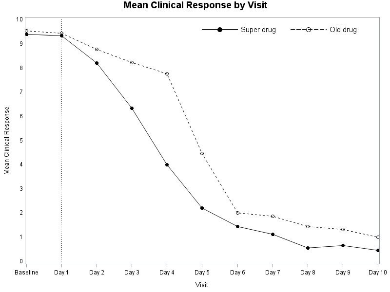
I am creating a line plot with gplot procedure, and would like to change the appearance of the legend.
Below are my codes.
The look of my legend is
But the style I want is
I know that I can use repeat = N to control the number of dots in the legend,
and I can use shape = symbol(width, height) to change the size and width of the the legend.
But if I am using both, say
legend1 label = NONE repeat = 1 shape = symbol(50 pt, 10 pt) FRAME position = (TOP RIGHT INSIDE);
It will end up to be like this
i.e. by defining repeat = 1, I am losing the ability of changing the width of legend shape.
Does anyone know how to do it?
Thank you!
data ADEFF;
label AVAL = "Analysis Value"
AVISITN = "Analysis Visit (N)"
TRTPN = "Planned Treatment (N)";
input TRTPN AVISITN AVAL @@;
datalines;
1 0 9.40 2 0 9.55
1 1 9.35 2 1 9.45
1 2 8.22 2 2 8.78
1 3 6.33 2 3 8.23
1 4 4.00 2 4 7.77
1 5 2.22 2 5 4.46
1 6 1.44 2 6 2.00
1 7 1.13 2 7 1.86
1 8 0.55 2 8 1.44
1 9 0.67 2 9 1.33
1 10 0.45 2 10 1.01
;
run;
proc format;
value avisitn
0 = "Baseline"
1 = "Day 1"
2 = "Day 2"
3 = "Day 3"
4 = "Day 4"
5 = "Day 5"
6 = "Day 6"
7 = "Day 7"
8 = "Day 8"
9 = "Day 9"
10 = "Day 10";
value trtpn
1 = "Super Drug"
2 = "Old Drug";
run;
symbol1 v = dot i = join line = 1 c = black;
symbol2 v = circle i = join line = 2 c = black;
data anno;
retain xsys ysys "2";
x = 1; y = 0; function = "move"; output;
x = 1; y = 10; function = "draw";line = 33; size = 1; output;
run;
proc print data = anno;
run;
title "Mean Clinical Response by Visit";
axis1 label = (angle = 90 "Mean Clinical Response") minor = none major = none;
axis2 label = ("Visit") minor = none;
legend1 label = NONE repeat = 3 shape = symbol(50 pt, 10 pt) FRAME position = (TOP RIGHT INSIDE);
proc gplot data = ADEFF;
plot aval * avisitn = trtpn/ haxis = axis2 vaxis = axis1 legend = legend1 annotate = anno;
format avisitn avisitn.;
format trtpn trtpn.;
run;
Accepted Solutions
- Mark as New
- Bookmark
- Subscribe
- Mute
- RSS Feed
- Permalink
- Report Inappropriate Content
Unfortunately, I don't think gplot's legend statement will let you do what you're wanting.
But, as always, if you're willing to do a little extra custom coding, you could 'fake' the legend you're wanting with annotate:
data anno_legend;
length function $8 style $35 text $100;
xsys='1'; ysys='1'; hsys='3'; when='a';
function='move'; x=50; y=95; output;
function='draw'; x=60; line=1; color='black'; size=.001; output;
function='label'; x=55; position='+'; style='albany amt/unicode'; text='25cf'x; color='black'; size=4.0; output;
function='label'; x=61; position='>'; style=''; size=2.5; text='Super drug'; output;
function='move'; x=75; y=95; output;
function='draw'; x=85; line=3; color='black'; size=.001; output;
function='label'; x=80; position='+'; style='albany amt/unicode'; text='25cb'x; color='black'; size=4.0; output;
function='label'; x=86; position='>'; style=''; size=2.5; text='Old drug'; output;
run;
- Mark as New
- Bookmark
- Subscribe
- Mute
- RSS Feed
- Permalink
- Report Inappropriate Content
Move to proc sgplot and GTL, gplot is really old. When you do you will have a lot more control over your graphs and will find it far simpler. You can read through the posts in this blog:
http://blogs.sas.com/content/graphicallyspeaking/
Which have examples of anything you can think of with code.
- Mark as New
- Bookmark
- Subscribe
- Mute
- RSS Feed
- Permalink
- Report Inappropriate Content
Unfortunately, I don't think gplot's legend statement will let you do what you're wanting.
But, as always, if you're willing to do a little extra custom coding, you could 'fake' the legend you're wanting with annotate:
data anno_legend;
length function $8 style $35 text $100;
xsys='1'; ysys='1'; hsys='3'; when='a';
function='move'; x=50; y=95; output;
function='draw'; x=60; line=1; color='black'; size=.001; output;
function='label'; x=55; position='+'; style='albany amt/unicode'; text='25cf'x; color='black'; size=4.0; output;
function='label'; x=61; position='>'; style=''; size=2.5; text='Super drug'; output;
function='move'; x=75; y=95; output;
function='draw'; x=85; line=3; color='black'; size=.001; output;
function='label'; x=80; position='+'; style='albany amt/unicode'; text='25cb'x; color='black'; size=4.0; output;
function='label'; x=86; position='>'; style=''; size=2.5; text='Old drug'; output;
run;
Catch up on SAS Innovate 2026
Dive into keynotes, announcements and breakthroughs on demand.
Explore Now →Learn how use the CAT functions in SAS to join values from multiple variables into a single value.
Find more tutorials on the SAS Users YouTube channel.
SAS Training: Just a Click Away
Ready to level-up your skills? Choose your own adventure.


