- Home
- /
- Programming
- /
- Graphics
- /
- Re: GLM LSMeans PDiff Graph colors
- RSS Feed
- Mark Topic as New
- Mark Topic as Read
- Float this Topic for Current User
- Bookmark
- Subscribe
- Mute
- Printer Friendly Page
- Mark as New
- Bookmark
- Subscribe
- Mute
- RSS Feed
- Permalink
- Report Inappropriate Content
Hello,
I am currently working on my bachelors thesis and have decided to do the statistics within SAS. I don't have any deeper experience with SAS before (except for a small introduction in my statistics course) so im very sorry if what I am trying to archive might be pretty easy but I am just to stupid to find it (as I don't even know what this is called im looking for).
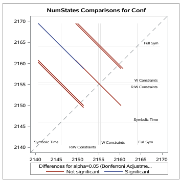
So basically I am using proc GLM for doing a one way F-Test ANOVA with paired t-tests. By default GLM provides this graph
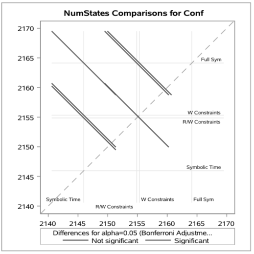
Which I would really like to use within my thesis (to visualize the significance). The problem arises with the fact that most professors print out the thesis in grayscale to correct them, and sadly the red ad the blue colors have nearly the same grayscale value
My question is now how do I change these colors?
Accepted Solutions
- Mark as New
- Bookmark
- Subscribe
- Mute
- RSS Feed
- Permalink
- Report Inappropriate Content
click  and select Preferences. Click on Results. You will see a drop down to select the style for each output type. Set the style to either JOURNAL or JOURNAL2. That should get you what you want.
Hope this helps!
Dan
- Mark as New
- Bookmark
- Subscribe
- Mute
- RSS Feed
- Permalink
- Report Inappropriate Content
How are you running SAS? In SAS Studio, or display manager?
- Mark as New
- Bookmark
- Subscribe
- Mute
- RSS Feed
- Permalink
- Report Inappropriate Content
Oh sorry I've should have written this. Im using the SAS university edition (SAS Studio?)
- Mark as New
- Bookmark
- Subscribe
- Mute
- RSS Feed
- Permalink
- Report Inappropriate Content
click  and select Preferences. Click on Results. You will see a drop down to select the style for each output type. Set the style to either JOURNAL or JOURNAL2. That should get you what you want.
Hope this helps!
Dan
Catch up on SAS Innovate 2026
Nearly 200 sessions are now available on demand with the SAS Innovate Digital Pass.
Explore Now →Learn how use the CAT functions in SAS to join values from multiple variables into a single value.
Find more tutorials on the SAS Users YouTube channel.
SAS Training: Just a Click Away
Ready to level-up your skills? Choose your own adventure.


