- Home
- /
- Programming
- /
- Graphics
- /
- Excess Lines in Prism Map
- RSS Feed
- Mark Topic as New
- Mark Topic as Read
- Float this Topic for Current User
- Bookmark
- Subscribe
- Mute
- Printer Friendly Page
- Mark as New
- Bookmark
- Subscribe
- Mute
- RSS Feed
- Permalink
- Report Inappropriate Content
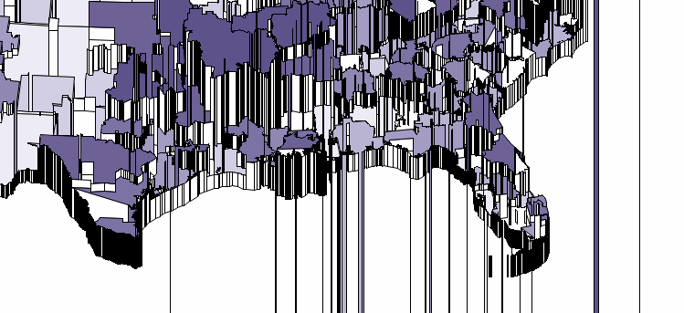
I have a map that I usually create using the CHORO statement, but decided to test out the PRISM statement instead. The map looks just fine using CHORO, but the PRISM option seems to create an abundance of excess lines across the map. I've attached an example of the southern US for reference.
I assume this is due to the structure of my map, I created it using custom regions rolled up from zip codes. Could it be due to too many observations per region or is it somehow related to the order of the regions? As I mentioned, the map looks fine when using the CHORO statement, so I'm struggling to figure out how to produce a better PRISM map. Any assistance is greatly appreciated. Thanks!

- Mark as New
- Bookmark
- Subscribe
- Mute
- RSS Feed
- Permalink
- Report Inappropriate Content
You might want to provide the code and possibly a few records. Did you use the RELZERO option for instance?
Also the documentation says that PRISM maps do not work will with "holes" which could be lakes or similar boundaries.
- Mark as New
- Bookmark
- Subscribe
- Mute
- RSS Feed
- Permalink
- Report Inappropriate Content
You might try reducing (GREDUCE) the map. It has too many lines when the Prism is solid black. It is likely confusing it.
Catch up on SAS Innovate 2026
Nearly 200 sessions are now available on demand with the SAS Innovate Digital Pass.
Explore Now →Learn how use the CAT functions in SAS to join values from multiple variables into a single value.
Find more tutorials on the SAS Users YouTube channel.
SAS Training: Just a Click Away
Ready to level-up your skills? Choose your own adventure.


