- Home
- /
- Programming
- /
- Graphics
- /
- Error with Proc Gsilde using Annotate Facility
- RSS Feed
- Mark Topic as New
- Mark Topic as Read
- Float this Topic for Current User
- Bookmark
- Subscribe
- Mute
- Printer Friendly Page

- Mark as New
- Bookmark
- Subscribe
- Mute
- RSS Feed
- Permalink
- Report Inappropriate Content
Hi everyone,
I am having error in using annotate facility with proc gsilde. Please help.
Thanks,
Amit
data:
| function | color | style | rotate | xsys | ysys | hsys | when | size | x | y |
| pie | green | psolid | 360 | 2 | 2 | 3 | a | 0.7 | 0.298793402 | -0.071374623 |
| pie | green | psolid | 360 | 2 | 2 | 3 | a | 0.7 | 0.972524828 | -0.878230289 |
| pie | green | psolid | 360 | 2 | 2 | 3 | a | 0.7 | 1.530872005 | -0.917012611 |
| pie | green | psolid | 360 | 2 | 2 | 3 | a | 0.7 | 0.298711887 | -0.073254838 |
| pie | green | psolid | 360 | 2 | 2 | 3 | a | 0.7 | 0.299087504 | -0.069009284 |
Error:
proc gslide annotate=testa;
20 run;
NOTE: ERROR DETECTED IN ANNOTATE= DATASET WORK.TESTA.
NOTE: PROBLEM IN OBSERVATION 2 -
DATA SYSTEM REQUESTED, BUT VALUE IS NOT ON GRAPH 'Y'
NOTE: PROBLEM IN OBSERVATION 3 -
DATA SYSTEM REQUESTED, BUT VALUE IS NOT ON GRAPH 'Y'
quit;
NOTE: There were 5 observations read from the data set WORK.TESTA.
NOTE: PROCEDURE GSLIDE used (Total process time):
real time 0.09 seconds
cpu time 0.10 seconds

- Mark as New
- Bookmark
- Subscribe
- Mute
- RSS Feed
- Permalink
- Report Inappropriate Content
I usually use xsys='3' ysys='3', and x/y coordinates in the range 0-100 with gslides.
I've used xsys='2' ysys='2' (data coordinate system) with gplot and gmap (which have 'data'), but never tried using it with gslide. How did you come up with your x/y coordinates, and what is the "data coordinate system" for a gslide?
- Mark as New
- Bookmark
- Subscribe
- Mute
- RSS Feed
- Permalink
- Report Inappropriate Content
Hi Robert ,
I am a big fan of your work. looking forward to using your book.
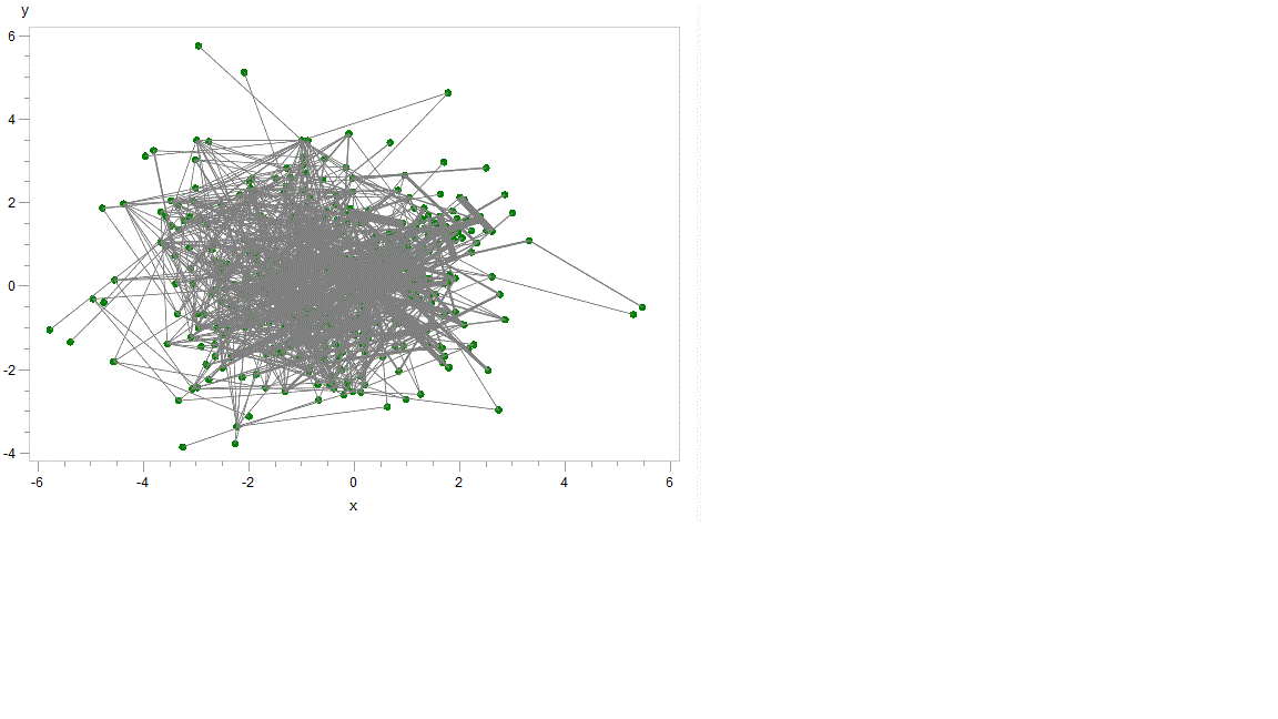
I am trying to visualize network data. THe x and y cordinates come from proc MDS. I am using code from paper " Visualizing Healthcare Provider Network using SAS tools" by John Zheng presented at PharmaSUG2011. He provides sample code for the annotate facility to visualize network of healthcare providers.
I dont know what you mean by "data cordinate system" for a gslide.
I appreciate all your help.
Regards,
Amit

- Mark as New
- Bookmark
- Subscribe
- Mute
- RSS Feed
- Permalink
- Report Inappropriate Content
hi ... re "coordinate systems" ... take a look at ...
and scroll down to coordinates (the attached illustration is from that page)
ps by all means, by Robert's book ...
Amazon.com: SAS/GRAPH: Beyond the Basics (9781607649892): Robert Allison Ph.D.: Books

- Mark as New
- Bookmark
- Subscribe
- Mute
- RSS Feed
- Permalink
- Report Inappropriate Content
Hi Mike/Rob,
Since I am using real data , the data cordinate system would be Absolute (2). Xsys and ysys also would be 2. Thats what the paper also does.
Thanks for your help.
Regards,
Amit
- Mark as New
- Bookmark
- Subscribe
- Mute
- RSS Feed
- Permalink
- Report Inappropriate Content
I think it would be easiest for you to use 'proc gplot' rather than 'proc gslide' (at least, to start with), using your annotate data set as both the data= and the annotate=, and using a symbol statement to make your gplot markers small (or invisible). And you can use your xsys and ysys='2' like this.
Something like ...
symbol1 value=point interpol=none color=gray;
proc gplot data=testa annotate=testa;
plot y*x=1;
run;
- Mark as New
- Bookmark
- Subscribe
- Mute
- RSS Feed
- Permalink
- Report Inappropriate Content
Hi Rob,
Thanks for the work around. It definitely helps.
I dont need the axis and also is there a way to expand the size of the plot area to space things out. I know i have too many points.
Thanks for your help.
Regards,
Amit
Results:
- Mark as New
- Bookmark
- Subscribe
- Mute
- RSS Feed
- Permalink
- Report Inappropriate Content
You can suppress the axes using something like this...
axis1 label=none major=none minor=none value=none style=0;
proc gplot data=testa annotate=testa;
plot y*x=1 / vaxis=axis1 haxis=axis1;
run;
You might need to make the entire plot larger, so that you can see more detail. Depending on how you're generating your output, you could use something like:
goptions xpixels=1000 ypixels=1000;
- Mark as New
- Bookmark
- Subscribe
- Mute
- RSS Feed
- Permalink
- Report Inappropriate Content
Thanks for your help.
.jpg")
Catch up on SAS Innovate 2026
Nearly 200 sessions are now available on demand in the Innovate Hub.
Watch Now →Learn how use the CAT functions in SAS to join values from multiple variables into a single value.

Find more tutorials on the SAS Users YouTube channel.
SAS Training: Just a Click Away
Ready to level-up your skills? Choose your own adventure.
-
8 replies
-
05-31-2012 10:51 AM
-
4383 views
-
3 likes
-
3 in conversation
-
