- Home
- /
- Programming
- /
- Graphics
- /
- Drawing confidence intervals in gplot using annotate
- RSS Feed
- Mark Topic as New
- Mark Topic as Read
- Float this Topic for Current User
- Bookmark
- Subscribe
- Mute
- Printer Friendly Page
- Mark as New
- Bookmark
- Subscribe
- Mute
- RSS Feed
- Permalink
- Report Inappropriate Content
Hello all,
I am trying to draw CI95% on bars in gplot. Does anybody know what I am missing, respectively why does the scritp not produce the CI lines?
Reagrds, Emin
| Var | Mean | LowerCI | UpperCI |
| X1 | 1.2 | 0.1 | 4.2 |
| X2 | 1.2 | 0.1 | 4.2 |
| X3 | 50.0 | 98.7 | 1.3 |
| X4 | 6.0 | 5.0 | 7.3 |
| X5 | 6.1 | 5.0 | 7.3 |
| X6 | 16.7 | 0.4 | 64.1 |
| X7 | 66.4 | 75.2 | 56.6 |
data anno;
length function color $8;
retain xsys ysys '2' when 'a';
set testtest4;
/****/
function='move'; xsys='2'; ysys='2'; yc=var; x=0; output;
function='bar'; x=_BIN_; y=+2; ysys='9'; style="solid";output;
function='bar'; x=0; y=-4; output;
/* Draw the horizontal line from lower_limit to upper_limit */
function='move'; yc=var; xsys='2'; ysys='2'; x=LowerCI; color='black'; output;
function='draw'; x=UpperCI; size=1; output;
/* Draw the tick line for the lower_limit value */
function='move'; xsys='2'; ysys='2'; yc=group; x=LowerCI; color='black'; output;
function='draw'; x=LowerCI; y=+1; ysys='9'; size=1; output;
function='draw'; x=LowerCI; y=-2; size=1;output;
/* Draw the tick line for the upper_limit value */
function='move'; xsys='2'; ysys='2'; yc=group; x=UpperCI; color='black'; output;
function='draw'; x=UpperCI; y=+1; ysys='9'; size=1; output;
function='draw'; x=UpperCI; y=-2; size=1; output;
run;
proc gplot data=testtest4;
plot var*Mean / annotate=anno nolegend;
run; quit;
Accepted Solutions
- Mark as New
- Bookmark
- Subscribe
- Mute
- RSS Feed
- Permalink
- Report Inappropriate Content
I've made a few tweaks to your code (and your data), and I think the following does what you're wanting...
data testtest4;
input Var $ 1-2 Mean LowerCI UpperCI;
datalines;
X1 1.2 0.1 4.2
X2 1.2 0.1 4.2
X3 50.0 48.7 60.3
X4 6.0 5.0 7.3
X5 6.1 5.0 7.3
X6 16.7 0.4 64.1
X7 66.4 55.2 69.6
;
run;
data anno;
length function color $8;
retain /*xsys ysys '2'*/ when 'a';
set testtest4;
/****/
/* Draw the horizontal line from lower_limit to upper_limit */
function='move'; yc=var; xsys='2'; ysys='2'; x=LowerCI; color='black'; output;
function='draw'; x=UpperCI; size=1; output;
/* Draw the tick line for the lower_limit value */
function='move'; xsys='2'; ysys='2'; yc=Var; y=.; x=LowerCI; color='black'; output;
function='draw'; x=LowerCI; y=+1; ysys='9'; size=1; output;
function='draw'; x=LowerCI; y=-2; size=1; output;
/*function=''; output;*/
/* Draw the tick line for the upper_limit value */
function='move'; xsys='2'; ysys='2'; yc=Var; y=.; x=UpperCI; color='black'; output;
function='draw'; x=UpperCI; y=+1; ysys='9'; size=1; output;
function='draw'; x=UpperCI; y=-2; size=1; output;
run;
symbol1 value=dot height=1 color=red;
proc gplot data=testtest4;
plot var*Mean / annotate=anno nolegend;
run; quit;
- Mark as New
- Bookmark
- Subscribe
- Mute
- RSS Feed
- Permalink
- Report Inappropriate Content
I just want to point out that the new SGPLOT procedure will do most of the computations for you. It's really easy to do this. Point the PROC at the original (unsummarized) data, then submit something like:
proc sgplot data=MyData;
vbar MyVar / response=MyY stat=mean limitstat=stddev limits=both;
run;
- Mark as New
- Bookmark
- Subscribe
- Mute
- RSS Feed
- Permalink
- Report Inappropriate Content
Thank you very much Rick. I have checked the sgplot: a very usefull procedure. I was just not able to use sgplot for my script since my summarized answers came from different equations and denominators. I will keep it in mind for future.
The script corrected by Robert works now properly.
Regards, Emin
- Mark as New
- Bookmark
- Subscribe
- Mute
- RSS Feed
- Permalink
- Report Inappropriate Content
Hi Rick,
This is a good post. I have a similar question here:
when use sgplot to draw a v bar or h bar, how can I let them to display my cusmizce confidence interval when I use a unique variable?
E.g.
data mydata;
input Var $ 1-2 LowerCI UpperCI;
datalines;
X1 0.1 4.2
X2 0.1 4.2
X3 48.7 60.3
X4 5.0 7.3
X5 5.0 7.3
X6 0.4 64.1
X7 55.2 69.6
;
run;
how can I use proc sgplot to draw v bar using Var only with LowerCI and UpperCI as the ranges of confience interval for each bar? thanks.
- Mark as New
- Bookmark
- Subscribe
- Mute
- RSS Feed
- Permalink
- Report Inappropriate Content
Support for custom intervals was added to SGPLOT and SGPANEL in SAS 9.3. There are two new statements, VBARPARM and HBARPARM, to draw pre-summarized bar charts. You can set you upper and lower limit variables on these charts.
- Mark as New
- Bookmark
- Subscribe
- Mute
- RSS Feed
- Permalink
- Report Inappropriate Content
Our SAS is still 9.2, so there is not other way with v9.2 to achieve that? thanks.
- Mark as New
- Bookmark
- Subscribe
- Mute
- RSS Feed
- Permalink
- Report Inappropriate Content
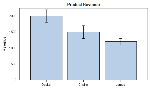
At SAS 9.2, you can use GTL to do create a bar chart with custom error bars by overlaying a SCATTERPLOT with error bars on top of a BARCHART. You can set the marker size for the scatter to zero. See program and graph.
data error;
  input Product $  Revenue Upper Lower;
  datalines;
Desks  2000 2200  1800
Chairs 1500 1700  1300
Lamps  1200 1100  1300
;
run;

proc template;
  define statgraph errorbars;
    begingraph;
      entrytitle 'Product Revenue';
      layout overlay / yaxisopts=(offsetmin=0) xaxisopts=(display=(ticks tickvalues line));
     barchart x=product y=revenue;
        scatterplot x=product y=revenue / yerrorupper=upper yerrorlower=lower markerattrs=(size=0);
      endlayout;
    endgraph;
  end;
run;

ods listing;
ods graphics / reset width=5in height=3in imagename='Error';
proc sgrender data=error template=errorbars;
run;

- Mark as New
- Bookmark
- Subscribe
- Mute
- RSS Feed
- Permalink
- Report Inappropriate Content
Perfect!!! exactly what I am wanting. ![]()
Thanks a lot to Sanjay.
- Mark as New
- Bookmark
- Subscribe
- Mute
- RSS Feed
- Permalink
- Report Inappropriate Content
You are welcome. You may find more helpful information in Graphically Speaking, a new blog on GTL and SG Procedures.
- Mark as New
- Bookmark
- Subscribe
- Mute
- RSS Feed
- Permalink
- Report Inappropriate Content
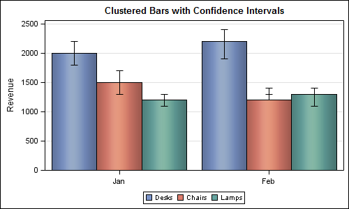
Really easy with SAS 9.3 where you can just use X=Month, GROUP=Product and GROUPDISPLAY=Cluster.
But I assume you are using SAS 9.2. If you have the M3 maintenence release, you can structure you data as multi-variable, and then overlay the bars as needed. You will need to customize your program and data based on how many groups you have. See example below with three products.

data MultiErrorMonth;
  input Month $  Revenue1 Upper1 Lower1 Revenue2 Upper2 Lower2 Revenue3 Upper3 Lower3;
  datalines;
Jan  2000  2200  1800 1500 1700  1300  1200 1300 1100
Feb  2200  2400  1900 1200 1400  1300  1300 1400 1100
;
run;

ods listing;
proc print;run;

proc template;
  define statgraph MultiError;
    begingraph;
      entrytitle 'Clustered Bars with Confidence Intervals';
      layout overlay /  xaxisopts=(offsetmin=0.25 offsetmax=0.25 display=(ticks tickvalues))
                        yaxisopts=(label='Revenue' griddisplay=on) cycleattrs=true;
         barchartparm x=month y=revenue1 / errorupper=upper1 errorlower=lower1 skin=modern
                     discreteoffset=-0.3 barwidth=0.3 name='Desks' legendlabel='Desks';
         barchartparm x=month y=revenue2 / errorupper=upper2 errorlower=lower2 skin=modern
                     discreteoffset=-0.0 barwidth=0.3 name='Chairs' legendlabel='Chairs';
         barchartparm x=month y=revenue3 / errorupper=upper3 errorlower=lower3 skin=modern
                     discreteoffset=0.3 barwidth=0.3 name='Lamps' legendlabel='Lamps';
          discretelegend 'Desks' 'Chairs' 'Lamps';
       endlayout;
     endgraph;
  end;
run;

ods listing;
ods graphics / reset width=500px height=300px imagename='MultiError';
proc sgrender data=MultiErrorMonth template=MultiError;
run;
- Mark as New
- Bookmark
- Subscribe
- Mute
- RSS Feed
- Permalink
- Report Inappropriate Content
Thanks Sanjay. But my data structure is like what I posted in my question. If I know how many groups but don't want to transpose the data to your format, is there any ways to do this? I mean just use the data I posted to produce the same graph. In addition, I don't want to 'hard code' the item names in legend, but use the values in the dataset.
Thanks again.
- Mark as New
- Bookmark
- Subscribe
- Mute
- RSS Feed
- Permalink
- Report Inappropriate Content
Yes, with SAS 9.3 (see options mentioned). Not with SAS 9.2 SG procs or GTL. You could use proc gchart and annotate.
- Mark as New
- Bookmark
- Subscribe
- Mute
- RSS Feed
- Permalink
- Report Inappropriate Content
I've made a few tweaks to your code (and your data), and I think the following does what you're wanting...
data testtest4;
input Var $ 1-2 Mean LowerCI UpperCI;
datalines;
X1 1.2 0.1 4.2
X2 1.2 0.1 4.2
X3 50.0 48.7 60.3
X4 6.0 5.0 7.3
X5 6.1 5.0 7.3
X6 16.7 0.4 64.1
X7 66.4 55.2 69.6
;
run;
data anno;
length function color $8;
retain /*xsys ysys '2'*/ when 'a';
set testtest4;
/****/
/* Draw the horizontal line from lower_limit to upper_limit */
function='move'; yc=var; xsys='2'; ysys='2'; x=LowerCI; color='black'; output;
function='draw'; x=UpperCI; size=1; output;
/* Draw the tick line for the lower_limit value */
function='move'; xsys='2'; ysys='2'; yc=Var; y=.; x=LowerCI; color='black'; output;
function='draw'; x=LowerCI; y=+1; ysys='9'; size=1; output;
function='draw'; x=LowerCI; y=-2; size=1; output;
/*function=''; output;*/
/* Draw the tick line for the upper_limit value */
function='move'; xsys='2'; ysys='2'; yc=Var; y=.; x=UpperCI; color='black'; output;
function='draw'; x=UpperCI; y=+1; ysys='9'; size=1; output;
function='draw'; x=UpperCI; y=-2; size=1; output;
run;
symbol1 value=dot height=1 color=red;
proc gplot data=testtest4;
plot var*Mean / annotate=anno nolegend;
run; quit;
- Mark as New
- Bookmark
- Subscribe
- Mute
- RSS Feed
- Permalink
- Report Inappropriate Content
Thank you very much Robert. The script work now even with the "bar" function.
Regards, Emin
- Mark as New
- Bookmark
- Subscribe
- Mute
- RSS Feed
- Permalink
- Report Inappropriate Content
Hi ,
I tried Robert's Confidence Interval code(posted on this link: https://communities.sas.com/t5/SAS-GRAPH-and-ODS-Graphics/Drawing-confidence-intervals-in-gplot-usin...
on my code to get the confidence bands on GPLOT but these are not working because there are some Y axis / Y axis changes that are required(according to robert).
Can you please help me out with this?
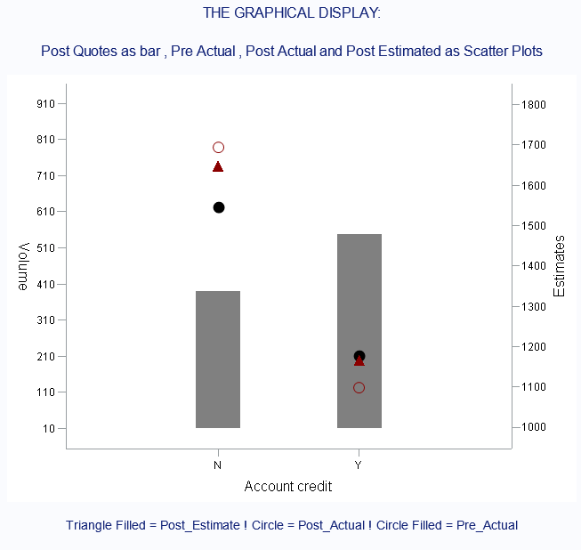
Also I have one more general question. I have to plot 3 variables in scatter plot all on the same Y axis but 2 of them would have confidence bands. Is that possible ? If yes, then does anyone have such a code?
I am working on SAS Enterprise Guide(7.1)
Here is the code:
data a;
   input ACCOUNT$ POST_QUOTES PRE_ACTUAL PRE_ERROR POST_ACTUAL POST_ERROR POST_ESTIMATE ;
   datalines;
N 389 1546 30 1695 98 1648
Y 547 1177 16 1098 53 1166
;


run;

data a(drop= post_error pre_error);
                set a;

LOWERCI_PRE = PRE_ACTUAL-PRE_ERROR;
UPPERCI_PRE = PRE_ACTUAL+PRE_ERROR;

LOWERCI_POST = POST_ACTUAL-POST_ERROR;
UPPERCI_POST = POST_ACTUAL+POST_ERROR;
run;

symbol1 value=none INTERPOL=needle color=gray  width=50 ;

symbol2 height=0.17 in value=dot color=black INTERPOL=none l=1;

symbol3 height=0.17 in value=CIRCLE color=DARKRED INTERPOL=none l=1;

symbol4 height=0.17 in value=circlefilled color=DARKRED INTERPOL=none l=1;

axis1 label=(height=0.17 in f=triplex "Account credit") value=(height=0.135 in
f=triplex) offset=(25);

axis2 label=(height=0.17 in a=90 f=triplex "Estimates") minor=none order=(1000
to 1800 by 100) offset=(5 pct) value=(height=0.135 in f=triplex);

axis3 label=(height=0.17 in a=270 f=triplex "Volume") minor=none
order=(10 to 1000 by 100) offset=(5 pct) value=(height=0.135 in f=triplex);

data anno_pre;
  length function color $8;
  retain /*xsys ysys '2'*/ when 'a';
  set A;
  /****/
  /* Draw the horizontal line from lower_limit to upper_limit */
  function='move'; yc=PRE_ACTUAL; xsys='2'; ysys='2'; x=LOWERCI_PRE; color='red'; output;
  function='draw'; x=UPPERCI_PRE;  size=1; output;
  /* Draw the tick line for the lower_limit value  */
  function='move'; xsys='2'; ysys='2'; yc=PRE_ACTUAL; y=.; x=LOWERCI_PRE; color='red'; output;
  function='draw'; x=LOWERCI_PRE; y=+1; ysys='9'; size=1; output;
  function='draw'; x=LOWERCI_PRE; y=-2; size=1; output;
  /*function=''; output;*/
  /* Draw the tick line for the upper_limit value    */
  function='move'; xsys='2'; ysys='2'; yc=PRE_ACTUAL; y=.; x=UPPERCI_PRE; color='red'; output;
  function='draw'; x=UPPERCI_PRE; y=+1; ysys='9'; size=1; output;
  function='draw'; x=UPPERCI_PRE; y=-2; size=1; output;
run;

data anno_post;
  length function color $8;
  retain /*xsys ysys '2'*/ when 'a';
  set A;
  /****/
  /* Draw the horizontal line from lower_limit to upper_limit */
  function='move'; yc=post_ACTUAL; xsys='2'; ysys='2'; x=LOWERCI_post; color='orange'; output;
  function='draw'; x=UPPERCI_post;  size=1; output;
  /* Draw the tick line for the lower_limit value  */
  function='move'; xsys='2'; ysys='2'; yc=post_ACTUAL; y=.; x=LOWERCI_post; color='orange'; output;
  function='draw'; x=LOWERCI_post; y=+1; ysys='9'; size=1; output;
  function='draw'; x=LOWERCI_post; y=-2; size=1; output;
  /*function=''; output;*/
  /* Draw the tick line for the upper_limit value    */
  function='move'; xsys='2'; ysys='2'; yc=post_ACTUAL; y=.; x=UPPERCI_post; color='orange'; output;
  function='draw'; x=UPPERCI_post; y=+1; ysys='9'; size=1; output;
  function='draw'; x=UPPERCI_post; y=-2; size=1; output;
run;


proc gplot data=a;
plot POST_QUOTES*Account/ overlay noframe nolegend haxis=axis1 vaxis=axis3;
plot2 (Pre_Actual ) *Account / annotate=anno_pre overlay noframe nolegend haxis=axis1 vaxis=axis2;


title1 h=0.17 in f=triplex "THE GRAPHICAL DISPLAY:";
title3 h=0.17 in f=triplex "Post Quotes as bar , Pre Actual , Post Actual and Post Estimated as Scatter Plots";

footnote1 j=c h=0.15 in f=triplex "Legends will go here";
run;
quit;
Catch up on SAS Innovate 2026
Dive into keynotes, announcements and breakthroughs on demand.
Explore Now →Learn how use the CAT functions in SAS to join values from multiple variables into a single value.
Find more tutorials on the SAS Users YouTube channel.
SAS Training: Just a Click Away
Ready to level-up your skills? Choose your own adventure.


