- Home
- /
- Programming
- /
- Graphics
- /
- Re: Displaying Values for Histograms
- RSS Feed
- Mark Topic as New
- Mark Topic as Read
- Float this Topic for Current User
- Bookmark
- Subscribe
- Mute
- Printer Friendly Page
- Mark as New
- Bookmark
- Subscribe
- Mute
- RSS Feed
- Permalink
- Report Inappropriate Content
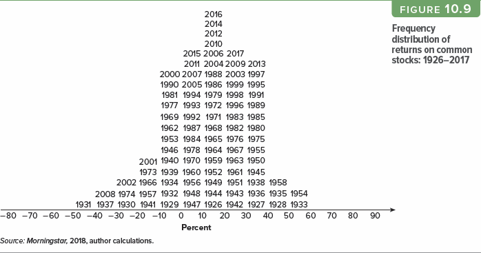
The following histogram uses the year labels of observations:
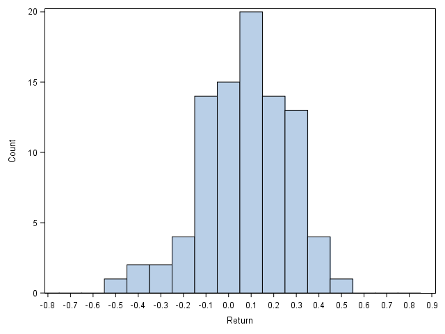
Can I do something similar to this in SAS? Here is a non-labeled replication using SGPLOT HISTOGRAM.
Here I attach the snippet; in addition, I also wonder if the vertical bars can be drawn not centered around tick marks but in between two tick marks.
filename raw url 'https://query1.finance.yahoo.com/v7/finance/download/%5EGSPC?period1=-9999999999&period2=99999999999';

proc import file=raw dbms=csv replace out=raw;
run;

data return;
	set raw;
	year=year(date);
data return;
	set return;
	by year;
	if last.year;
	return=adj_close/lag(adj_close)-1;
run;

ods results=off;
ods listing gpath='!userprofile\desktop';
ods graphics/reset noborder imagename='Example';

proc sgplot;
	where 1926<=year<=2017;
	histogram return/binstart=-.8 binwidth=.1 nbins=17 scale=count;
	xaxis values=(-.8 to .9 by .1) label='Return';
run;
Thanks for your help!
Accepted Solutions
- Mark as New
- Bookmark
- Subscribe
- Mute
- RSS Feed
- Permalink
- Report Inappropriate Content
/*
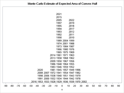
I like this picture.
*/
data have;
call streaminit(123);
do year=1926 to 2022;
 return=rand('normal');
 output;
end;
run;
proc sql;
create table have2 as
select year,(return-min(return))/(range(return)+0.5)-0.4 as return
 from have;
quit;
data have3;
 set have2;
 x=round(100*return,10)-5;
run;
proc sort data=have3 out=have4;
by x year;
run;
data have5;
 set have4;
 by x;
 if first.x then y=0;
 y+1;
run;


proc sgplot data=have5;
scatter x=x y=y/markerchar=year markercharattrs=(size=10 ) labelstrip;
xaxis values=(-90 to 90 by 10) min=-90 max=90 valueshint;
yaxis display=none offsetmin=0 offsetmax=0.1 min=1.6 valueshint;
run;
- Mark as New
- Bookmark
- Subscribe
- Mute
- RSS Feed
- Permalink
- Report Inappropriate Content
Your going to need to look at the histogram to set some limits but see if this gets you close. Since you want to display Year values then the obvious choice is a TEXT plot, which uses an X, Y pair for coordinates and allows some offset position values. So round the Return value to get plot groups, sort, add in a Y value that increments for each year of data.
Caution: the amount of space you use may not allow all the text and you may have to adjust the increment for the Yval.
data return2;
	set return;
	by year;
	if last.year;
	return=adj_close/lag(adj_close)-1;
   xplot= round(return,0.1);
run;
proc sort data=return2;
   by xplot year;
run;


data toplot;
   set return2;
   by xplot year;
   retain yval ;
   if first.xplot then yval=0;
   else yval+1;
run;

proc sgplot data=toplot;
   text x=xplot y=yval text=year/
             position=topright;
	xaxis values=(-.8 to .9 by .1) label='Return';
   label yval='Year count';
run;
- Mark as New
- Bookmark
- Subscribe
- Mute
- RSS Feed
- Permalink
- Report Inappropriate Content
/*
I like this picture.
*/
data have;
call streaminit(123);
do year=1926 to 2022;
 return=rand('normal');
 output;
end;
run;
proc sql;
create table have2 as
select year,(return-min(return))/(range(return)+0.5)-0.4 as return
 from have;
quit;
data have3;
 set have2;
 x=round(100*return,10)-5;
run;
proc sort data=have3 out=have4;
by x year;
run;
data have5;
 set have4;
 by x;
 if first.x then y=0;
 y+1;
run;


proc sgplot data=have5;
scatter x=x y=y/markerchar=year markercharattrs=(size=10 ) labelstrip;
xaxis values=(-90 to 90 by 10) min=-90 max=90 valueshint;
yaxis display=none offsetmin=0 offsetmax=0.1 min=1.6 valueshint;
run;
Catch up on SAS Innovate 2026
Dive into keynotes, announcements and breakthroughs on demand.
Explore Now →Learn how use the CAT functions in SAS to join values from multiple variables into a single value.
Find more tutorials on the SAS Users YouTube channel.
SAS Training: Just a Click Away
Ready to level-up your skills? Choose your own adventure.


