- Home
- /
- Programming
- /
- Graphics
- /
- Re: Discrete legend for proc sgplot heat map
- RSS Feed
- Mark Topic as New
- Mark Topic as Read
- Float this Topic for Current User
- Bookmark
- Subscribe
- Mute
- Printer Friendly Page
- Mark as New
- Bookmark
- Subscribe
- Mute
- RSS Feed
- Permalink
- Report Inappropriate Content
Hello all and thank you in advance,
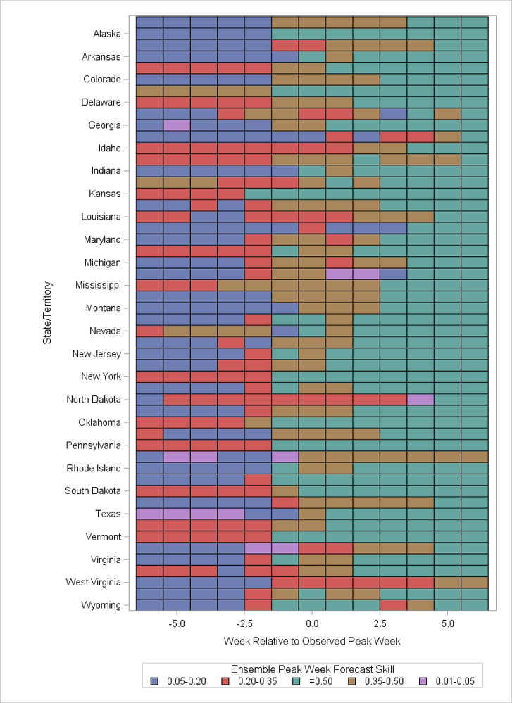
I have the below code to produce a heat map. My color response variable is discrete, with values from 1-5. Obviously the "gradlegend" creates the gradient legend, but I don't know what to replace it with to get a discrete legend. As is, the gradient legend both hides my minimum and maximum values for display, and the gradient just doesn't really make sense when the values can only be one of five colors. I tried "discretelegend", which didn't work, and this thread https://communities.sas.com/t5/Graphics-Programming/Please-explainh-the-illogical-gradlegend-in-foll..., which also wasn't the ticket. Does anyone know how to get the legend to display my discrete values? Thank you in advance!
proc sgplot data=heatmap;
   heatmap x=relative_wk y=territory / discretex colormodel=(cxFFFF66 cxFFCC00 cxFF9900 cxCC3300 /*cx800000*/ cx910014) colorresponse=Skill_bin
		   outline;
		 gradlegend  / title="Ensemble Peak Week Forecast Skill";
		 xaxis label="Week Relative to Observed Peak Week";
		 yaxis label="State/Territory";
	format Skill_bin b.;
run;Accepted Solutions
- Mark as New
- Bookmark
- Subscribe
- Mute
- RSS Feed
- Permalink
- Report Inappropriate Content
1. Delete your COLORMODEL= option. That only applies to a continuous color response variable.
2. Add DISCRETEX option to the HEATMAPPARM statement.
3. If you use the XAXIS statement, you also need to add TYPE=DISCRETE to that statement.
data heatmap;
set sashelp.us_data (where=(statecode not in ('DC' 'PR')));
territory=statename;
do relative_wk = -6 to 6 by 1;
   Skill_bin = rand("Integer", 1, 5);
   output;
end;
run;

title;
ods graphics / height=800px width=480px;
proc sgplot data=heatmap;
   heatmapparm x=relative_wk y=territory colorgroup=Skill_bin /
      	   outline discretex;
   keylegend  / title="Ensemble Peak Week Forecast Skill";
   xaxis type=discrete label="Week Relative to Observed Peak Week";
   yaxis reverse label="State/Territory";
run;
- Mark as New
- Bookmark
- Subscribe
- Mute
- RSS Feed
- Permalink
- Report Inappropriate Content
Do you have IML ?
This example is taken from iml documentation.
proc iml;
use Sashelp.Cars;
read all var _NUM_ into Y[c=varNames];
close Sashelp.Cars;
corr = corr(Y);
Bins = {"1: V. Neg", "2: Neg", "3: Neutral", "4: Pos", "5: V. Pos"};
idx = bin(corr, {-1, -0.6, -0.2, 0.2, 0.6, 1});
disCorr = shape(Bins[idx], nrow(corr));


call HeatmapDisc(disCorr) title="Correlations"
xvalues=varNames yvalues=varNames
LegendTitle="Magnitude";
quit;
- Mark as New
- Bookmark
- Subscribe
- Mute
- RSS Feed
- Permalink
- Report Inappropriate Content
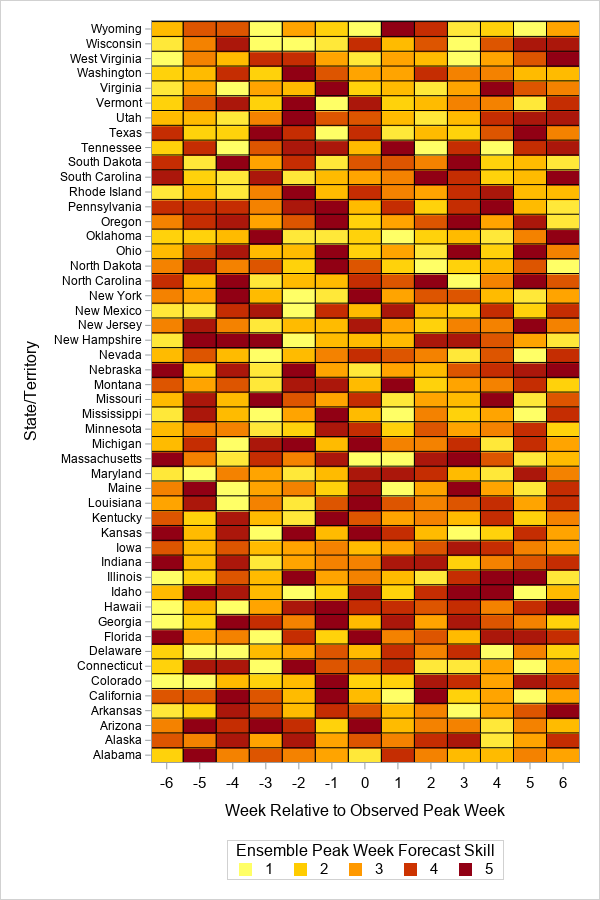
If you've got a fairly recent version of SAS, one way to do it would be to use the new 'legenditem' statement to custom-create each item you want in the legend ...
data heatmap; set sashelp.us_data (where=(statecode not in ('DC' 'PR')));
territory=statename;
do relative_wk = -6 to 6 by 1;
Skill_bin = rand("Integer", 1, 10);
output;
end;
run;
ods graphics / width=600px height=900px;
proc sgplot data=heatmap;
heatmap x=relative_wk y=territory / discretex
colormodel=(cxFFFF66 cxFFCC00 cxFF9900 cxCC3300 cx910014)
colorresponse=Skill_bin outline name='heat';
legenditem type=marker name='one' / label='1' markerattrs=(symbol=squarefilled size=9pt color=cxFFFF66);
legenditem type=marker name='two' / label='2' markerattrs=(symbol=squarefilled size=9pt color=cxFFCC00);
legenditem type=marker name='three' / label='3' markerattrs=(symbol=squarefilled size=9pt color=cxFF9900);
legenditem type=marker name='four' / label='4' markerattrs=(symbol=squarefilled size=9pt color=cxCC3300);
legenditem type=marker name='five' / label='5' markerattrs=(symbol=squarefilled size=9pt color=cx910014);
keylegend 'one' 'two' 'three' 'four' 'five' / title="Ensemble Peak Week Forecast Skill";
xaxis label="Week Relative to Observed Peak Week";
yaxis label="State/Territory" valueattrs=(size=8pt);
run;
- Mark as New
- Bookmark
- Subscribe
- Mute
- RSS Feed
- Permalink
- Report Inappropriate Content
I would switch to the HEATMAPPARM statement with the COLORGROUP= option. You can then use the DISCRETELEGEND statement to get the legend. For an example of syntax, see the last code segment at
https://blogs.sas.com/content/iml/2017/04/26/visualize-design-matrix.html
(and add a DISCRETELEGEND statement).
This assumes that you have one observation per cell. That is, the data are pre-summarized into bins.
- Mark as New
- Bookmark
- Subscribe
- Mute
- RSS Feed
- Permalink
- Report Inappropriate Content
Hi @Rick_SAS
Thank you. The HEATMAPPARM statement worked halfway. Using the below code, I now get my discrete legend (yay!). However, my XAXIS is no longer discrete (i.e., instead of -6 to 6 by 1, I get -5 to 5 by 2.5), and any statement I add to fix that doesn't work...
proc sgplot data=heatmap;
   heatmapparm x=relative_wk y=territory colorgroup=Skill_bin /
			   colormodel=(cxFFFF66 cxFFCC00 cxFF9900 cxCC3300 cx910014)
		   	   outline;
		 discretelegend  / title="Ensemble Peak Week Forecast Skill";
		 xaxis label="Week Relative to Observed Peak Week";
		 yaxis label="State/Territory";
	format Skill_bin b.;
run;
I had "discretex" in the layout statement after the slash and before the outline argument. I received this error
WARNING: HEATMAPPARM statement has a conflict with the axis type. The plot will not be drawn.
So, as per SAS support (http://support.sas.com/kb/55/717.html), I changed it to "Discretex=true" and just got a syntax error/nothing ran.

- Mark as New
- Bookmark
- Subscribe
- Mute
- RSS Feed
- Permalink
- Report Inappropriate Content
1. Delete your COLORMODEL= option. That only applies to a continuous color response variable.
2. Add DISCRETEX option to the HEATMAPPARM statement.
3. If you use the XAXIS statement, you also need to add TYPE=DISCRETE to that statement.
data heatmap;
set sashelp.us_data (where=(statecode not in ('DC' 'PR')));
territory=statename;
do relative_wk = -6 to 6 by 1;
   Skill_bin = rand("Integer", 1, 5);
   output;
end;
run;

title;
ods graphics / height=800px width=480px;
proc sgplot data=heatmap;
   heatmapparm x=relative_wk y=territory colorgroup=Skill_bin /
      	   outline discretex;
   keylegend  / title="Ensemble Peak Week Forecast Skill";
   xaxis type=discrete label="Week Relative to Observed Peak Week";
   yaxis reverse label="State/Territory";
run;
- Mark as New
- Bookmark
- Subscribe
- Mute
- RSS Feed
- Permalink
- Report Inappropriate Content
- Mark as New
- Bookmark
- Subscribe
- Mute
- RSS Feed
- Permalink
- Report Inappropriate Content
- Mark as New
- Bookmark
- Subscribe
- Mute
- RSS Feed
- Permalink
- Report Inappropriate Content
- Mark as New
- Bookmark
- Subscribe
- Mute
- RSS Feed
- Permalink
- Report Inappropriate Content
For future reference, I wrote a blog post that describes how to use PROC SGPLOT to create a discrete heatmap with a discrete legend:
Create a discrete heat map with PROC SGPLOT
Catch up on SAS Innovate 2026
Dive into keynotes, announcements and breakthroughs on demand.
Explore Now →Learn how use the CAT functions in SAS to join values from multiple variables into a single value.
Find more tutorials on the SAS Users YouTube channel.
SAS Training: Just a Click Away
Ready to level-up your skills? Choose your own adventure.


