- Home
- /
- Programming
- /
- Graphics
- /
- Different colors for bars
- RSS Feed
- Mark Topic as New
- Mark Topic as Read
- Float this Topic for Current User
- Bookmark
- Subscribe
- Mute
- Printer Friendly Page
- Mark as New
- Bookmark
- Subscribe
- Mute
- RSS Feed
- Permalink
- Report Inappropriate Content
Hello everyone,
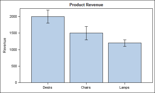
I don't know how to change the color only for one bar (for example just for desks) and keep the same color for all the other ones? Could you please help me ? Thank you very much
data error;
  input Product $  Revenue Upper Lower;
  datalines;
Desks  2000 2200  1800
Chairs 1500 1700  1300
Lamps  1200 1100  1300
;
run;

proc template;
  define statgraph errorbars;
    begingraph;
      entrytitle 'Product Revenue';
      layout overlay / yaxisopts=(offsetmin=0) xaxisopts=(display=(ticks tickvalues line));
     barchart x=product y=revenue;
        scatterplot x=product y=revenue / yerrorupper=upper yerrorlower=lower markerattrs=(size=0);
      endlayout;
    endgraph;
  end;
run;

ods listing;
ods graphics / reset width=5in height=3in imagename='Error';
proc sgrender data=error template=errorbars;
run;

Accepted Solutions
- Mark as New
- Bookmark
- Subscribe
- Mute
- RSS Feed
- Permalink
- Report Inappropriate Content
Well, the two things jump to mind:
- Use a proc template step to define a styles for the graph, and set the colors for group 1 to be one color, then the other groups to the same color.
- Use two separate graph statements, one barchart statement for the first group setting the color, then another barchart statement for the rest of the data, setting the color there.
- Mark as New
- Bookmark
- Subscribe
- Mute
- RSS Feed
- Permalink
- Report Inappropriate Content
Hey RW9,
Thank you very very muuuuuuuuuuuuuuch, it worked !!!!!
- Mark as New
- Bookmark
- Subscribe
- Mute
- RSS Feed
- Permalink
- Report Inappropriate Content
Add a group variable that has one value for the "desks" and another for everything else and use the GROUP option on the scatterplot statement to use that variable to display different color (and/or marker)
- Mark as New
- Bookmark
- Subscribe
- Mute
- RSS Feed
- Permalink
- Report Inappropriate Content
Thanks ballardw 😉
- Mark as New
- Bookmark
- Subscribe
- Mute
- RSS Feed
- Permalink
- Report Inappropriate Content
Another approach to consider is using a discrete attrmap and setting the group variable on the barchart to be the same as the category variable. In the attrmap, set the one category value to the desired color and the other values to another color. The benefit of this approach is that it will work regardless of data order.
Hope this helps!
Dan
Catch up on SAS Innovate 2026
Dive into keynotes, announcements and breakthroughs on demand.
Explore Now →Learn how use the CAT functions in SAS to join values from multiple variables into a single value.
Find more tutorials on the SAS Users YouTube channel.
SAS Training: Just a Click Away
Ready to level-up your skills? Choose your own adventure.


