- Home
- /
- Programming
- /
- Graphics
- /
- Dark to light color gradient
- RSS Feed
- Mark Topic as New
- Mark Topic as Read
- Float this Topic for Current User
- Bookmark
- Subscribe
- Mute
- Printer Friendly Page
- Mark as New
- Bookmark
- Subscribe
- Mute
- RSS Feed
- Permalink
- Report Inappropriate Content
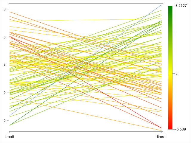
I recently received a request which may not even be possible, so I wanted to see if the community could offer any insight. I am creating 4 spaghetti plots, positioned side by side using SAS GTL with the lattice statement. Each spaghetti plot has approximately 100 uniquely-colored lines, connecting two points (e.g. Baseline to Time 1), so it is somewhat difficult to identify a trend when I allow SAS to select default colors. The request I received is to assign dark color shades to the increasing lines (i.e. the line the with the greatest positive slope would be colored the darkest) and light color shades to the decreasing lines (i.e. the line the with the greatest negative slope would be colored the lightest) - or vice versa, in order to create a color shade gradient. Any suggestions would be appreciated.
Accepted Solutions
- Mark as New
- Bookmark
- Subscribe
- Mute
- RSS Feed
- Permalink
- Report Inappropriate Content
Just a note. With only two points per line, you could use SERIESPLOT or VECTORPLOT depending on your data structure.
To get a better control on your color gradients, you can use a COLORRESPONSE option with RangeArrtMap instead of ColorModel. A Range attribute map allows you to specify the color (or range) for specific values of your data. So, for example, you could specify that all slopes< -0.2 should be red, > +0.2 should be green and between -0.2 and +0.2 should be gray. Just like a format.
http://blogs.sas.com/content/graphicallyspeaking/2013/04/14/attributes-map-3-range-attribute-map/
- Mark as New
- Bookmark
- Subscribe
- Mute
- RSS Feed
- Permalink
- Report Inappropriate Content
I believe you can accomplish what you want by assigning your slope column to the COLORRESPONSE option and setting the COLORMODEL option to TwoColorRamp.
Hope this helps!
Dan
- Mark as New
- Bookmark
- Subscribe
- Mute
- RSS Feed
- Permalink
- Report Inappropriate Content
After posting this reply, I realized that using the COLORRESPONSE option would depend on your data structure. Are you using GROUPed series plots?
- Mark as New
- Bookmark
- Subscribe
- Mute
- RSS Feed
- Permalink
- Report Inappropriate Content
Thanks for your reply! Yes, I am using grouped series plot.
seriesplot y=yvar x=xvar / group=subject;
- Mark as New
- Bookmark
- Subscribe
- Mute
- RSS Feed
- Permalink
- Report Inappropriate Content
Thanks again, DanH_sas! The COLORRESPONSE option is working well with the slope variable. However, COLORMODEL appears to be limited in that you can only select a 2 or 3 color ramp. Since I have about 100 unique lines/subjects in each plot, I am seeking a broader range of colors within the gradient. I suppose I can manually assign a list of colors (e.g. COLORMODEL=(black brown ... yellow)), but was just wondering if there's a more automated way. It appears that the non-existent option I am seeking is COLORMODEL=NINTYCOLORRAMP ![]()
- Mark as New
- Bookmark
- Subscribe
- Mute
- RSS Feed
- Permalink
- Report Inappropriate Content
I am curious as to how you intend to compute the slope? Difference betwee final and initial values? Average of slopes for each time segment?
Since you intend to panel the charts, see the article "Create spaghetti plots in SAS."
To help untangle the noodles, you might consider an alternative visualization called the "lasagna plot." See "Lasagna plots in SAS: When spaghetti plots don't suffice," which includes a discussion of sorting the rows of a lasagna plot (in your case, by slope).
- Mark as New
- Bookmark
- Subscribe
- Mute
- RSS Feed
- Permalink
- Report Inappropriate Content
Thanks, Rick_SAS! I only have two timepoints, so each line is only a single segment and a single slope can be calculated. I have already created the plots and the panels, so now I'm just noodling over the colors!
I will read up on Lasagna Plots to see if this will be a better fit for my data!
- Mark as New
- Bookmark
- Subscribe
- Mute
- RSS Feed
- Permalink
- Report Inappropriate Content
I see. So you don't actually have a spaghetti plot, which implies multiple time points and segments. You have what is commonly called a "slope chart."
How you visualize the data depends on your audiance, but for an alternate visualization that does notoverlay 100 lines, see my article "Women and jobs: Redesigning a New York Times graphic."
- Mark as New
- Bookmark
- Subscribe
- Mute
- RSS Feed
- Permalink
- Report Inappropriate Content
Slope chart, yes - thank you for that correction! I will reference both of the articles that you provided. Thanks again!
- Mark as New
- Bookmark
- Subscribe
- Mute
- RSS Feed
- Permalink
- Report Inappropriate Content
Just a note. With only two points per line, you could use SERIESPLOT or VECTORPLOT depending on your data structure.
To get a better control on your color gradients, you can use a COLORRESPONSE option with RangeArrtMap instead of ColorModel. A Range attribute map allows you to specify the color (or range) for specific values of your data. So, for example, you could specify that all slopes< -0.2 should be red, > +0.2 should be green and between -0.2 and +0.2 should be gray. Just like a format.
http://blogs.sas.com/content/graphicallyspeaking/2013/04/14/attributes-map-3-range-attribute-map/
- Mark as New
- Bookmark
- Subscribe
- Mute
- RSS Feed
- Permalink
- Report Inappropriate Content
Thank you, Sanjay_SAS! This is the exact solution I have been searching for! I used the sample code from your blog post, but replaced RANGECOLORMODEL with RANGEALTCOLORMODEL in order to apply the colors to a SERIESPLOT (where the lines are considered contrast colors).
data test;
 do x = 1 to 100;
 subj = 99 + x;
 time0 = rand('normal',4,2);
 time1 = rand('normal',4,2);
 chg = time1 - time0;
 output;
 end;
run;

proc transpose data=test out=test (rename=(_name_=time col1=value));
 by subj chg;
 var time0 time1;
run;

proc template;
 define statgraph sp;
 begingraph;
 rangeattrmap name='map';
 range min -< 0 / rangealtcolormodel=(red yellow);
 range 0 -< max / rangealtcolormodel=(yellow green);
 endrangeattrmap;
 rangeattrvar attrvar=attrvar var=chg attrmap='map';
 layout overlay / xaxisopts=(display=(ticks tickvalues)) yaxisopts=(display=(ticks tickvalues));
 seriesplot x=time y=value / group=subj colorresponse=attrvar lineattrs=(pattern=1) name='a';
 continuouslegend 'a';
 endlayout;
 endgraph;
 end;
run;

ods html;
proc sgrender data=test template=sp;
 title 'Gradient Seriesplot';
run;

Thank you again!! ![]()
- Mark as New
- Bookmark
- Subscribe
- Mute
- RSS Feed
- Permalink
- Report Inappropriate Content
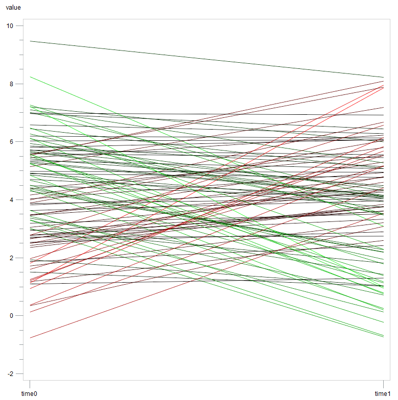
If you have fewer than 255 lines and if you are not dedicated to using proc sgrender, sas/graph makes it easy to set line colors.
data DIF;
  set TEST;
  DIF=dif(VALUE);
  if TIME='time1';
run;

proc sql noprint;
  select min(DIF), max(DIF) into :min, :max from DIF;
quit;

data _null_;
  set DIF;
  call execute(cat('symbol',_N_,' color="cx',
                  ifc(DIF>0, put(DIF*255/&max.,hex2.)||'0000"'
                      ,'00'||put(DIF*255/&min.,hex2.)||'00"')
                  ,' i=j l=1 v=none;'));
run;

goptions xpixels=800 ypixels=800;
proc gplot data=TEST;
  plot VALUE*TIME=SUBJ/nolegend ;
  run;
quit;
- Mark as New
- Bookmark
- Subscribe
- Mute
- RSS Feed
- Permalink
- Report Inappropriate Content
Thanks, ChrisNZ! I believe that solution may also work.
- Mark as New
- Bookmark
- Subscribe
- Mute
- RSS Feed
- Permalink
- Report Inappropriate Content
Good catch on using RangeAltColorModel for setting contrast colors for the series plot.
Catch up on SAS Innovate 2026
Dive into keynotes, announcements and breakthroughs on demand.
Explore Now →Learn how use the CAT functions in SAS to join values from multiple variables into a single value.
Find more tutorials on the SAS Users YouTube channel.
SAS Training: Just a Click Away
Ready to level-up your skills? Choose your own adventure.


