- Home
- /
- Programming
- /
- Graphics
- /
- Re: Customize PROC REG pots
- RSS Feed
- Mark Topic as New
- Mark Topic as Read
- Float this Topic for Current User
- Bookmark
- Subscribe
- Mute
- Printer Friendly Page
- Mark as New
- Bookmark
- Subscribe
- Mute
- RSS Feed
- Permalink
- Report Inappropriate Content
Hi,
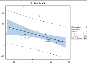
Is there a way to customize the standard plots that are produced using PROC REG ? For example, is there a way I can color code ( on the basis of group), enlarged the circles or change the shape of the symbol in this fit plot?
Dummy Data:
Group Xaxis Yaxis
1 10 5
1 20 10
1 30 15
2 40 20
2 50 25
3 60 30
3 70 35
3 80 40

- Mark as New
- Bookmark
- Subscribe
- Mute
- RSS Feed
- Permalink
- Report Inappropriate Content
Yes, but not easily.
It's done via modifying the graph template.
Warren Kuhfeld has a few papers as well as a video that details the steps.
The other option is to get the raw data and create the plot manually using either SGPLOT or GTL.
- Mark as New
- Bookmark
- Subscribe
- Mute
- RSS Feed
- Permalink
- Report Inappropriate Content
I am trying to create the confidence bands and predictive limits bands using the symbol I= RLCLM but it's not coming like the one produced by proc reg.
So, was wondering if the colors can be changed in this plot only.
- Mark as New
- Bookmark
- Subscribe
- Mute
- RSS Feed
- Permalink
- Report Inappropriate Content
Maybe see this example:
SG Procs offer a lot of options for customization.
- Mark as New
- Bookmark
- Subscribe
- Mute
- RSS Feed
- Permalink
- Report Inappropriate Content
- Mark as New
- Bookmark
- Subscribe
- Mute
- RSS Feed
- Permalink
- Report Inappropriate Content
- Mark as New
- Bookmark
- Subscribe
- Mute
- RSS Feed
- Permalink
- Report Inappropriate Content
An attribute map is the easiest way.
Full write up:
- Mark as New
- Bookmark
- Subscribe
- Mute
- RSS Feed
- Permalink
- Report Inappropriate Content
You haven't specified a SAS version, I'm assuming 9.4
The Procs have changed a lot in the last versions.
- Mark as New
- Bookmark
- Subscribe
- Mute
- RSS Feed
- Permalink
- Report Inappropriate Content
My SAS version is 9.2.
- Mark as New
- Bookmark
- Subscribe
- Mute
- RSS Feed
- Permalink
- Report Inappropriate Content
Three ways, depending on your needs and programming experience. A nice overview is the paper by Rodriguez.
1. ODS Graphics Editor for tiny changes (titles, lines,...)
2. Use the OUTPUT statement to generate the data you want, then use PROC SGPLOT to create the graph with the attributes you want.
3. Create an ODS style or modify the templates. See "ODS Graphics" chapter in the SAS/STAT documentation.
Personally, I recommend (2) for your needs, since it sounds like you don't have much experience with ODS styles or templates. There are many papers that introduce SG procedures like SGPLOT. Here's an introductory paper on SG procedures that I encountered recently.
- Mark as New
- Bookmark
- Subscribe
- Mute
- RSS Feed
- Permalink
- Report Inappropriate Content
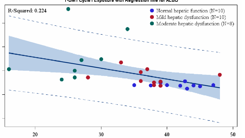
stuck in assigning different symbols for example, triangle for Normal,
circle for moderate and square for mild. Is there a quick fix?
[image: Inline image 1]
##- Please type your reply above this line. Simple formatting, no
attachments. -##
- Mark as New
- Bookmark
- Subscribe
- Mute
- RSS Feed
- Permalink
- Report Inappropriate Content
Thanks I did some work around and was able to get this plots. But getting stuck in assigning different symbols for example, triangle for Normal, circle for moderate and square for mild. Is there a quick fix?

- Mark as New
- Bookmark
- Subscribe
- Mute
- RSS Feed
- Permalink
- Report Inappropriate Content
That depends. You should post your code, otherwise we don't know if you used GPLOT or SGPLOT or GTL or modified the template...
- Mark as New
- Bookmark
- Subscribe
- Mute
- RSS Feed
- Permalink
- Report Inappropriate Content
Thanks below is the code. I have SAS 9.2
proc sgplot data=plot_data ;
reg x=&xaxis y=&yaxis / CLM CLI markerattrs=(color=white) name="reglegend";
inset "R-Squared: %cmpres(&rsq_3sig)" /noborder ;
scatter x=&xaxis y=&yaxis/ group = cohort_no markerattrs=(symbol=circlefilled size=10px) name="scatterlegend" ;
footnote height=1 justify=center "P-Value: %cmpres(&pvalue)" ;
keylegend "reglegend" / position = bottom location = outside;
keylegend "scatterlegend"/ position = topright location = inside down=3 noborder ;
&xaxis = "&xlabel";
run;
- Mark as New
- Bookmark
- Subscribe
- Mute
- RSS Feed
- Permalink
- Report Inappropriate Content
Have you tried the symbol option on markerattrs?
Catch up on SAS Innovate 2026
Nearly 200 sessions are now available on demand with the SAS Innovate Digital Pass.
Explore Now →Learn how use the CAT functions in SAS to join values from multiple variables into a single value.
Find more tutorials on the SAS Users YouTube channel.
SAS Training: Just a Click Away
Ready to level-up your skills? Choose your own adventure.


